For over 100 years, MARION, an independent, nonprofit, private general hospital, has served its patients in Marion County, Indiana. Today she announced a name change and rebranding, slated to launch on October 01, 2021. This is due to the need to meet the requirements of our time – to constantly improve the quality of service, increase the effectiveness of treatment and prophylactic methods, and reduce the incidence rate. This can be achieved only by ensuring the professional compliance of its employees, updating special equipment, and timely application of the achievements of modern technologies. All this provides the necessary conditions for improving the quality of the main mission of the medical institution – protecting the population from the risk of diseases, preventing injuries and situations leading to disability, maintaining the physical and mental health of people, maintaining a healthy environment.
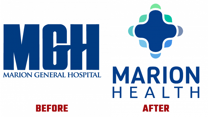
Cardinal changes in the field of medical care, the introduction of an innovative approach to patient care at a new high-quality level, the organization’s expansion require adjustments and the organization’s corporate identity, its full compliance with current changes. Today’s rebranding facilitates this. The name change is one of the important steps in achieving the set task. The hospital will be called Marion Health- MGH Campus. Its 12 health care points will become simply Marion Health. This is a huge step towards future change, which will occur in stages and begin with a change in inpatient use.
The new design is the most accurate reflection of the goals and objectives of the organization, its expanding influence on society, associated with the fundamental principles of the Red Cross. The background of the logo matches the font color of the previous emblem – “blue dust.” It bears a new brand name – a stylized white cross with rounded corners. In the background is a rectangle with rounded corners and a color gradient from cornflower blue and blue Crayola to Persian green and moderate aquamarine. Below this symbol is the text of the name of the organization Marion Health, the words of which are symmetrically located one under the other. The font of the first word is close in its execution to Zosimo Cyrillic Bold and the second to Alesand Regular.


