


The Helper Bees has updated its brand as its in-home support services for older adults expand. After 10 years in business, the company turned to Whipsaw to align its identity with its growth. The designers retained the name and bee, reworking the mascot’s silhouette and the lettering beside it.
The Helper Bees platform connects families, care providers, and insurance organizations. As its partner network grew, the company needed to balance the professional presentation of a technology service with a warm, personal tone. The familiar character maintains a connection to the previous identity. At the same time, new letter proportions give the name greater prominence in the logo.
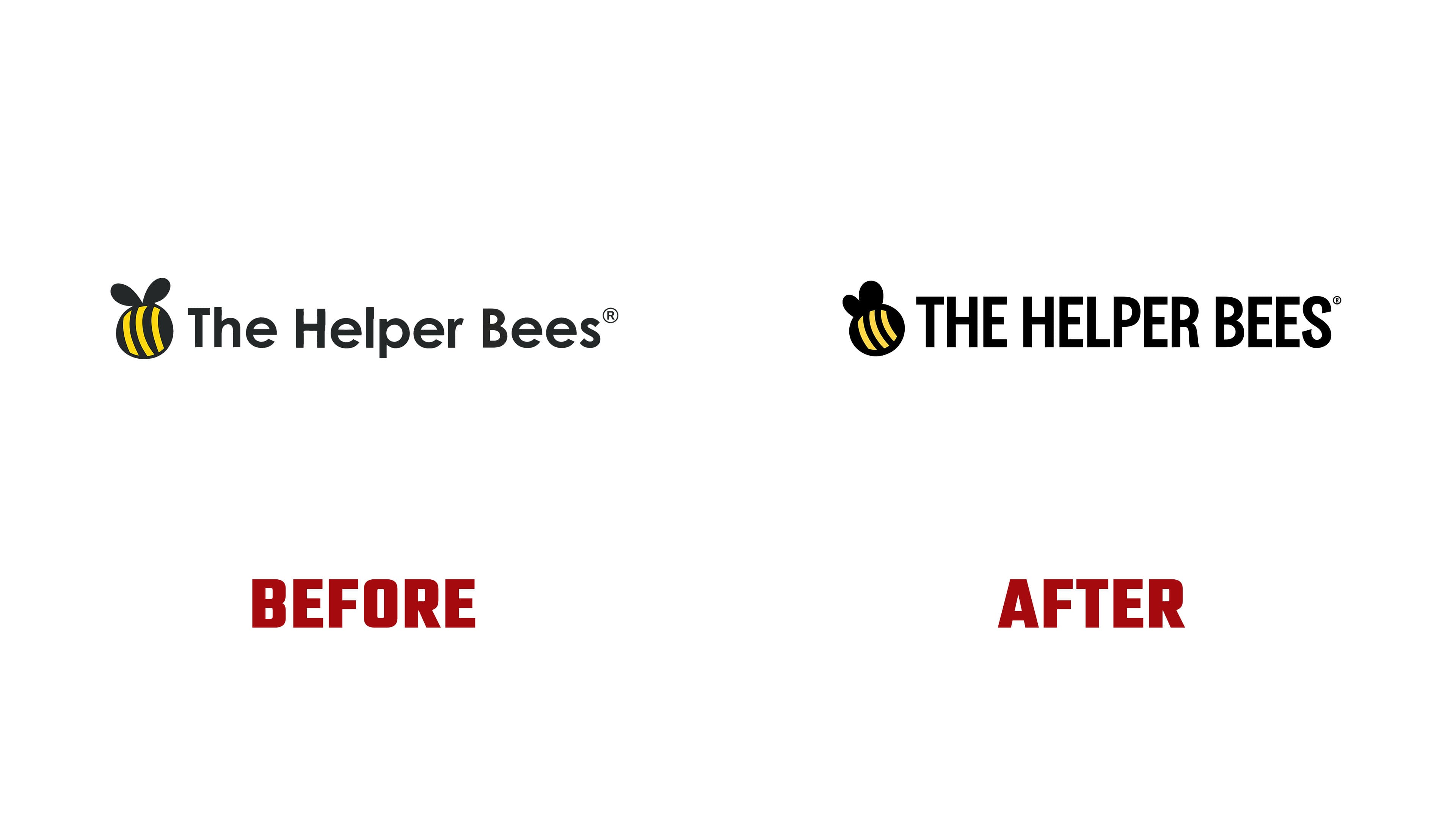
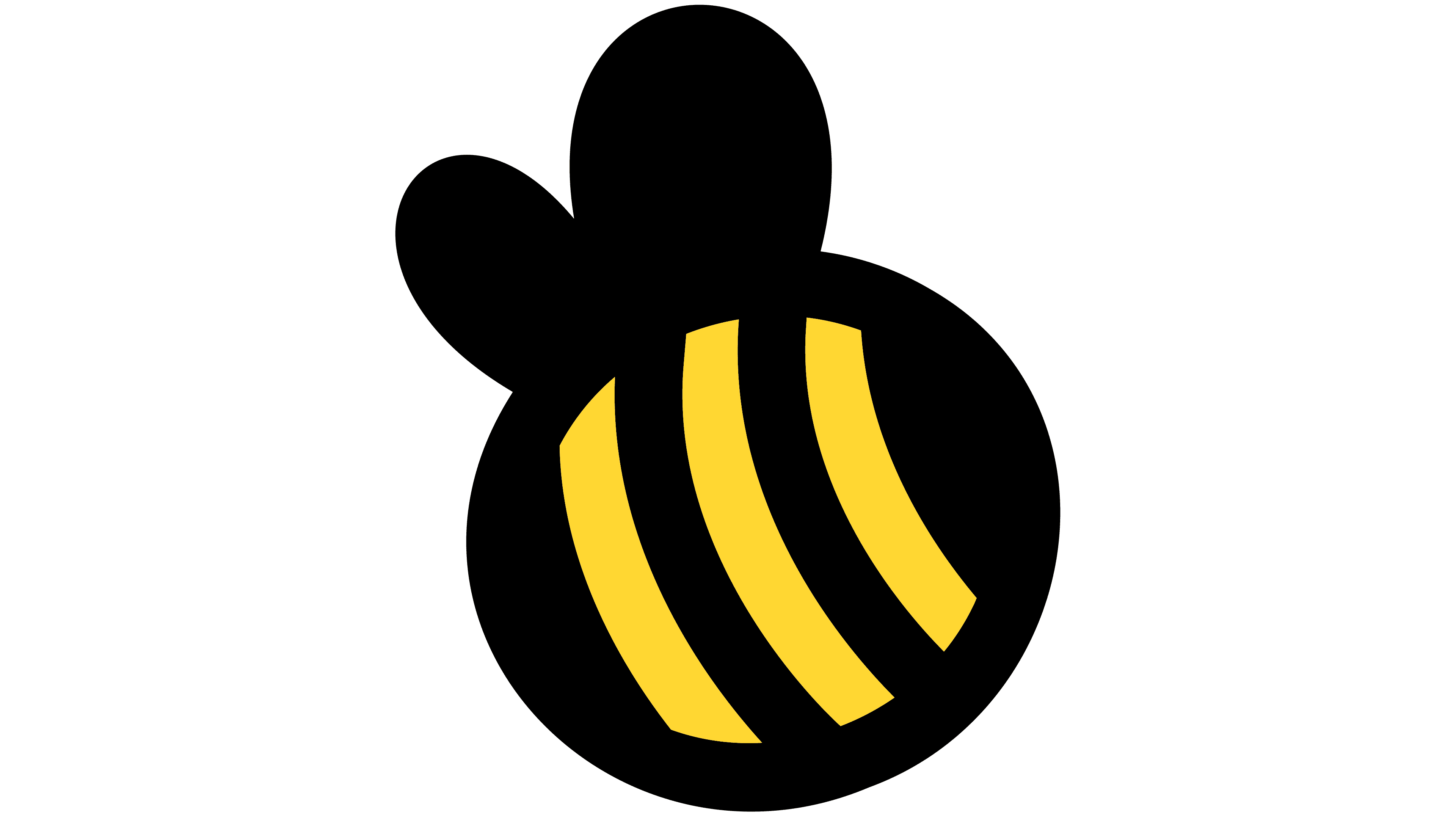
Previously, the bee had an elongated body with nearly vertical yellow stripes and two wings spreading outward. Its body is now rounder, and the stripes curve more strongly along the diagonal. The wings sit closer together, with one pointing almost straight up and the other extending to the left. The new curves and wing positions make the bee appear turned relative to the earlier illustration.
The mascot still consists of a black body with three yellow stripes and a pair of wings. Whipsaw retained its simplified style, concentrating on the proportions of the main shapes. The rounded bee sits beside narrow lettering, with the contrasting forms keeping the character and name distinct even when placed close together.
The wordmark has changed substantially. The title-case The Helper Bees has become THE HELPER BEES, set entirely in uppercase. The tall, narrow letters have heavy strokes and tight spacing. Black replaces the previous dark gray. The bee remains to the left of the name, preserving the familiar horizontal arrangement.
The mascot can stand alone in small digital applications. One version places the bee on a yellow square with rounded corners for use as an icon or social media profile image. The silhouette and yellow-and-black combination connect this compact version to the full logo.
Designer Sam Peart presented the update. Whipsaw’s team included Walker Harden, Laura Ogle, Candace Pong, Emma Kushner, and Jaye A. Megan Goldshine, Zoe Fu, and Elisa Wikey participated on behalf of The Helper Bees. The project covered positioning, visual identity, photography, animation, video, and a new website.
Supporting colors extend the nature theme. Dark green, light green, cream, orange, pink, and light blue reference flowers, foliage, soil, and sunlight. Illustrations show older adults engaged in everyday activities. The updated website explains the platform’s expanded capabilities and how it coordinates in-home support.