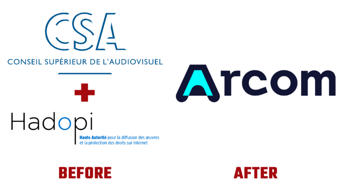
France has traditionally been a leader in developing and preserving cultural values, which was once again confirmed by creating a new regulator, ARCOM. The created organization acquired broad powers, including an expanded range of control in the field of supervision of video streaming services online platforms of the international level. The creation of such a regulatory structure is long overdue. The transformations that have taken place in the digital and audiovisual space have demanded tighter control with enhanced access rights. The task of the new structure includes not only controlling and punitive functions but also providing convenience for distribution, creating a variety of various creative forms of art. At the same time, it is especially important to protect users of digital technologies from obvious abuses in this area. At the same time, the necessary economic balance and compliance with the requirements for freedom of expression, the presence of pluralism, and the creation of conditions for conducting various kinds of research will be ensured. The new structure was built based on two organizations – Conseil Supérieur de l’Audiovisuel and HADOPI, which was responsible for Internet piracy.
The purpose of the new brand and its functional features have left their mark on forming the visual identity of the new structure. To give the brand weight and seriousness of its perception, a two-color corporate palette was chosen, which, with its contrast, emphasizes the main task – the fight against violations of the Law. Naturally, the side of justice reflects the traditionally white color used in the execution of the font of the brand name in its logo. The font was specially designed for this task. It is simple, bold, catches the eye, and is easy to read in any form – printed or digital, and in different sizes. This makes it possible to read it at a great distance or fairly small print. The letter “r” can be interpreted as a symbol of stopping, restrictions and continuation at the same time, which reflects the essence of the regulator, as controlling, and at the same time promoting further development.
Going further in the elaboration of the visual concept of the brand, the developers paid special attention to the formation of a single sign for the entire system, which would ensure recognition and the possibility of its use in the most limited and overloaded with information spaces. The stylized letter A allows the imagination to “roam” but forms the visual perception of the brand as an official and legal structure. This is facilitated by the contrasting white strict deep purple-blue background color.


