MedExpress is entering 2026 with an updated identity from Pentagram. The British digital health care service grew alongside the online medicine market and the demand for GLP-1 medications, and the previous image gave way to a system suited to the company’s new scale. MedExpress operates as an online pharmacy, provides online consultations, issues prescription treatments, and delivers medication to patients. The company, founded in 2013 and part of HeliosX, has served more than 1.5 million customers.
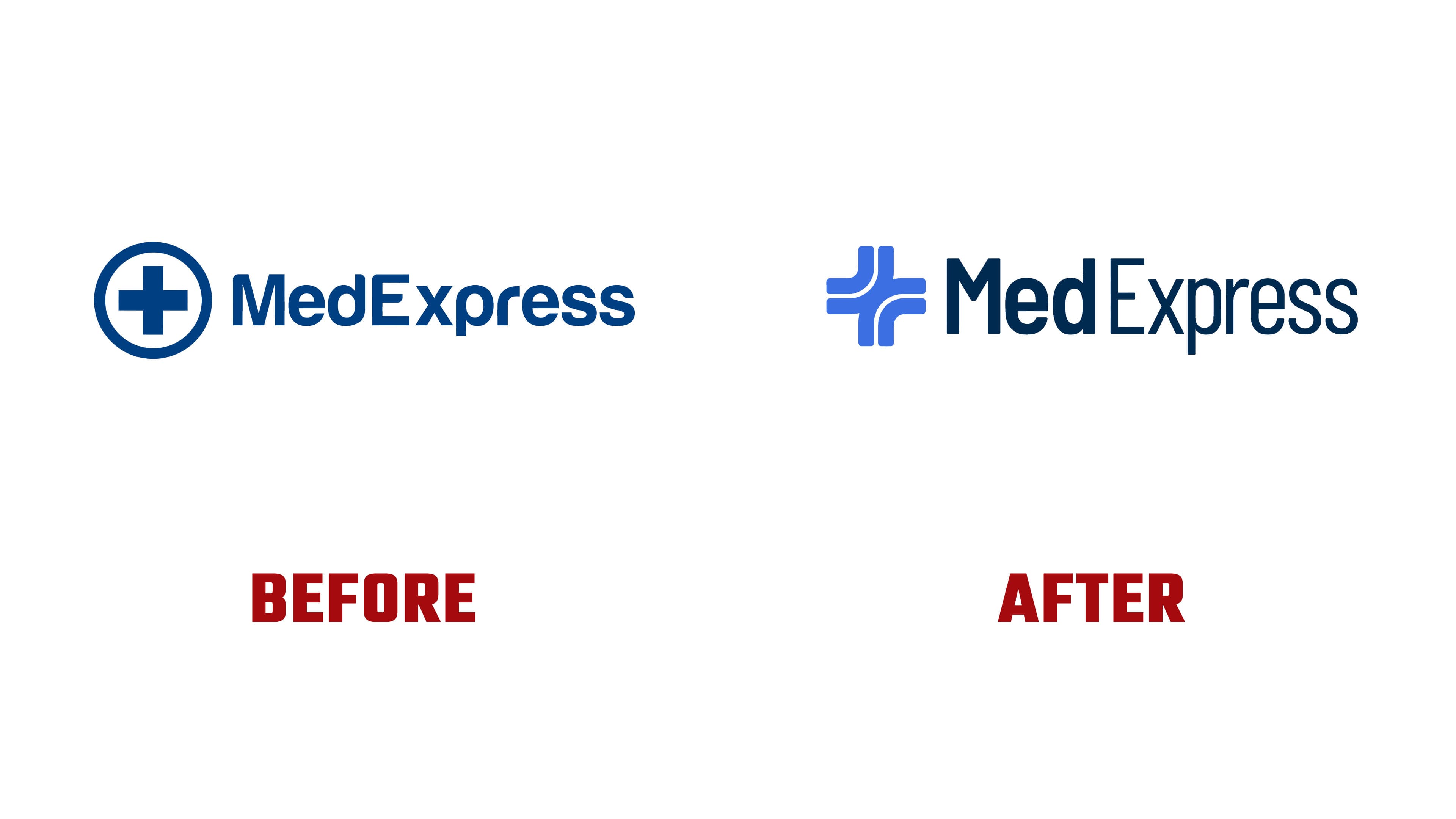
The old logo with a cross in a circle quickly associated the brand with medicine and positioned it within the familiar landscape of pharmacies, clinics, and urgent care services. The new emblem keeps the link to the medical cross and makes the image more individual. Intersecting soft lines form the MedExpress mark. It suggests contact between patient and clinician, the path through the service, an online consultation, and treatment delivery.
Pentagram worked on the brand identity, brand strategy, and campaign system. The main task was to move away from a utilitarian medical look and prepare the brand for digital-first health care. The new style is designed for advertising, social media, TV, radio, and customer communications. The growing company needed a mark that would help MedExpress stand out among competitors in digital and social advertising.
The logo combines clinical precision and human warmth. The light blue symbol looks softer than the previous dark blue cross. The medical association remains, now with a warmer, more service-oriented feel. The name became lighter through the use of Barlow. The rounded letterforms echo the symbol’s lines, making the service feel closer to the patient.

The new MedExpress tagline is “Clinical excellence, delivered with care.” In the identity, the idea is expressed through the mark’s form. Clinical quality remains the foundation of the service. At the same time, care is conveyed through soft lines, an open structure, and a calm tone. The logo presents MedExpress as a medical brand with digital logic, where consultation, access to treatment, and support converge on a single path.
The rebrand appeared during MedExpress’s first major above-the-line campaign, launched in January 2026. Amid the noise around weight loss, the company presented its service as a medically supervised alternative to the chaos of advice. The new emblem works as a compact formula for the brand. Medicine, contact, the treatment path, and caring service are combined into a single visual image.