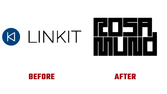
Since its inception, Rosamund Studio, formerly known as the LINKIT agency, has focused its activities on developing custom video content. Founded in 2012 with headquarters in Nantes and Paris, the company has long gone beyond its country’s borders. Among Rosamund’s clients are well-known French and foreign companies and brands. A wide variety of video content is created in the required formats, including the creation of corporate films. One of the brand’s directions has been and remains the professional support of various large French groups in the creation of any video content formats. A division for the production of films and fiction has recently been added. The changes that took place became the basis for forming a new image, which required a radical rebranding, which led to a complete change of the obsolete name.
As a result of the overdue changes and current changes, a complete reworking of the previously accepted graphic image was carried out, where material from Brand Brothers was used. The work carried out provided the creation of a new image and corporate identity, which demonstrate some rigor with an increased level of sensitivity, reflecting these features as characteristic of an updated brand. Real stories stand out in the foreground in the company’s activities, whose manner of presenting information to the viewer gravitates more towards documentaries. This effect is enhanced by technical means. To enhance the understanding of such an important characteristic of the brand’s essence, a thick and structured typogram was used, which forms the required idea of style and accuracy. The applied typography, in the form of a sign, actively interacts with the image. To do this, a modular window system was created that expresses the full power and diversity of the content created by the brand during its existence.
This technology of composition formation opens up unlimited possibilities for constantly updating visualizations creating presentations and new images in both typographic and digital versions. The limited and at the same time saturated spatial territory of reflection of the visual form of the brand is filled with text filling from letters made in the LL Riforma typeface (Norm, Zurich), created by Lineto. Its eclecticism harmonizes perfectly with the creative atmosphere and direction of the agency, creating the required visual perception of the company whose logo is formed using this type of font.


