For several years of its activity, the venture fintech company Payrix has reached significant heights in its development. Rapid growth has led to the need for change, resulting in a change in strategy and appearance. As a venture financial fund, the brand focuses on creating ready-made payment solutions for direct software developers. These proposals are distinguished by increased security ease of implementation in ready-made products that are already in use. The benefits of using Payrix are especially valuable when dealing with payments, which is typical for any business. The ability to reduce the number of actions and unnecessary movements when making everyday payments is only one of the positive aspects of the system. Together with Payrix, the efficiency and security of payment management increase significantly.
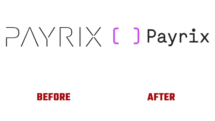
The Brooklyn creative studio Franklyn and the NMC agency carried out a comprehensive rebranding. As a result of their joint activities, a new logo, visual language, and corporate identity were created. The implemented changes made it possible to open a new chapter in the brand’s history. Particular attention was paid to the creation of a new B2B website. Its important characteristic is not only bright attractiveness and informativeness but also ease of management ease of use due to the use of CMS WordPress. The beginning was based on a deep study of the features of the process and a survey of users. The result was a dynamic look built with custom illustrations. A bright color palette and sophisticated typography provided a fundamental difference between the brand and its analogs.
When constructing the appearance, the emphasis was placed on modernity and conciseness, which made the brand attractive and practical, easy to remember, and recognizable. Adding some playfulness, dynamics, different types of movements with the help of “GIFs” provided a spectacular attraction of attention while highlighting important information for users. But the created energy is effectively silenced by the clarity and functionality of the created controls. With their help, it was possible to divide the form into segments, allowing users to correctly and quickly find and distribute content according to existing tasks. At the same time, the “digital presence,” which is the basis of the new brand, is constantly maintained. The created system makes it easy to make the necessary changes and additions.


