The Belgian municipality of Zulte introduced a new logo in June 2026, 17 years after its previous emblem debuted. Designer Thomas Mahieu retained the connection to the Leie River, incorporating its bends into the first letter of the name. The update is intended to make the municipality’s communications with residents feel contemporary and accessible.
In the new “Z,” a winding form replaces the conventional diagonal between the two horizontal bars. Cutouts on opposite sides create a series of bends resembling a river channel. The letter’s three sections represent Zulte, Machelen, and Olsene, the communities that make up the municipality. Mayor Simon Lagrange associates the emblem with unity, development, and accessibility. Mahieu describes the concept in terms of the area’s active community life and its future.
The remaining letters match the large scale of the “Z.” The “U,” “L,” “T,” and “E” are set in heavy uppercase sans-serif forms. Thick strokes combine with rounded corners, while the bottom of the “U” forms a smooth curve. In the color version, the light blue ZULTE wordmark appears on a saturated blue background. The river reference now sits within the word itself, built into the first letter.
The previous logo originated in a municipal competition held in May 2009. Charlotte Vermeersch’s design received unanimous support from 43 entries. She depicted the Leie’s original course as a wave whose curves connected the three communities. Blue represented water, while warm gray was used as a politically neutral color.
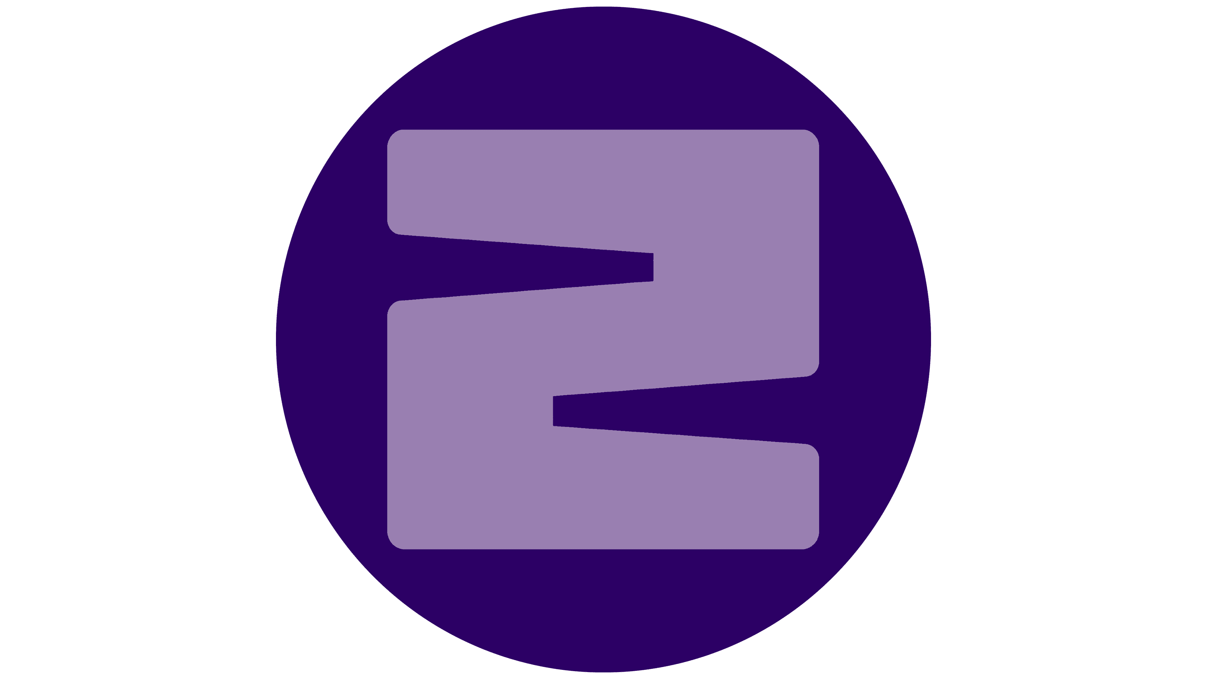
In that emblem, a turquoise line ran through thin, angular lettering in a warm gray-brown. The wave passed in front of and behind the letters, creating depth. It also helped form the “Z,” completing its outline. Beneath the name was the tagline “Warm en stijlvol,” meaning “Warm and stylish.” The new version consists of a bold wordmark, replacing the earlier light lettering with heavy strokes and rounded corners.
Mahieu developed the identity for social media, printed materials, signage, vehicles, and buildings. The municipal social services organization Sociaal Huis will adopt the same identity. The logo will also appear on workwear and official materials. The municipality has allowed both versions to remain in use during the transition.