Onto is an electric car subscription startup that provides a service for driving an electric car.
At first, the brand had the name Evezy, which, a few years after the launch, the creators marked as “difficult to pronounce, unreadable, difficult to remember.” The desire to be creative, innovative, and vibrant has developed into this name. But, alas, it did not take root. Whether the difficulty is that the pronunciation of the combination of vowels and consonants is too inconvenient, or the graphic design, it is impossible to say unequivocally what went wrong with such naming of the company. The service initiators wanted to do their best – to offer the first service in the UK that could provide anyone with a car without any obligations or conventions. With all the guarantees and service capabilities of the machine. Availability of rentals with short-term agreements and convenience in a technical sense.
Of course, the service caused a stir among the British, especially when they were offered a full subscription. Users appreciated this attitude of the brand towards themselves, in every possible way supporting its activities, even despite such an amazing creative name.
Reimagining the experience of owning a car, appreciating the prospects for a future without borders, and with the possibility of simplifying electrification, the brand began its journey to new heights.
From now on, it is called Onto. It is a step forward towards innovation and adventure. A new identity, a new site, an application will be created. And quality services will remain at their best, as before.
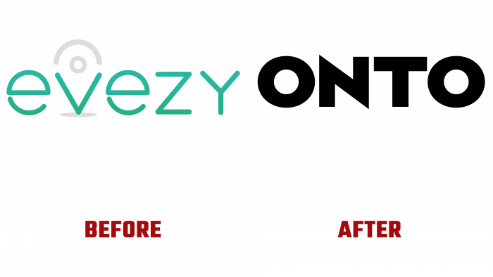
Comparing the two logos based on the company name’s graphic design, the difference is obvious. Onto is a solid, modern, “confident” brand that has already managed to transform itself. And Evezy is the beginning of the path, a green sprout making its way to the sun. It is not for nothing that they symbolically used green for the contours of the logo. It is noteworthy that the letter V has been stylized as a geotags to illustrate the service’s specifics better.
The current black-type logo without additional elements plays on contrasts. He doesn’t tell anything, doesn’t show. Simply stating that this brand is a strong team, excellent service, and innovative approach. The specifics of the company are not determined. But at the same time, the intrigue remains, thanks to which new communication with users is being built.
This is a marketing ploy that increases customer attention and demand.
The general public will look forward to the announced updates in the identity, and the brand will continue its development with a new name and a new visual identity.


