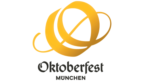
Oddly enough, Germany’s largest festivities did not have a single official emblem. The organizers corrected the oversight in 2022 by introducing a new Oktoberfest logo in early August. The most important thing is that it is now made in a unified corporate style and will become the decoration of the next festival.
The event was announced by Clemens Baumgärtner, the head of Wiesn. He noted that the personal symbol is included in the rebranding scheme of the international event and involves the entire change of identity with the arrangement of new stores and stalls. The center of the visual basis was the capital “O” – the first letter of the name of the legendary fall event, attracting people from many countries.
It is decorated with a twisted pattern and is a long ribbon of different widths gathered into a double ring. This arrangement creates an ornate decoration for the letter “O,” and the flowing lines make it eye-catching, perfect for consistent Oktoberfest marketing. From now on, they will decorate all promotional materials and souvenirs related to the festival. In addition, loose rings (open) provide a dynamic that conveys the energy and spirit of the German autumn festivities.
The black inscription on the emblem is also made in a similar style. The glyphs are slightly sinuous, ribbon-like, with diagonal cuts and points. In color, they contrast with the golden “O,” tinted with the classic tone of beer and autumn. Moreover, the letter has a gradient: it is lighter at the top and darker at the bottom. The word “München” from the second row is also black. It is even, strict, chopped, and aligned to the center of the first line.


