In connection with the beginning of the coronavirus pandemic, many companies have emerged that have taken their place in the niche of medicine. As the business develops, they promote the brand. For example, Curative, founded in 2020, a large company providing health services and medical services, has become one of the leaders in the segment.
The carefully designed system, well-established communication with partner companies, convenient technical equipment of services contribute to the emergence of successful cases and the implementation of the brand’s main mission – to keep people healthy in the difficult era of covid. A huge team of doctors, scientists, developers, engineers, experts in the medical industry and tourism helped create an internal network of 15,000 sites in 20 states and three certified laboratories. The company has already implemented 22 million tests and 2 million covid vaccines in medical institutions and presented them to customers.
Due to the growth of the service network, Curative decided to update the logo. And this is the very case of design when both the first option and the new one looked and represented the company equally harmoniously. We were updating Landscape from San Francisco. The developers emphasized that customers’ growth justifies a quick start and fully supports the brand’s strategy. At first, it was a lab that started as a simple start-up. But then 7,000 employees were hired, 13,000 tested1 and 500 vaccination sites across America, and 35,000 vaccines a week. This brand inspires, inspires, encourages with its successful activity, and it is important to maintain a balance between the desired creativity and the company’s position.
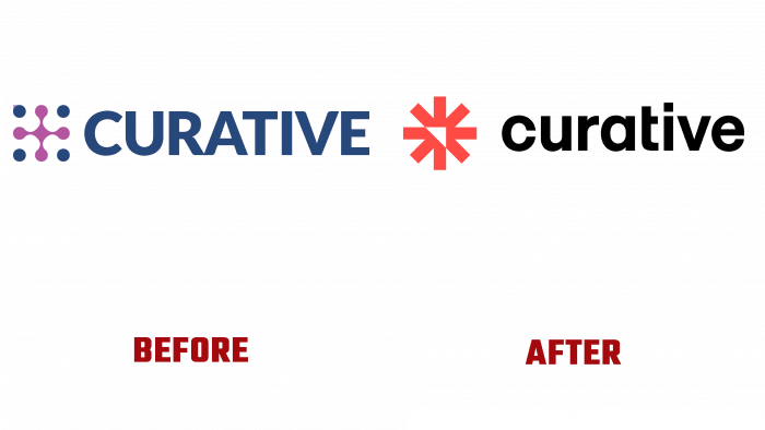
At first, the logo was decorated in pink and blue—pink cross created from connected dots as a symbol of medical care. Scattered blue dots complemented it to match the Curative font image. Beautiful and distinctive, solid and reliable font. It looks solid and presentable, innovative, and it is easy to remember. The graphic symbol of the dots creates a square as if to say: “Your health is under our control!”.
And now the square has turned into a sphere that looks like an orange-red flower with an inner white triangle showing the upward direction. The petals are made of rectangles, so it is generally a game of geometric shapes and the illusion of sharpness. A more rounded one replaced the font with the letter t extending beyond the main body only on one side. If the name was written in capital letters earlier, it is now created from small letters but warmer and closer to the people.
Surprisingly, only a year has passed since the company’s founding, and the rebranding process has already been initiated so quickly. It can be assumed that this situation is related to the company’s ambitions to grow further and also reflects the nature of the relationship between man and medicine, patient and doctor, naturalness, and the artificial world.


