Bedimo updated its identity along with its new role in the market. Previously, the brand was more often associated with selling office furniture through catalogs. After Nemesis’s work, the brand transitioned to a one-stop shop for office design. The conversation is now about a complete work environment, rather than separate desks, chairs, and cabinets.
The formula Workspaces for well-being sets the new focus. Bedimo treats the office as a tool for a team’s daily work. First comes the idea, then the layout, furniture, lighting, meeting areas, and places for quiet concentration. The client receives a well-planned space for people, where objects, routes, and atmosphere work together.
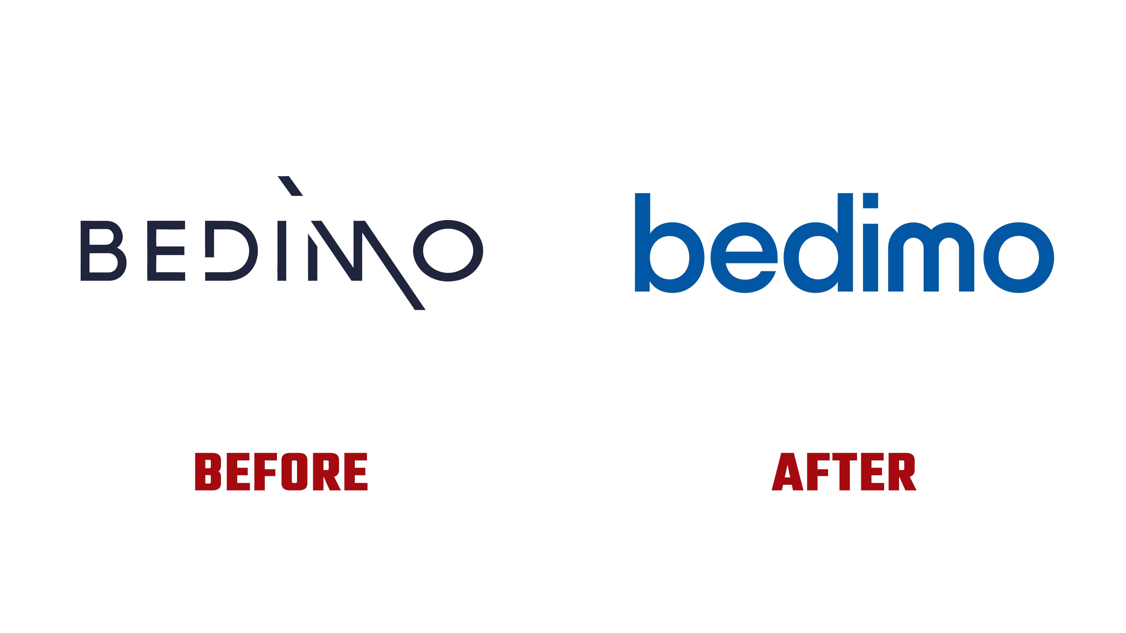
The previous logo leaned more toward architecture and interior design. Thin letters, generous spacing, and the diagonal in the “M” created the feel of an expensive custom project. The complex detail in the name slowed brand recognition.
The new wordmark became softer. Lowercase rounded letters reduce the distance between the brand and the client. The rich blue background helps the mark work in digital environments, presentations, the website, and commercial materials.
The updated logo changes how people perceive Bedimo. The company moves from a furniture seller to a partner in office design and construction. The visual image shifted toward a service that guides the client through the entire process. From the first idea to a finished work environment, where furniture, layout, and atmosphere help the team feel better and work more calmly.