Founded in 1901, the Argentine professional sports club Atlético River Plate, based in Núñez, near Buenos Aires, changed its logo and presented a new identity. The club’s name was chosen after the river flowing near the city, where its mouth is located. The club is multidisciplinary in its field, but it is especially known for its soccer team, with 37 wins in the national championship, the highest number of goals scored and points, and the best goal difference. Its merits are marked by the first place in the historical table of the Copa Libertadores, as the team with the most victories among South American teams.
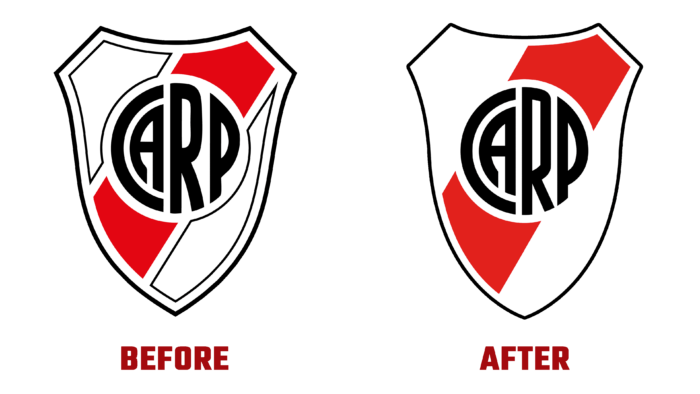
The modern look of the brand forms a new image of the club, resulting from the fruitful work of the entire team and the Berro Group design team. The main goal of creating a long-term identity was achieved based on the brand’s deep history. The new identity has made it possible to integrate its entire universe into a single system, linked by common communications and management. The evolution of the emblem combined the latest technical achievements in the way of visualization and the modern vision of the identity with the historical past of the club. Emphasis was placed on considering the characteristics and requirements of modern digital and polygraphic ways of reflecting information, ensuring high quality and clarity of visual transmission and textual information reading. At the same time, the main symbolic aspect – high quality of the three key elements – the coat of arms, company colors, the architecture of the image construction – was observed. At the same time, high-quality visualization of historically accepted brand abbreviation CARP’s readability in different dimensional versions was provided.
Maximum minimization of the image was ensured by removing unnecessary visual elements, especially strokes that created excessive visual noise. The abbreviation itself underwent slight changes, becoming more attractive, beautiful, and proud. This was facilitated both by some increase in its size and by the formation of a conventional, invisible circle, the shape of which can be seen in the graphic construction of the text element and the missing part of the red stripe. The stroke added to the ridge holds the eye, making the outline stronger and more unified.
The wordmark provided a magnificent harmony with the coat of arms itself, becoming a favorable addition to it, effectively echoing the compressed letters with the low rungs of the abbreviation—the unconventional counter spaces of the letters R and P work to enhance its appeal. The small notch in the lower part of the L enhances the perception of the kerning used.


