


![]()
The Coconut Cult, known for its vibrant coconut yogurt and gelato, has introduced a refreshed logo and visual identity crafted by Brooklyn-based creative agency &Walsh. This redesign signals a new chapter for the brand, aiming to create a more unified look while keeping the quirky, playful character that has defined it since 2016.
The original logo had a bold, eccentric typographic style with thick outlines and an exaggerated drop shadow. While this design captured the company’s offbeat charm, it often lacked consistency across different packaging formats. The variety of wordmark treatments and graphic styles made maintaining a cohesive presence challenging as the product line grew.
![]()
The new logo keeps the spirit of the original but introduces key refinements for a cleaner, more balanced look. The typography has been carefully adjusted—letter proportions, spacing, and alignment have been fine-tuned to create harmony within the wordmark. Previously, the “COCO” and “NUT” segments felt uneven, with rounded letters appearing smaller next to angular ones. This imbalance has been corrected, giving the design a more cohesive appearance.
A noticeable update is the drop shadow. In the old design, it appeared inconsistent, creating visual clutter. Now, the shadow is clean and uniform, adding depth without overwhelming the text. This refined shadowing technique introduces a subtle 3D effect, enhancing readability while keeping the design light and approachable. The consistency in shadow placement also helps the wordmark adapt better to different packaging sizes and digital formats.
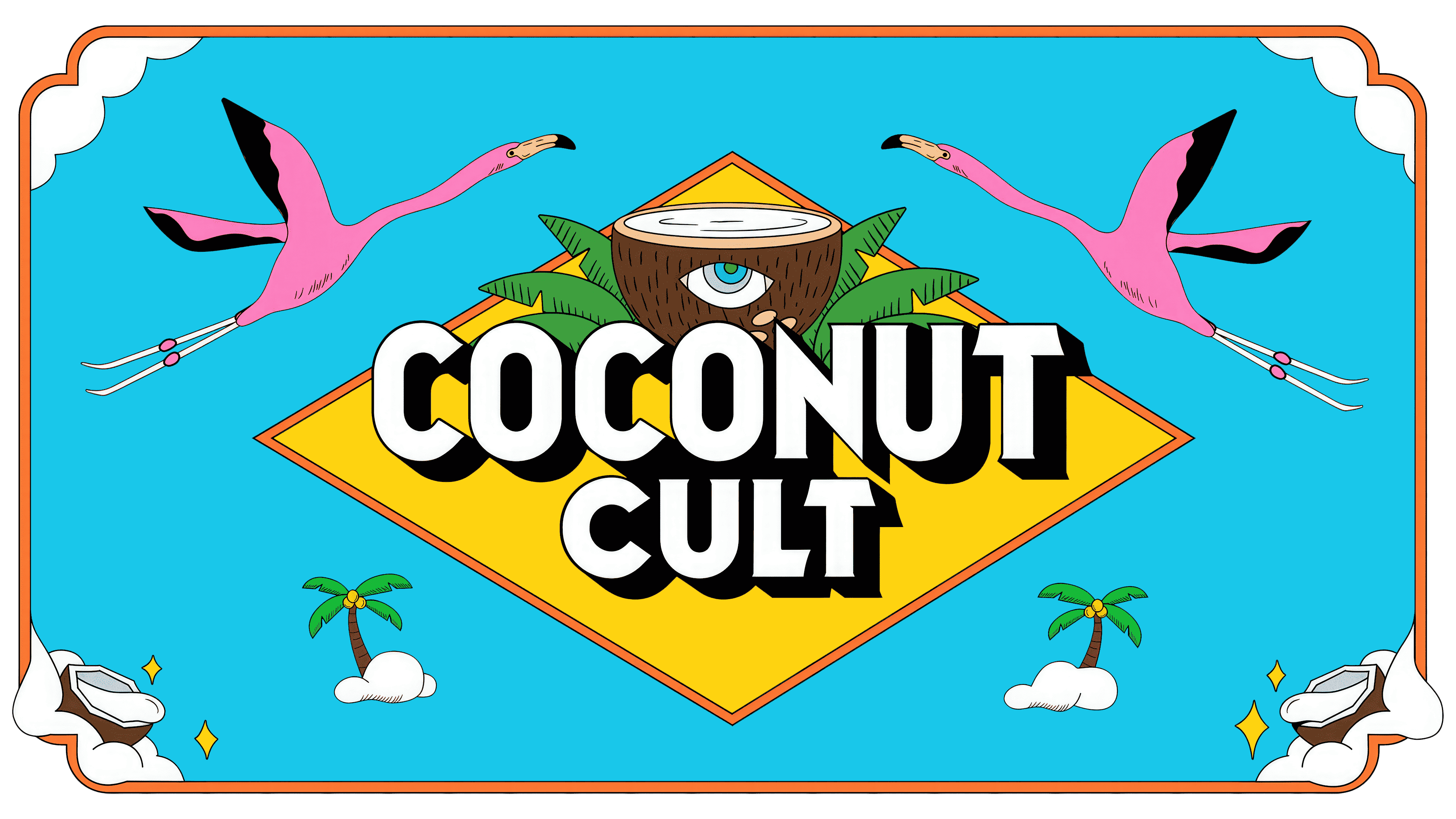
The letterforms have been softened, with smoother curves and rounded edges that lend the logo a friendlier, more contemporary feel. This shift aligns with the health-conscious, accessible image while retaining the signature playful vibe. The refined contours improve readability and create a deliberate and polished design.
A new framing system has been introduced to ensure the logo works seamlessly across the expanding product range. This system consistently anchors the wordmark, whether featured on 16-ounce jars, 8-ounce containers, or single-serve products. A subtle coconut motif integrated into the design serves as an additional visual cue, reinforcing brand identity and making it easily recognizable on store shelves.
![]()
The color palette remains bold and vibrant but with more balance. Where the original design relied heavily on strong contrasts, the updated palette uses cleaner lines and controlled color application, enhancing visibility without overwhelming the design. This thoughtful use of color makes the logo stand out while maintaining a polished, cohesive look.
The packaging has been redesigned to reflect the new identity. The updated labels showcase the refined logo, supported by clean layouts that still embrace the company’s signature whimsy. The bold wordmark stands out, helping The Coconut Cult maintain its distinctive presence in the competitive dairy-free yogurt market.
This new visual identity strengthens brand recognition and sets the stage for continued growth in the health food space, ensuring The Coconut Cult remains as bold and unique as ever.