Nortiva is entering a new chapter with a new name, bringing biopharmaceuticals closer to engineering. Before the rebrand, the company operated as Lyndra Therapeutics. Founded in 2015, it develops long-acting oral medications. Its work is based on the LYNX platform, designed to replace a weeklong pill regimen with a single dose.
Goal and Orchestra developed the identity. The update moves the brand away from a familiar biotech look and toward a more precise health tech presentation. The old Lyndra Therapeutics mark centered on a multicolored abstract symbol. Some viewers might have seen it as a molecule or a bird, a crystal or a scientific diagram.
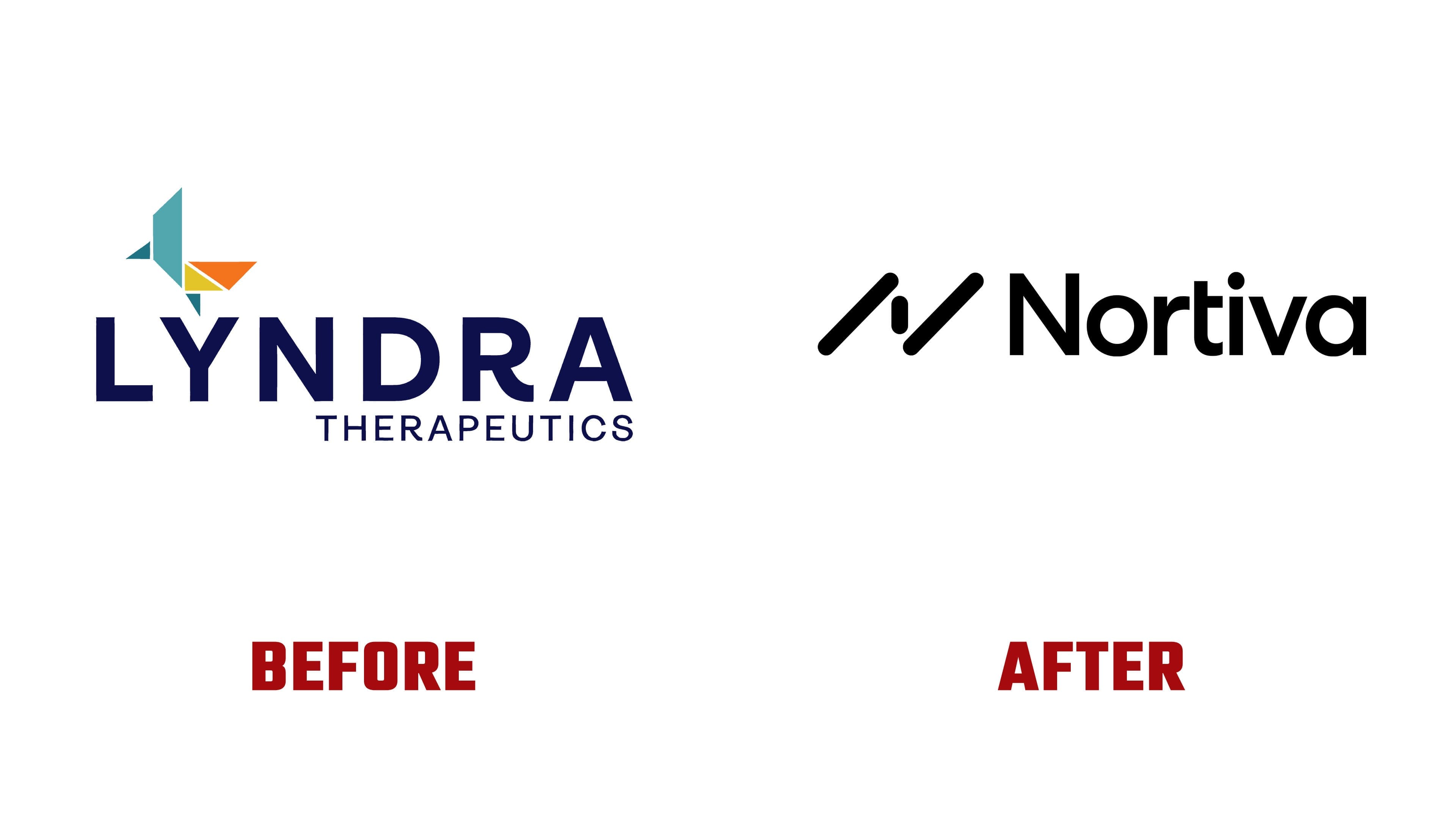
Nortiva’s logo has become stricter. The “N” monogram, which also serves as the symbol, is built from two diagonal parts. It resembles a connection, a route, or a component in a technological system. The form feels more like an engineering module than a medical illustration.
The wordmark looks softer. The name Nortiva is set in Aeonik, a sans-serif typeface. The enlarged “i” echoes the monogram’s rounded form and adds a warmer tone to the mark. The combination of the strict “N” symbol and the calm typeface makes the brand feel technological and open.

The name change shifts how the company is perceived. Lyndra Therapeutics sounded like a pharmaceutical structure built around a single drug. Nortiva feels broader. It presents a clinical biopharma company with an engineering platform for chronic disease therapy and long-lasting effects.
The visual system keeps a scientific tone while moving away from heavy medical sterility. In its new form, Nortiva looks more composed and mature. The older biotech metaphors have moved into the background.