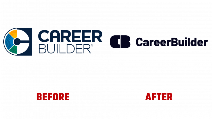
The Texas American company CareerBuilder has appeared before the public in an updated form. As a global leader in attracting talent, the platform has chosen a time for its change. The world most needs high-level specialists from a wide variety of professional specialties. She has redesigned the visual visibility of the image and ran a TV, radio, and digital campaign called Let’s Job It Up with the creative studio Decoded Advertising. The new visualization positions the company as a reliable assistant for those looking for work every day. An important feature of the platform is the availability of technologies and resources that help people find what they need most, what they need in employment or the selection of the necessary specialist.
Forming its image, the site seeks to reflect the urgent realities and aspirations in its advertising. Relying on a simple and bold appearance and an effective new strategy, the brand, after 25 years of its existence, has decided to place itself at the center of a broader cultural interview about work and human relations with job providers. Focusing on the dramatic realities of life situations, the brand actively uses the most difficult emotions, forcing them to continue looking for a new job.
The brand expressed its deep essence through the graphic elements that made up the logo composition. Black color and text monogram provide the required impression of the essence of the platform. The brevity and simplicity of visualization made the logo well remembered and readable in any advertising. The monogram of two bold letters – “C” and “B,” which are the first letters of the two words of the brand name, acts assertively and effectively. Despite its seeming awkwardness, it has a fairly powerful psychological impact on those who decide to use CareerBuilder’s services. However, there is a feeling of some incompleteness of the whole composition. Something is missing to complete the composition.
The full brand name font, such as Latinka Extra Bold by Jaroslav Zavodny, sans serif, has been slightly redesigned to give the text a clearer feel at any scale and digitally. The general impression of the new visualization is the desire to add something more effective and very serious, which could immediately indicate priorities and goals.


