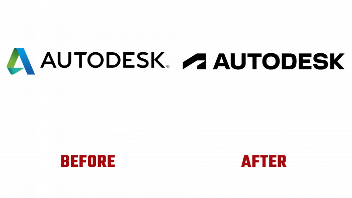
With the advent of a new digital age and business trends during a pandemic, the Autodesk brand has taken a course of renewal and created a new logo, corporate colors, typeface, web design guidelines, marketing materials.
Indeed, the company has made a bold decision to do identity on such a large scale. This is a completely new stage in the development of Autodesk, immersion in modernity and perspectives. The fact that the company is rethinking its strategy and the system as a whole is emphasized. This speaks to the maturation process of something more than just a brand. This is a whole philosophy.
Since 2013, Autodesk has used its logo, which now, although it might look advanced, still does not reflect the new thinking of the company’s team. The current logo symbolizes strength and ease of replacement. This current reflection of the brand’s credo is synonymous with action, determination, and responsibility.
Initially, the logo was a two-dimensional image of the letter A; notably, the colors had a gradient. The icon combined grassy blue and a more saturated blue hue, close to the sea wave. Earlier, the fashion for logos was different; there was a request for volumetric transitions, merging letters, ornateness to show the process.
As you can see, now this is a thing of the past; flat vector graphics are replacing the volume, which is easier to use in advertising and print. There is no need to worry about how the logo will look on different surfaces and media, no need to rack your brains over color. Nowadays, simplification is in vogue because any visual product must be quickly memorable, recognizable, and accessible to the target audience.
It is impossible to say why the new badge A, which is now a fresh icon for the brand, has such a design. One could say that “A” hid the line of movement, but this is not certain. In the letter’s space, one can see either a rise, or a step, or guidelines that break the internal structure of the stylized letter A. The font has become bolder than the previous one, more solid, and reliable.
If you think about modern visual culture and marketing, then the brand has done everything to become as effective as possible and minimally “gentle.” Therefore, the focus on stability and strength, announced as the pursued goals of rebranding justify this simplification of the identity.


