In 2021, a new platform, Bright, appeared as a video chat service for content makers who want to monetize their talents through live streams of video sessions. This kind of business is very common among young people.
The topic of blogs, live performances, lectures, stand-ups, and other entertainment and online educational events has gone viral in a sense. And this is not about the current conditions of the pandemic, due to which many people are forced to work remotely, relax and develop through a TV screen or smart device.
Video sessions like these are made available due to their wide reach, ease of organization, and the live audience. Therefore, the popularity of the genre will only grow in conditions of limited time and space.
Launched Bright in May 2021. What’s most amazing is the impact the service has had on fans of the music industry. The whole trick is that such seasoned music gurus as Rolling Stone, for example, began to appear on the platform. Immediately, the platform was “demolished” by a wave of devoted fans to the group, the stream began to fill more and more, which influenced the brand’s rating. A successful advertising move, thanks to the outstanding artists for this.
In general, Bright is the flagship in the entertainment industry. With massive and controlled technology, intelligent positioning, and a sense of the audience, they quickly became industry leaders.
The flamboyant brand turned to an equally modern and vibrant creative rebranding agency, Lobster Phone, based in San Francisco.
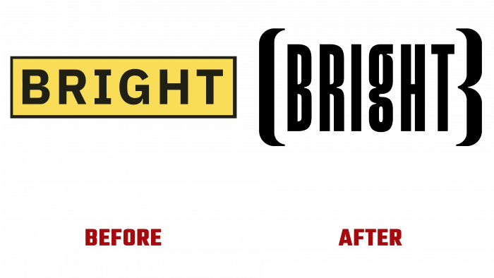
As a result, the work was done excellently. What was the logo up to this point? A yellow rectangle, surrounded by a black outline, with a normal typographic font inside. Depersonalized, boring, insipid.
With the light hand of the agency’s creators, the new framework for the brand is already ready. These are brackets, like claws, in which stylized black lettering is clamped in capital letters. It is so compressed that it seems as if the letters cannot be exhaled.
There is also a trademark icon. And everything is organic, black, and juicy.
It’s amazing how it turns out to make a simple logo with an utterly simple brand name so silent and bright at the same time… The logo wants to be examined, even to feel these claws of the brackets; they look so cool. Applause is awaiting platform users and the authors of the new design of the Bright platform.


