One Day has replaced its old mark with the oryx silhouette. R/GA created the new logo for the label and artist management team, as well as Never Sit Still. The identity is built around the feeling before a concert, when the lights come on, the audience waits for the artist to appear, and the name is about to show up on the screen.
The brand grew around Nick Lupi and Adit Gauchan. The company works in management, A&R, production, One Day Sundays concerts, and artist development. ONEFOUR, Chillinit, Spanian, tiffi, Triple One, J Emz, 18YOMAN, LEN20, Ethan Parodi, and other members of the Australian scene are connected with the company.
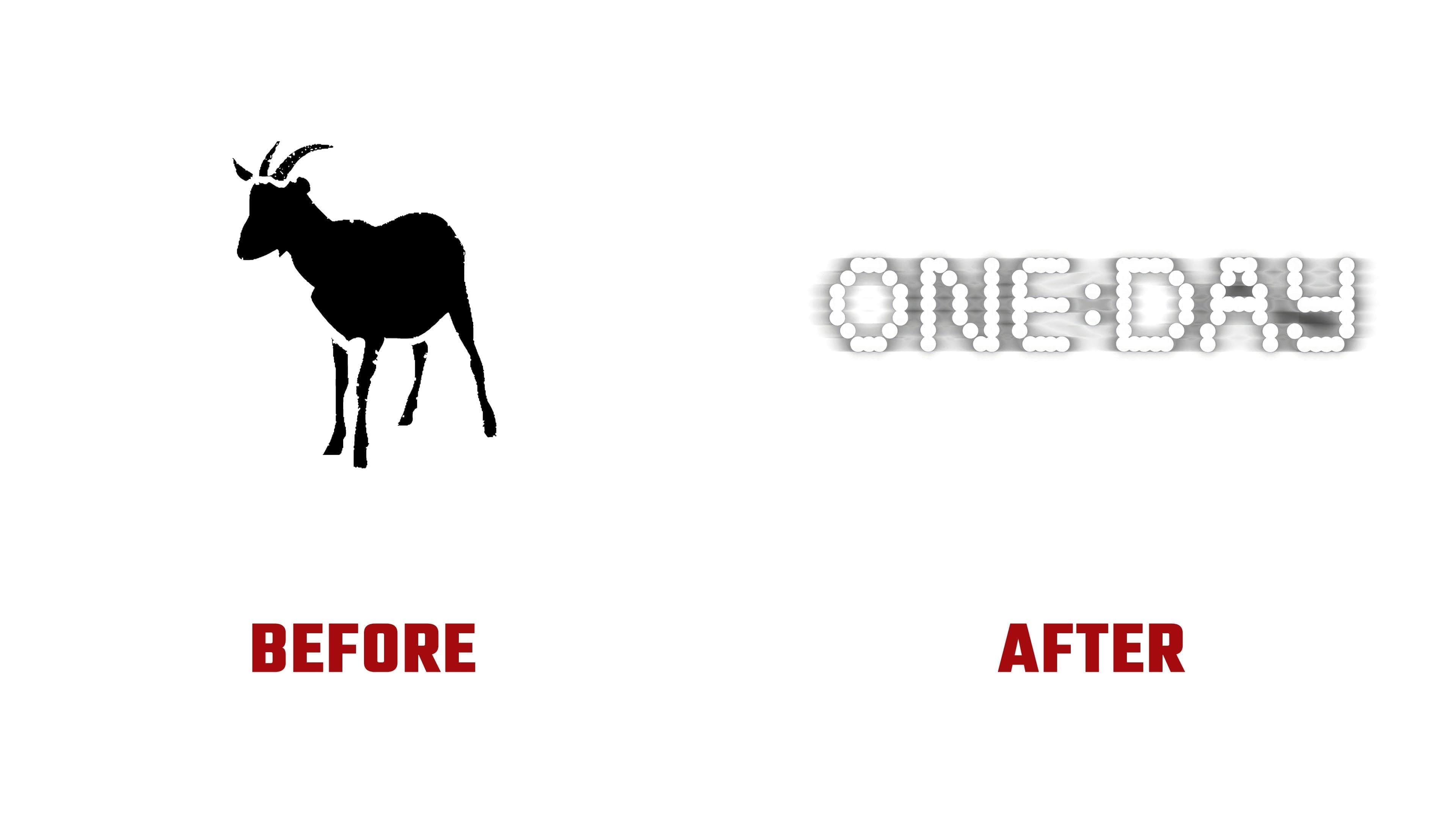
The previous logo featuring the black oryx created a mysterious, closed-off image. The unusual shape helped the mark stay memorable. At the same time, its connection to artists, concerts, releases, and a live audience remained weak.
The new mark is built differently. The name ONE: DAY is formed from glowing dots. They recall an LED screen, an electronic display, pixels, and phone lights in a venue. The colon in the name feels like a brief pause before an event. It creates a sense of countdown, anticipation, and the day an artist works toward through releases, performances, and constant effort.
In the updated identity, One Day has moved closer to the live music environment. The mark is tied to the stage, light, the crowd, and digital culture. In static form, it looks tough and urban; in motion, it flickers, powers on, and shifts between different states.
R/GA focused on One Day’s role in the local scene. Never Sit Still added a motion system evoking concert lighting, a packed crowd, and performance energy. ABC Bingo is used for headlines, while the overall style refers to video cameras, backstage footage, and live culture archives.
The main change brings the ONE:DAY name to the foreground. The logo now feels closer to artists, fans, and the music industry.