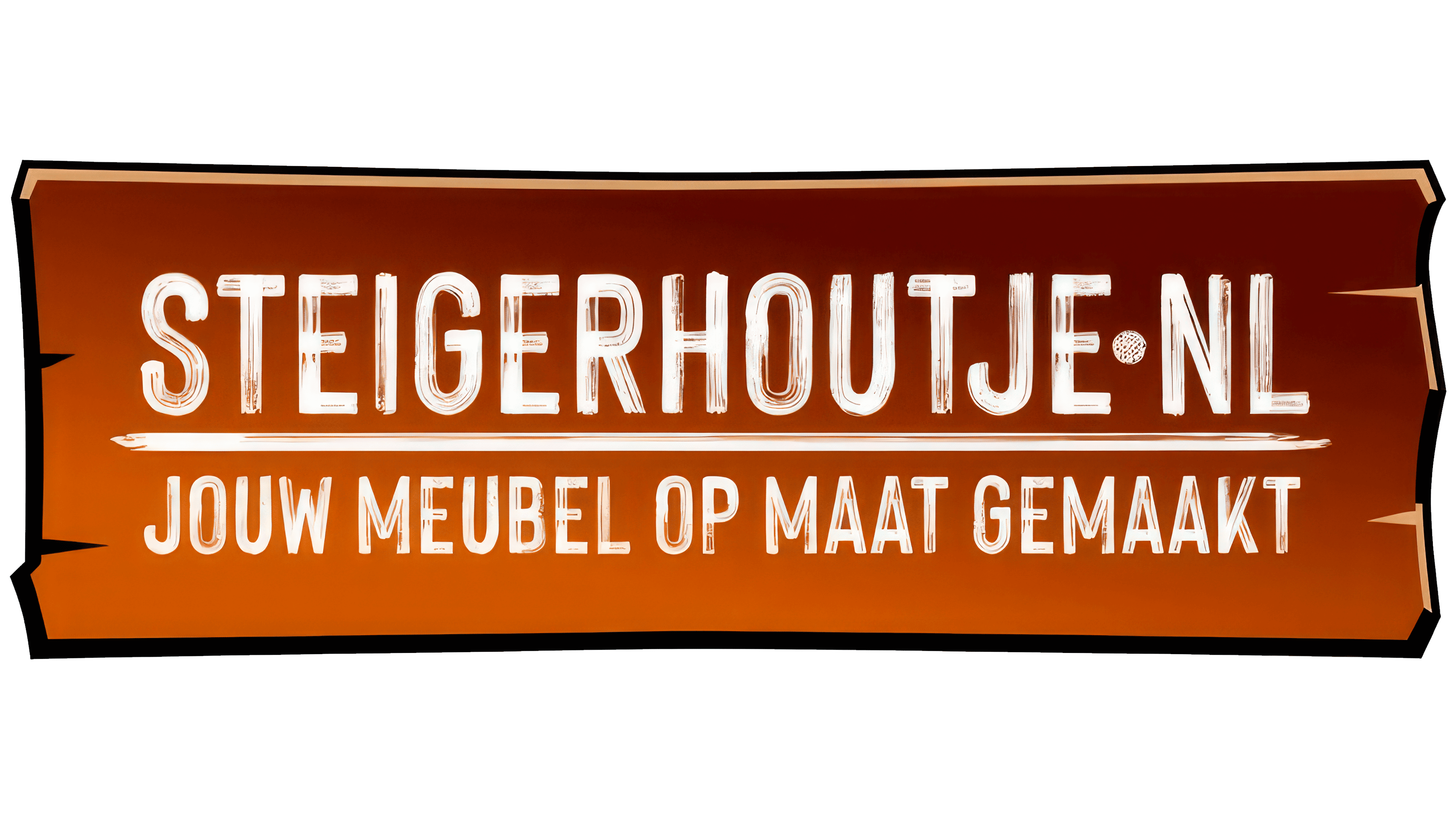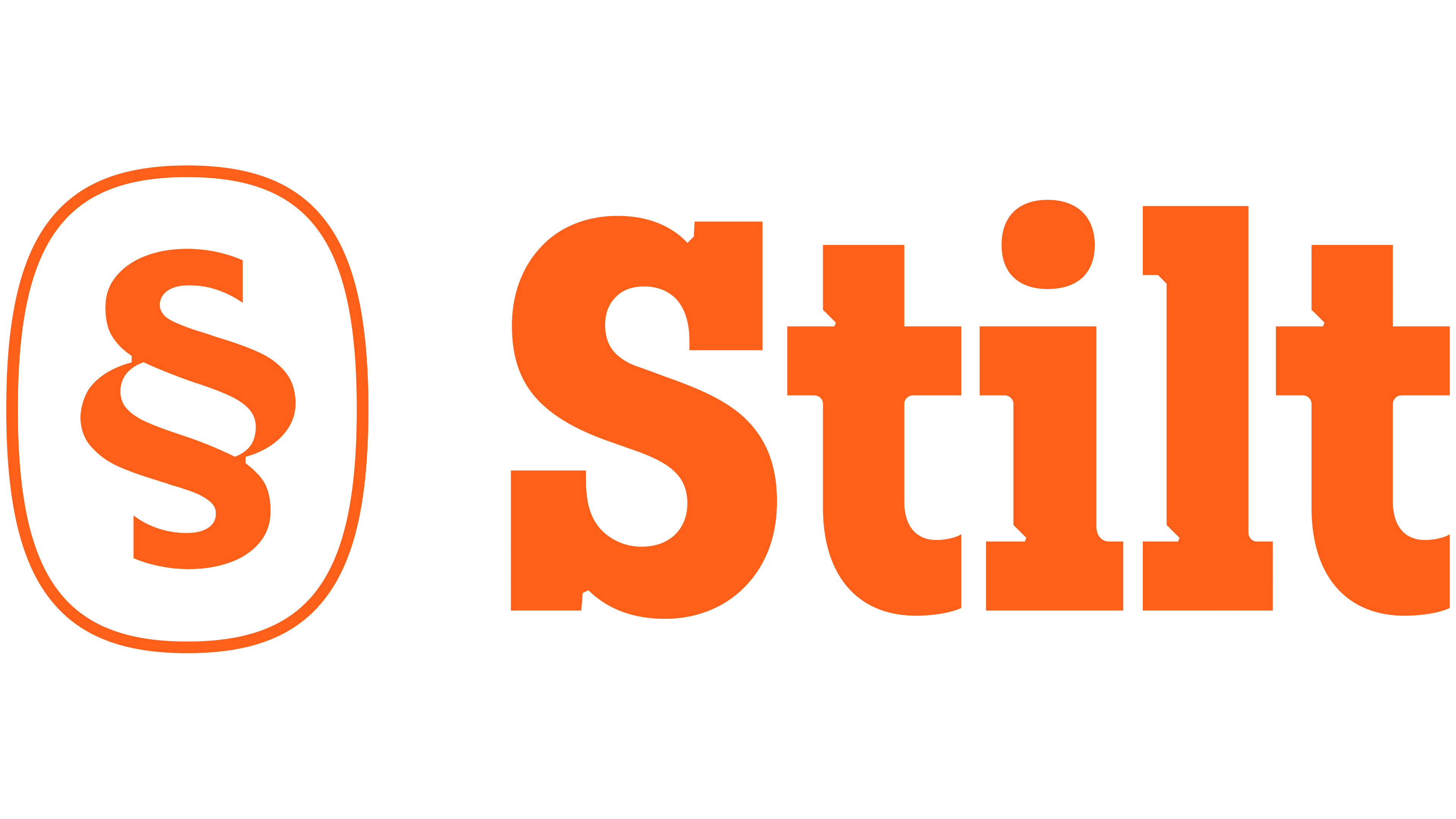
Stilt replaced Steigerhoutje.nl. The old name sounded like a local workshop, but the brand grew out of a small carpentry project. The company began with Stijn Voorhoeve’s interest in woodworking. Today, it produces DIY kits made from Douglas fir for furniture, outdoor kitchens, bars, benches, and pergolas.
Komma handled the rebrand. The identity moved the brand out of a craft niche and into a company with a showroom, online sales, and a 7,500 m² production site in Beek en Donk.
The previous mark centered on a board, wood texture, volume, and a long domain name. The explanatory tagline and the name created the image of a custom workshop. The new short name Stilt works differently. It works easily on facades, in digital environments, in catalogs, on packaging, and in business correspondence.
The logo is built from dense letters with large serifs. Inside the forms are cutouts resembling carpentry joints, tool marks, and precise part fitting. Sharp angles suggest solid construction, while softer lines preserve the connection to handwork.
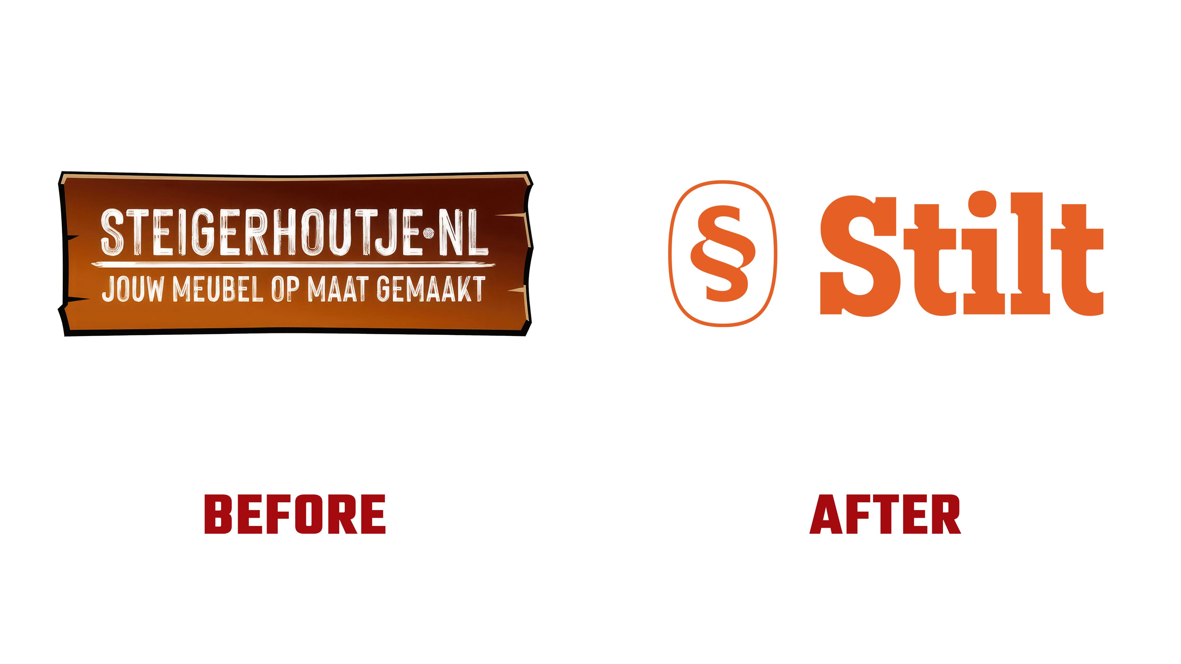
For shorter formats, we created a monogram “S” inside a rounded rectangle. It replaced the previous board illustration. The symbol became more universal, although it closely resembles the section sign.
The color system moved away from copying wood. It includes dark green, light green, warm white, and an orange accent. They connect the brand with the garden, the home, hands-on work, and outdoor living. Orange adds energy while keeping the tone calm.
Gamay and Elizeth Condensed are used for typography. The first typeface gives density and a working feel. The second makes the presentation warmer. Together, they support the idea of a solid structure with a warm craft appearance.
The new identity helps Stilt present its DIY kits as a well-developed system. Customers can configure a product to meet their needs using a 3D configurator or choose a ready-made option from the range.