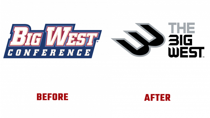
The Big West Conference Student Athletic Association announced a change to its logo on July 29. The new brand mark provides a more powerful impact on the audience represented by the current generation Z. This was made possible thanks to the company’s careful work carried out by the company’s marketing department, in-depth analysis of public opinion, and a professional design creative approach. As a result, the transformed corporate identity and logo became a demonstration of a renewed and progressive brand, which was based on the core values and principles characteristic of the association. It was especially important to focus on stability and reliability, the ability to withstand any changes that arise in the interuniversity athletics environment.
The key moment was the demonstration of the Big West Conference’s commitment to athletes – members of the student league, who are characterized by a competitive spirit, passion, desire to win, united under a common motto – Only The Bold.
The rebranding process includes completely redesigning the corporate identity with the obligatory restart of the drastically changed official website – BigWest.org. The resource has been reoriented to quickly make changes and introduce the most relevant information for the association’s fans, which should increase interest in it and the life of the Big West Conference and increase attendance. The interactive information platform has become more attractive in design. Updated graphics, the addition of important features, and many animations and videos in an intuitive interface should help to cover the events and stories of all members of the association, sporting success, training features, and daily life of athletes, coaches, and those preparing to complete their educational process.
Modern and unique in its original visual and technical solutions, the rebranding of the Big West Conference was made possible thanks to the participation in its implementation of almost all members of the association and a huge number of fans and fans. The new logo is a completely original font in which the “B” character is made with a custom. The abandonment of the sidestroke provided her with the appearance of a bird striving to accelerate its flight to the desired goal. A white or black background is used for various places of application of the logo, which implies a contrasting filling of the symbol and the combination “Big West” with black or white, respectively. The badge is made with a gray border highlighting it. The article “The” remains gray in all cases.


