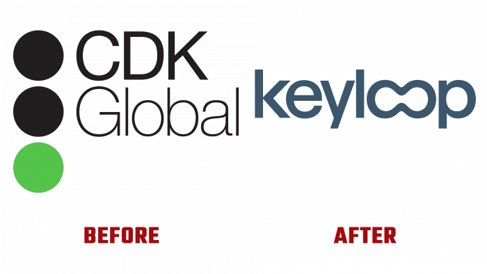
Following the completion of another acquisition of MotorDocs, which aims to become a single leader in the development and supply of software for the automotive retailer, the UK company Keyloop has announced a rebranding. The need to make changes to their visual identity has arisen due to the expansion of the specialization to cover the CDK by DMS. In response to the wishes of both sellers and buyers, the company started developing software that would allow maintaining all documentation related to the sale/purchase of a car in digital form, providing the ability to use digital signatures and store them in a common database of both parties involved in the transaction.
Keyloop (formerly CDK Global International), known worldwide for its automotive retail software, covers more than 16,000 retail centers and auto manufacturers in more than 90 countries around the world. In addition, given its coverage area of potential users, in Europe and the Middle East, Asia, and Africa, strict requirements were imposed on the new name. It should not contain any discrepancies that representatives of different cultures and nationalities could perceive in a negative and degrading way.
Among the difficulties faced by the company were: legal – the need to wait for three months for the possibility of challenging; lexical – the requirement of convenience and simplicity of pronunciation, ease of memorization by a multilingual contingent of consumers in 43 markets covered by the company custom – selection of domains according to their popularity in each of the zones of all sales markets.
The adopted name symbolizes many keys, which corresponds to both the car and the features of the software system being developed. The name itself consists of 2 syllables, which makes it easy to read with the simultaneous phonetic effect of “voiceless stop,” thanks to the use of the first letter “K,” which is also called “explosive” because of its pronunciation. This increases the level of memorization of the word. One of the important tasks performed by brilliant designer Zach Lieberman from New York was to reflect the company’s focus more as a developer of technological software tools than as one of the automotive industry. This was facilitated by the creation of a “loop” based on a double “oo.”
Lieberman applied an original solution with color shades, a kind of play of light, providing visual dynamism to the brand sign against a background in a gradient design. It highlights the text very effectively, enhancing its impact and perception.


