


Textile weaving formed the foundation of Alta’s new identity as a personal AI stylist. Seoul-based studio HuskyFox drew a parallel between the service’s work and the arrangement of threads in fabric, constructing the logo on a square grid. The project was developed in 2025 and unveiled in June 2026.
Alta puts together outfits from a digital wardrobe. Users upload photos of their clothes, and the service suggests combinations based on the weather, their lifestyle, and their budget. They can try outfits on a virtual avatar and plan what to wear for everyday activities and trips. Recommendations become more tailored as the service learns about their preferences. HuskyFox made this connection between clothing and data the basis of the identity.
The team called the idea “Weaving Your Data,” comparing units of digital information to threads woven into fabric. This parallel connected Alta’s technology to fashion. The weaving principle informed the letters’ construction, making the name part of the broader idea.
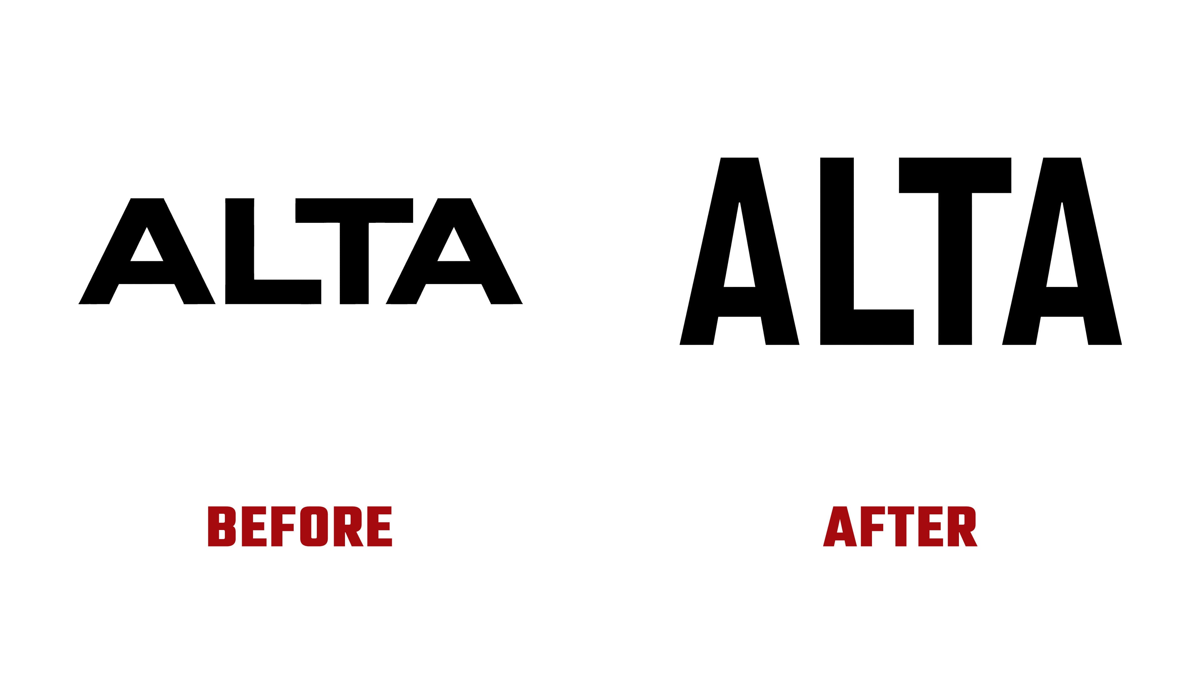
The previous ALTA logo used heavy uppercase sans-serif lettering. Its short letterforms and thick strokes gave the wordmark squat proportions. Both “A” letters had flat tops and small triangular counters. The “L” and “T” were rectangular. HuskyFox retained the four-letter name, black color, and angular terminals, while shifting the height-to-width balance.

The new letters are narrow and elongated. The triangular counters in the “A” letters are larger, with crossbars positioned closer to the baseline. Flat tops repeat at the word’s beginning and end. Long vertical strokes in the “L” and “T” reinforce the wordmark’s tall proportions. The logo retains its bold weight and flat stroke endings, with a shape that brings it closer to clothing labels and fashion publication headlines.
The letters were constructed on a grid of 1 × 1 square cells drawn from weaving diagrams. The grid determines stroke placement and negative space. In the finished wordmark, the modules form complete letters, while animation reveals how they are built. The name appears and dissolves through a data-weaving effect that extends the project’s textile theme.
Black and white remain the primary colors. The wordmark appears in black on light backgrounds and in white on dark backgrounds. In the app, the name sits inside a black square with rounded corners. The monochrome logo appears alongside color photographs of clothing, distinguishing the service’s identity from its suggested outfits.
Across other materials, the square grid becomes patterns with stepped edges and gaps. Sections meet at their corners and spread outward from the center, recalling woven motifs and pixel art. These patterns frame photographs, while the oversized wordmark sometimes partially overlaps a model, echoing a familiar magazine cover treatment.
Doohee Lee handled creative direction and project management. Heewon Kim served as lead designer, working with Jaeyoung Huh, Jihun Jang, Iseo Park, and Seyoung Kim. Taehee Lee developed the brand platform. The client was Flagship AI, Inc.