



Finom’s rebrand focuses on entrepreneurs and their everyday accomplishments. The financial platform unveiled its new look on September 23, 2025. Dubai-based agency Border Zero and Finom’s internal team replaced the uppercase name with lowercase lettering and built the identity around directional light.
Founded in 2019 and based in Amsterdam, Finom combines business accounts, payments, invoicing, and accounting tools for entrepreneurs and small businesses. By the time of the rebrand, over 200,000 accounts had been opened. The company had secured substantial investment and launched new products. As the business grew, the team reconsidered an identity that had focused on the service’s features. Developing the update and refining the company’s mission took almost a year.
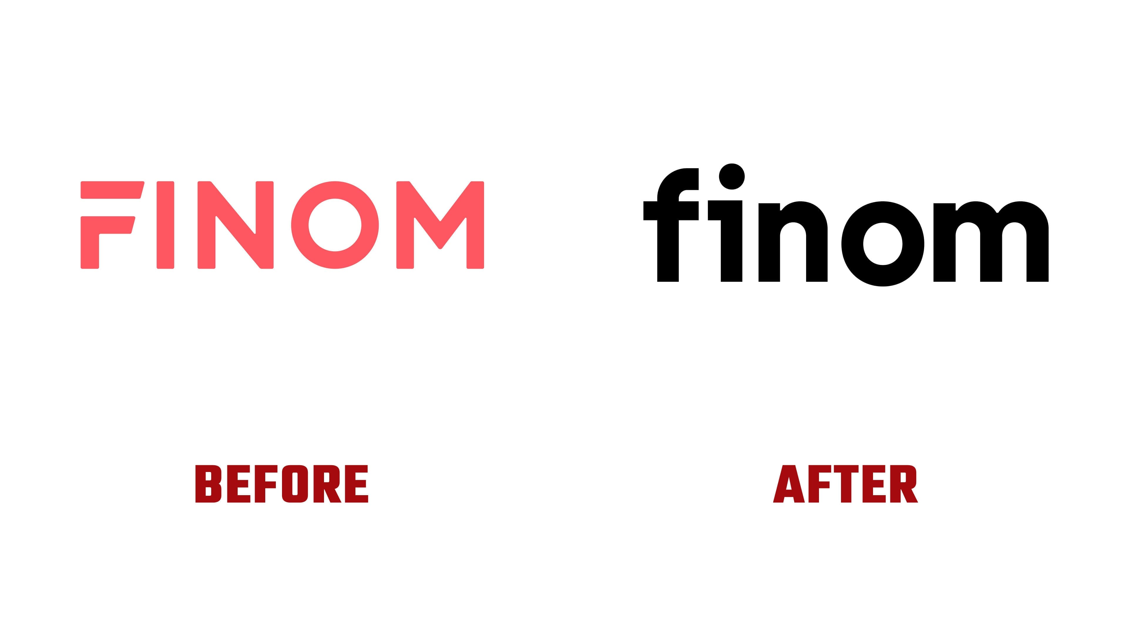
The new finom logo features heavy strokes and rounded forms. The top of the “f” curves into an arch, and a circular dot sits above the “i.” The shoulders of the “n” and “m” transition smoothly, while the round “o” reinforces the wordmark’s geometric construction. Tight letter spacing creates a compact horizontal block. The designers describe the shift to lowercase as part of an effort to make customer communications feel more human.
The previous logo spelled FINOM in coral-red capitals. The strokes were similar in thickness, with slightly softened corners. A gap separated the upper bar of the “F” from its stem, and the horizontal strokes ended in angled cuts on the right. The update changes the case, proportions, and color. The primary wordmark is now black, with a white version for dark backgrounds.

For the app icon, the designers used the first two letters of the name. A short horizontal projection extends from the left side of the “i” at the height of the crossbar of the “f.” It visually connects the letters while preserving a gap between them. The “fi” combination replaces the previous emphasis on a standalone “F.” In the presentation, the shortened logo appears in white against bright pink and with a glow against a dark background.
The lighting theme illustrates the platform’s role in its customers’ work. A spotlight illuminates the entrepreneur’s achievements while Finom handles routine financial tasks. A pool of light accompanies both the full name and the “fi” monogram, connecting the various materials. The designers associate pink with energy and vitality. Black backgrounds intensify the glow, while white is used for lettering.

At Border Zero, Lidia Kapysh led design, Elena Kostyrina served as art director, and Lera Gennadyeva managed the project. The design team included Ivan Belov, Roman Galeev, and Maria Mokina. Finom’s participants were Brand Director Roman Bukh, Head of Marketing Design Maxim Berg, and Head of Design Dinar Galimov.
The update extends across the website, app, advertising, social media, and payment cards. On Visa Business cards, the white logo sits in the upper-left corner beside an angled pink shape with a striped texture. The team received brand guidelines and templates for future work. Border Zero added the project to its portfolio on March 19, 2026, several months after the launch.