


![]()
The Home Inspector, a company specializing in residential property inspections, has revealed a new logo and visual identity created by the agency Forma. The rebranding reflects the company’s focus on accuracy, dependability, and thoroughness—qualities that matter when evaluating homes before a purchase or sale. The new design aims to highlight these values through a clean, simple approach that feels clear and professional.
At the center of the updated identity is a symbol representing a house made from three basic geometric shapes: a black triangle, a black rectangle, and a white triangle. Together, they form a stylized house with an “open corner,” subtly hinting at revealing what’s beneath the surface. The white triangle at the bottom left looks like a lifted corner, symbolizing the company’s dedication to uncovering hidden issues—whether structural problems, unnoticed flaws, or other critical details in property assessments.
Next to the symbol is the company’s name, “The Home Inspector,” set in a clean, sans-serif typeface. The font choice feels modern and professional, with sharp, precise lines that reflect the detailed nature of home inspections. Lowercase letters with balanced spacing add a friendly yet confident tone. The style complements the crisp lines of the logo, reinforcing the image of a reliable, detail-oriented service.
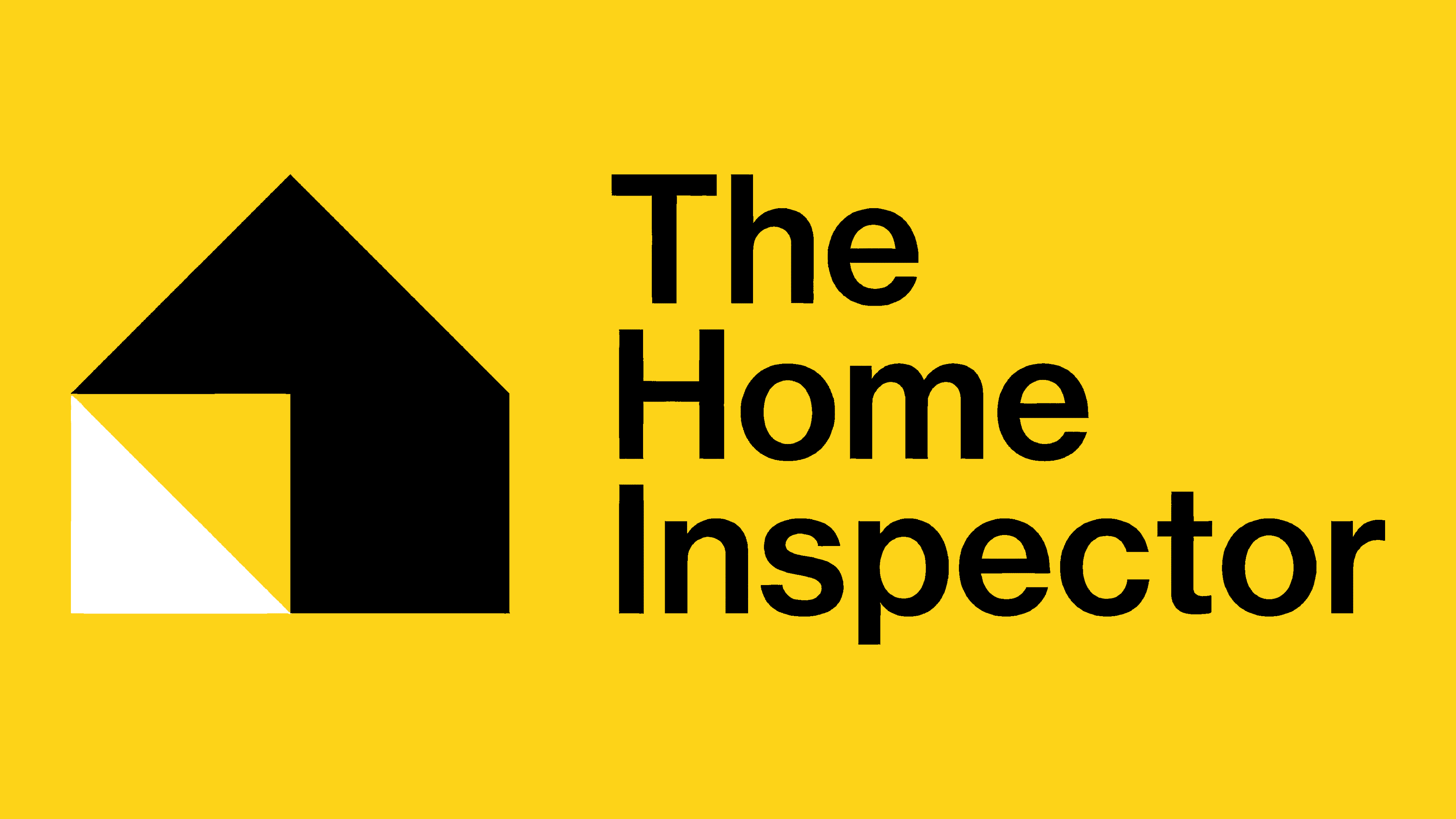
The bold black conveys strength, trust, and seriousness, matching the company’s role as a dependable advisor in real estate decisions. Bright yellow adds an energetic touch, often linked to caution and awareness—fitting for a business that focuses on identifying potential risks in homes. White helps balance the design, creating clarity and contrast that sharpens things.
The black, yellow, and white mix does more than just catch the eye. Yellow signals attentiveness and proactive thinking, while black anchors the design with a sense of authority. The white triangle adds a feeling of openness and honesty—reflecting the company’s commitment to clear, straightforward evaluations.
The simplicity of the geometric design makes the logo adaptable across different uses, from websites and reports to business cards and inspection tools. Its bold shapes and strong color contrast make it clear and recognizable, even when scaled down.

Forma developed a fully visual system with supporting graphics, typography, and color applications to create a unified brand look. The design language feels straightforward yet polished, emphasizing clarity and meticulous attention to detail—qualities that mirror the company’s inspection process.
Overall, the new identity for The Home Inspector turns the company’s mission into a strong visual statement. The simple house icon, smart use of negative space, and bold color contrast convey a sense of precision, trust, and expertise. By focusing on clean design and meaningful details, Forma has created an identity that stands out in the competitive real estate market and reinforces The Home Inspector’s role as a trusted guide when people make one of life’s biggest decisions—buying or selling a home.