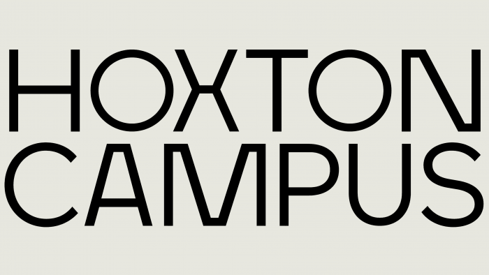
Anagram Design Studio took part in developing and implementing the new visual identity for the Hoxton Campus. It was built in 2021 in the heart of London and represented a cluster of 4 buildings located in Tech City on Hoxton Square, a high-tech area of East London. The campus is equipped with the most necessary high-tech equipment, built according to an original modern project; the campus has maximum comfort for efficiently running any business—areas of 1105 sq. ft to 31,719 sq. feet. The campus is owned by two companies – Aviva Investors and PSP Investments. Given the somewhat disunity of the location of the buildings – 3 on Hoxton Square and one on Old Street, the style of the campus that was being created was supposed to reflect their unity and community without fail.
Aviva previously occupied these buildings. Having put them up for rent, the company decided to present all four objects as a single system of commercial space. Under the quarantine conditions, interest in office premises has significantly decreased. Now there is a need to create an identity that would draw more attention to the features of this offer, its advantages, and opening opportunities, comfort, and convenient location. The changes directly affected the strategy of presenting the information.
The decision was to create a warm and welcoming brand with flexibility through graphics, logo typography, images, and live broadcast. Thanks to this approach, a new form of demonstration allows you to generate interest in small and large businesses, meeting their urgent needs. Expressive typography and the fluidity of forms create an emphasis on attracting tenants to the created aesthetics and furnishing of premises, their readiness for direct use without the need for modifications. This is presented with the help of fun, dynamic characters whose shape is based on one of the many spatial forms found in these buildings. Each character stands out with a single color characteristic only for him. The palette is quite diverse – from the original colors of the buildings themselves – brown, red, to shades that can be called a symbolic designation of the characteristics of potential tenants – shades of yellow or blues.
For the brand name font, a slightly modified version of Maax Regular from 205TF was used. The letter “O” was replaced by circles of an ideal shape, which were used as the dynamic eyes of the drawn characters. This sign has become a symbol that has found application in every group that forms a visual identity. The original solution – the visual formation of the letters “A” and “N” as non-traditional squares, which was prompted by the forms “X” and “N” from Maax connected the text with the very essence and objectives of the brand – the forms of schematic elements of the plan of each object.


