


![]()
Martistel, a Dubai-based intralogistics company, has unveiled a new logo and brand identity designed in collaboration with Shuka. This update reflects the company’s innovative approach and commitment to advancing technology and delivering reliable solutions for warehouse operations.
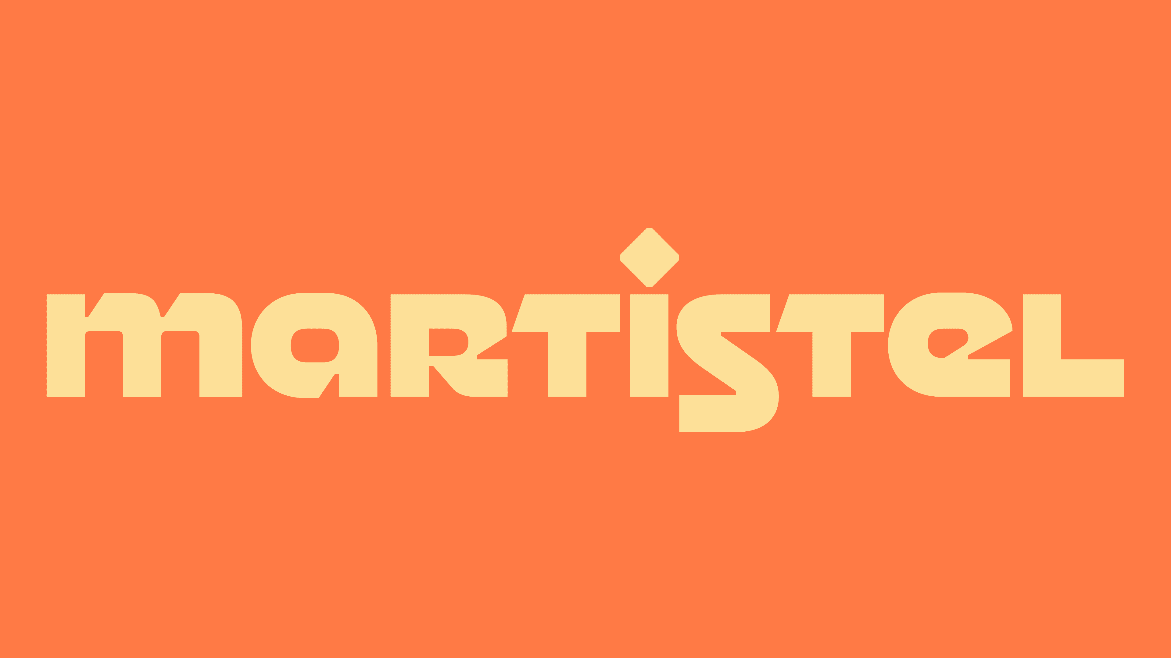
The new logo features a geometric, modern typeface with smooth, rounded edges that convey precision and approachability. Distinctive letterforms, including the stylized “r” and “s,” give the logo a unique and memorable look, helping the brand stand out in a competitive market. These design elements highlight the focus on offering forward-thinking, modern solutions.

A bold orange dominates the logo’s color palette, symbolizing energy, creativity, and forward momentum. The vibrant tone ensures the design grabs attention across various applications while limiting the palette to a single color, which enhances its clean, minimalist style. This streamlined approach reflects the dedication to delivering straightforward, effective solutions for complex intralogistics challenges.
One standout feature of the logo is the diamond-shaped accent above the letter “i,” which draws attention to precision and connectivity—qualities central to the company’s mission. The balanced alignment of the letters reinforces a sense of stability and harmony, making the logo versatile for both digital and physical uses.
The updated branding emphasizes reliability and excellence. Geometric elements and bold colors communicate progress and modernity, aligning with a focus on technological advancements. The minimalist design ensures clarity and consistency whether the logo appears on digital platforms, packaging, or promotional materials.
The new identity is more dynamic and contemporary than the previous branding. The updated logo reflects the energy and purpose driving the organization, emphasizing its position as a leader in the intralogistics industry. The clean, focused design better represents an innovative mindset and positions the company strongly in the competitive market.
This rebranding represents an important milestone, showcasing a vision for the future while reaffirming a commitment to quality and innovation. The refreshed logo helps strengthen the connection with its audience and solidifies its reputation as a dependable, cutting-edge partner in intralogistics.