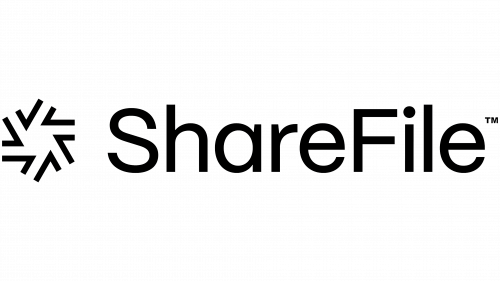
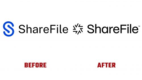
ShareFile, an industry leader in secure content collaboration, file sharing, and synchronization, has unveiled a new logo as part of a strategic brand identity overhaul. This redesigned ShareFile logo represents a significant shift, symbolizing the company’s dedication to offering innovative document-centric solutions for businesses of various sizes.
The previous logo featured a monogram, ‘S,’ that hinted at workflow and collaboration. However, it fell short of truly capturing the dynamism and innovative spirit of ShareFile’s services. The new logo addresses this gap, showcasing a compelling icon that immediately grabs attention with its distinctive texture and rhythm. Upon closer examination, the icon cleverly incorporates checkmarks, a thoughtful symbolization of efficiency and task completion, which are fundamental to ShareFile’s offerings.
The use of checkmarks in the design is conceptually robust, reflecting productivity and accomplishment, themes central to modern workplace environments. Accompanying the new icon is a wordmark set in PP Mori font. The font choice is visually appealing, though the proportion between the wordmark and icon may need refinement to achieve a more harmonious balance.
The rebranding is further enriched by 3D illustrations and animations created by CATK. These elements breathe life into the checkmark motif, presenting it in appealing gradients and engaging textures. These illustrations enhance the ShareFile logo and create a visual link to Citrix, its parent company, ensuring brand consistency across the family.
In contrast, the spot illustrations included in the branding, while endearing in their simplicity, appear somewhat less polished compared to CATK’s intricate 3D work. They lack the same level of detail and finish, creating a slight mismatch in the brand’s overall visual story.
The application of PP Mori across various platforms adheres to a minimalist design ethos. While this aligns with the brand’s contemporary and uncluttered aesthetic, it risks appearing overly simplistic, particularly when juxtaposed with the more elaborate 3D illustrations.
In summary, the new ShareFile logo and brand identity mark a calculated move towards refreshing the brand’s image. The innovative use of the checkmark motif and the dynamic 3D illustrations inject a fresh and lively perspective.


