



The international Eurovision Song Contest has unveiled a renewed visual identity created by the studio Pals. The changes are timed to the 70th anniversary of the project, which was first held in 1956 and has since become one of the world’s largest music events.
The previous Eurovision logo had been in use for about ten years. Its key element was a heart embedded in the word Eurovision. The mark became recognizable, but professionals criticized it for being overly romantic and for awkward proportions that made the composition appear overloaded.
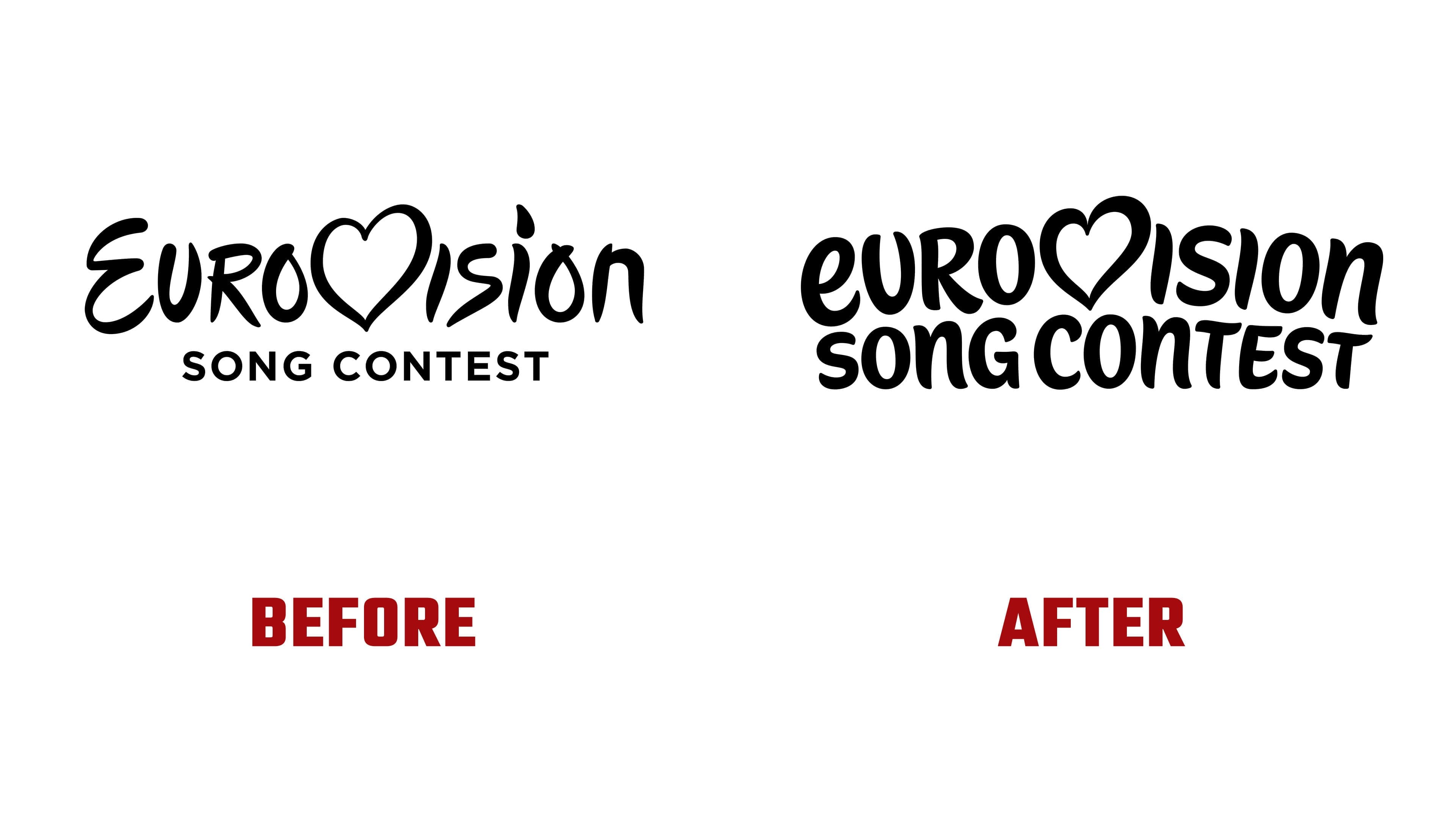
The designers at Pals kept the heart symbol but reworked its shape and integration into the letter “V.” Instead of the former handwritten style, they opted for a solid, dynamic typeface. The letters are placed closer together, creating a sense of rhythm reminiscent of a concert performance. The new style seeks to convey the energy of the stage and the audience, where music is perceived as a common language.
The main focus became the “chameleon heart” graphic. It is built from seventy layers, corresponding to the number of contests held. Each layer can be adapted based on the host country, the show’s theme, or the performers. The symbol supports cultural diversity and allows the design to be changed annually while maintaining visual continuity.

A custom typeface, Singing Sans, was created for the project. It features rounded shapes and smooth transitions and is well-suited for large-scale use, from stage design and print materials to digital interfaces. The font was designed as a universal tool, enabling organizers to easily adapt the visual style across various environments.
The new logo received mixed reviews. Some experts praised its energy, while others noted the difficulty in perceiving certain letters due to their unusual proportions. Nevertheless, the unconventional features make the identity more lively and help maintain public interest.

The renewed visual language of Eurovision emphasizes the scale of the celebration and Europe’s cultural diversity. It demonstrates the contest’s ambition to remain contemporary, evolve with its audience, and preserve the symbols that have become integral to its history.