The Eurovision logo is inspiring and friendly. The emblem points to unity and the formation of strong connections between countries. It highlights the desire and ability to admire the creative talents and performance styles characteristic of different countries around the world.
Eurovision: Brand overview
In the vibrant year of 1956, Marcel Bezençon of the European Broadcasting Union (EBU) conceived a dazzling idea: a musical extravaganza to unite Europe. Drawing inspiration from Italy’s Sanremo Music Festival, he envisioned a competition where countries would unite through song magic.
On May 24, 1956, this vision materialized in Lugano, Switzerland, where seven nations – Belgium, France, Germany, Italy, Luxembourg, the Netherlands, and Switzerland – showcased two songs. The evening ended with Switzerland’s Lys Assia capturing hearts and the top prize with “Refrain.”
A year later, the format was refined to allow only one song per country, and participation swelled to ten nations. The Netherlands’ Corry Brokken triumphed with “Net als toen,” setting the stage for the contest’s growing allure.
The 1960s saw the competition’s popularity soar, with more countries joining the fold and the groundbreaking 1967 broadcast in color, adding a new dimension to the spectacle.
The 1970s brought unforgettable moments, notably ABBA’s legendary “Waterloo” victory in 1974 and Brotherhood of Man’s charming “Save Your Kisses for Me” in 1976. 1975, a familiar scoring system was introduced, awarding points from 1 to 12 in an iconic format.
The 1980s heralded further expansion and the adoption of the jury voting system in 1985. The geopolitical shifts of the late 1980s and early 1990s, particularly the fall of the Iron Curtain, infused the competition with fresh cultural influences as Eastern European countries joined the contest.
In 1990, Italy’s Toto Cutugno celebrated European unity with “Insieme: 1992.” A pivotal change in 1998 allowed performances in any language, leading to a predominance of English songs and broadening the contest’s accessibility.
As participation grew, a semi-final round debuted in 2004, expanding to two semi-finals by 2008, ensuring a broader representation in the grand finale.
2009 introduced a dual voting system, combining jury and public votes to balance expert critique and popular opinion.
Australia’s inclusion in 2015, commemorating the competition’s 60th anniversary, underscored its global reach. Since then, Australia has become a cherished participant.
The competition has toured 26 cities, with Dublin hosting the event seven times. This grand musical arena has launched the careers of global stars like ABBA, Céline Dion, Julio Iglesias, and Olivia Newton-John.
The competition has blossomed into a cultural phenomenon, celebrated for embracing diversity, musical innovation, and its unique ability to unite nations through the joy of music.
Meaning and History
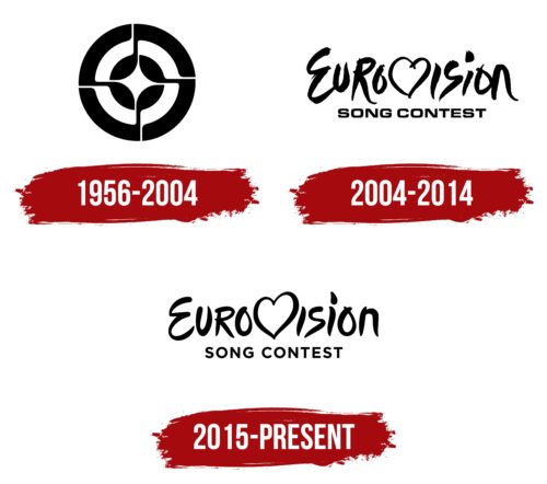
1956 – 2004
The first emblem of the contest features a circle with an image of four musical notes. In the black-and-white version, the figure transforms into a four-pointed star, symbolizing popularity and success for the winner. Concentric circles around the image resemble a dartboard target, evoking associations with victory and hitting the mark.
The emblem had a color version: red, white, and blue. In this version, the four notes dancing in a circle were visible, highlighting the songs’ lyrical nature and the contest’s musical focus. These notes, arranged in a circle, symbolized unity and harmony, key elements of the music festival.
2004 – 2014
JM International created the casual inscription with the letter V turned into a heart in the center to standardize the contest’s logo. This design draws attention to the center, where each host country can display its national flag and place the contest’s mascot. The flag in the heart-shaped symbol expresses gratitude to the host country for its hospitality and for welcoming the contest’s participants and audience.
The design represents energy and dynamism, emphasizing renewal and other important European creative growth and development aspects. It conveys the festive and inspirational atmosphere of the contest, bringing together people from different countries and cultures.
2015 – today
Maintaining the overall concept, the logo’s font has been changed to be softer and more pleasant to the eye. Storytegic designers carried out This transformation for the 10th anniversary of the unified logo. Smooth curves and equal spacing between symbols emphasize the pursuit of a harmonious artist who keeps pace with the times. Such a performer can touch the hearts of audiences in different countries and be a symbol of European music in the coming year.

