The logo is a little awkward but very lively and moving. The emblem conveys the singer’s character; her love of life and youth indicates an unusual, slightly masculine style in clothes and songs in the modern pop genre.
Billie Eilish: Brand overview
Meaning and History
Billie Eilish grew up in a creative atmosphere. Her parents encouraged children to express themselves and explore their interests. Among the primary interests were art, music, dance, and acting. The singer’s mother is a teacher, actress, and screenwriter; her father is a construction worker with experience filming feature films. Moreover, they are both amateur musicians.
The girl lived in the Highland Park area. Her mother taught Eilish and her brother the basics of songwriting. Therefore, it is unsurprising that Patrick O’Connell, who is four years older than his sister, already wrote, produced his works, and sang them with his group at the beginning of his performing career. The singer’s first real song was a composition about a zombie inspired by the TV series The Walking Dead. She composed it at the age of 11.
blohsh logo
The girl tried to break into an actress, having attended several auditions. But she didn’t like them – Eilish liked recording the background dialogs for the extra scenes. She worked on several famous films in this direction, including the X-Men series. While trying to break onto the stage, Billie Eilish participated in talent shows and joined the Los Angeles Children’s Chorus when she was eight.
Glory to the singer came later—in 2015, along with her debut song Ocean Eyes. To avoid getting lost and becoming recognizable, she used individual logos. They also served as covers for music albums. In total, there are four personal signs in her career.
What is Billie Eilish?
Billie Eilish is a model and popular American singer, the first person born in the 21st century to top the Hot 100 music rating. She is also the recipient of all four major Grammy awards (in 2020).
2016 – today
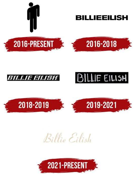
The performer has one graphic emblem. Each time a new album comes out, an inscription in a different style is added. The icon is called Blohsh and is a skewed human figurine. His head is tilted, his left shoulder is lowered, and his right leg is raised walking. One gets the impression that a person is walking, clearly stepping forward. The figure consists of a circle for the head, elongated cones for the arms and legs, and a vertical rectangle for the torso.
As a sign of rebellious spirit and increased energy, the singer’s logo is painted in acid green. But it comes in other colors and is played in different ways. There are several versions: a green man on black and, accordingly, black on green. There is a figure with tightly clasped hands and a black line circled along the edge. There are options with a stereo effect, on fire, in a tiled form, in a light gray frame. A white person is used against a dark background and a figure of a muted green shade.
2016 – 2018
This emblem first appeared in Don’t Smile at Me (EP). She was also on the singer’s official website. The inscription looks like an impregnable fortress wall in which there is not a single passage. This impression is created by combining the name and surname of the performer. “BILLIE EILISH” is in uppercase printable characters. The letters are bold, smooth, and even.
2018 – 2019
2018, the words were split, and a slight slope to the right appeared in the inscription. The letters are now three-dimensional, white and black, with shadows on the bottom and right side. A long horizontal rectangle painted black plays the background.
2019 – 2021
The third emblem was used more recently – for the debut album When We All Fall Asleep, Where Do We Go? He is also presented on the singer’s web resource. The lettering is in a personalized handwritten font, not an official typeface. Therefore, each letter is unique: they have different widths and heights. Moreover, the first word is larger than the second, and the letters decrease towards the end. The dirty lilac color softened the contrast between the text and the black background. The name and surname of the performer are written separately.
Billie Eilish chose a permanent icon that transitions from logo to logo without any changes. This is a schematic figure of a man with one bent shoulder. The style of the text part changes from business to informal.
2021 – today
Billie Eilish dramatically changed her image for her last album, released in 2021: she became a gentle blonde with sadness in her eyes. This is the image presented on the release of Happier Than Ever. A soft aura is created on the cover of the golden vinyl edition – a warm light for the magic of a defenseless girl from the ’70s lost in the new century and new relationships. The neat calligraphic lettering, which acts as a personal logo, perfectly fits this style. A vintage design of rounded lines with smooth transitions is chosen for it. But each letter stands alone as a personification of loneliness.
Billie Eilish: Interesting Facts
Billie Eilish has made a huge splash in the music world with her unique sound and style.
- Musical Roots: Born into a creative family, Eilish started writing and composing her music by 11, thanks to being homeschooled and having the freedom to explore her musical passions.
- Rise to Fame: She burst onto the scene at 14 with “Ocean Eyes,” a song uploaded to SoundCloud in 2015 that quickly went viral. Originally intended for her brother Finneas’s band, she signed with Interscope Records.
- Debut Album: In 2019, her first album, “When We All Fall Asleep, Where Do We Go?” hit number one on the Billboard 200, making her the first 2000s-born artist to achieve this in the U.S.
- Grammy Awards: At 18, Eilish won five Grammys in 2020, including the major categories of Best New Artist, Album of the Year, and Record of the Year, setting a record as the youngest to do so.
- Bond Theme: She made history as the youngest artist to write and perform a James Bond theme song with “No Time To Die.”
- Mental Health Advocacy: Open about her struggles with depression and Tourette syndrome, Eilish uses her platform to advocate for mental health awareness.
- Sustainable Fashion: Eilish is known for her distinctive, oversized fashion and promotes sustainable fashion practices, even launching a sustainable clothing line with H&M.
- Veganism: A vegan since 12, she speaks out on animal rights and the environmental impact of veganism.
- Social Media: With a vast following, Eilish addresses issues like climate change, body positivity, and political involvement on her platforms.
- Into Film: She’s also ventured into film with the Apple TV+ documentary “Billie Eilish: The World’s A Little Blurry,” offering an intimate look at her life and career.
Billie Eilish stands out not just for her musical talent but also for her approach to fashion and activism and for using her voice for important causes, marking her as a trailblazer in the music industry.
Font and Colors
The Neue Helvetica typeface was approved for the first version of the emblem, which is also similar to the TS Block. The letters are solid, wide, and smooth. The second version uses italic Akzidenz Grotesk. Her style is similar to that of LHF Convects Full. For the third logo, preference is given to a custom typeface that resembles signs scrawled on the wall. At the same time, they are close to the real-life ReadMyHand Pro and Basquiat Irregular Wide fonts.
The color scheme is dark and aggressive. A combination of black and neon green prevails. Poisonous yellow, white, and lilac-gray are also present.
For the new logo, the designers used the Coronet Bold, one of the digital variants of the Ribbon 131 family. The letters consist of soft ribbon-like lines, each forming a separate symbol. According to the author’s concept, these fonts are pre-installed by default in early Windows versions of older PCs, so they perfectly support the lyrical atmosphere of the 1970s-1980s of the 20th century.
FAQ
What is Billie Eilish’s real name?
Billie Eilish Pirate Baird O’Connell was born in Los Angeles, California, on December 18, 2001. She is an American singer and songwriter who gained fame at a young age. Standing 5ft 4ins tall, Billie made a mark with her unique voice and style. Her music, filled with dark themes and emotional depth, resonates with many people. Billie’s approach to music and fashion has made her a key figure in pop culture.
What is the Billie Eilish symbol?
The symbol, “Blohsh,” is a simple genderless figure tilted to the left. This logo has become a recognizable emblem of the brand. Introduced early in her career, it resonates with fans, reflecting her artistic personality. The exact meaning of the word “Blohsh” is unknown, adding to the symbol’s mystery. This ambiguity allows fans to interpret it their way, strengthening their connection to the brand.
What is the Billie Eilish logo called?
The logo is called Blohsh. It is a simple human figure with sloping shoulders and a slightly tilted head to the left. Billie uses this logo to represent herself and her work. Blohsh appears on her merchandise, album covers, and stage sets.
Blohsh reflects Billie’s unique style and artistic personality. Its simplicity makes it easy to recognize and remember. Fans love it because it symbolizes an unconventional approach to music and fashion. The word’s exact meaning is unknown, adding to the mystery and allowing fans to interpret it in their way.
Is Billie Eilish her name?
Yes, that’s her real name. Her full birth name is Billie Eilish Pirate Baird O’Connell. She was born in Los Angeles, California, on December 18, 2001. She has used her birth name throughout her career. Her unique name matches her personality and creative style, helping her achieve success in the music industry. The name is now known for her innovative music, fashion sense, and strong connection with her fans.
What is Blohsh?
Blohsh is a symbolic figure representing Billie Eilish. This is her logo. Introduced in 2016, the symbol depicts a person leaning to the left, with a high shoulder and a long leg. It appears on merchandise, album covers, and stage sets, making it easier for fans to recognize. The exact meaning of the word Blohsh is unknown, adding to the mystery. Fans interpret it in their way, strengthening their connection to the brand. Blohsh reflects Billie’s approach to music, fashion, and self-expression.
Is Billie Eilish a billionaire?
No, she’s not a billionaire. She’s a millionaire. As of 2021, her net worth is around $25 million. She earned this money through her music career, which included hits, albums, tours, advertising, and merchandise sales.
Her fame began with her debut single “Ocean Eyes” in 2015, which went viral. Her first album, “When We All Fall Asleep, Where Do We Go?” was released in 2019, and it topped the charts worldwide and won numerous awards. This success greatly increased her wealth. Despite her young age, she has built a successful career and continues to expand her influence in the music industry.

