


![]() TWICE Logo PNG
TWICE Logo PNG
The Twice logo is sleek, flexible, and fluid. The sign is like dancing girls creating joint compositions and figures onstage. The emblem conveys female energy, teamwork, and the group’s songs’ alluring sound.
Meaning and History
![]()
In December 2013, JYPE (JYP Entertainment) announced plans to form a girl group to debut in 2014. At the beginning of the year, the first two participants in the project, which was code-named 6MIX, were approved. That is, he indicated that the composition would include six people.
However, the team’s appearance on stage, scheduled for the 2014th year, was canceled due to the departure of two girls. Then J. Y. Park (producer, singer, and songwriter) announced that the final number of performers would be determined during the Sixteen show. The show aired on Mnet. After seven participants were named, the organizer announced that it would accept two more candidates. The audience offered one, and the second was chosen by Park himself, as he understood: the team must have a person with excellent musical abilities.
The name of the group is symbolic. Its concept is that the girls touch the audience’s hearts twice: once with beauty, and once with their singing. That is, they conquer both with their appearance and vocals. Moreover, the name “Twice” was proposed by J. Y. Park himself. But at first, he gave it a different meaning: in return for the fans’ loyalty, the performers would give them twice as much love in their songs. It was the name that became the key element of the logo. It only contains text, which has been partially converted into a graphic sign.
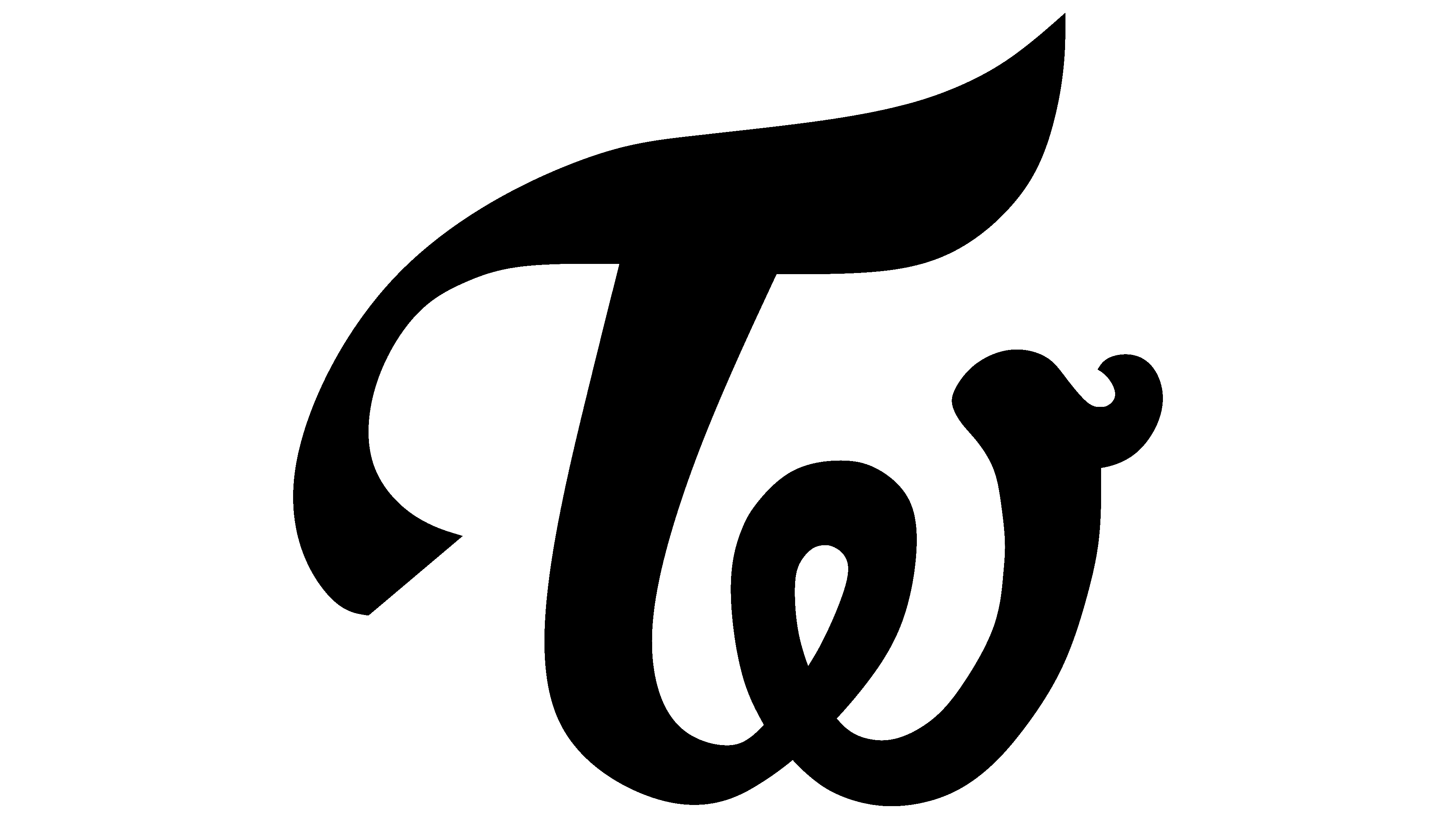
In the musical group’s visual symbolism, the word “Twice” conveys meaning. For the icon, the designers used the first two letters. The largest is “T.” It is handwritten in italics. The right side of the cap has a pointed end that extends upward; the left side is lowered and made even. In general, the crossbar resembles a wave because it is depicted with smooth height changes that mimic handwriting. The leg of the first letter is also rounded. It is turned to the right and harmoniously transforms into the “w” symbol. In the middle, it has a loop-shaped heart. Then the line rises and ends in a miniature hook-shaped protrusion.
The lower inscription, on the contrary, is strict, clear, and angular. It contrasts sharply with the icon and speaks to the musical team’s composure and coherence. The letters are small but bold and capitalized, so they are visible on a white background. The “E” and “T” have shortened protruding strokes, so they appear clipped. There is also a version of the logo without an inscription, featuring a “cardiogram” of the heart. The rhythm of its beating is presented schematically, with evenly spaced angular splashes and falls, along with a small heart.
Font and Colors

The developers chose Avant Garde Gothic Bold as the main font. It is geometric, grotesque, flat, and sleek. The base color of the emblem is red; the additional color is pink.