


![]() Guns N’ Roses Logo PNG
Guns N’ Roses Logo PNG
The Guns N’ Roses logo captures the band’s essence, blending rebellion and romance. The roses placed beside the guns speak to the contrast between strength and vulnerability, between peace and rage, that have always been present in their music. It is a symbol that contains the entire philosophy of rock and roll.
Guns N’ Roses formed in March 1985 from the merger of Hollywood Rose, led by Axl Rose and Izzy Stradlin, and L.A. Guns with Tracii Guns and Rob Gardner. The name combined both groups. The lineup stabilized after Duff McKagan and Slash joined.
In 1985, the band went on an informal “Hell Tour” between Los Angeles and Seattle with no budget or contracts. In 1986, they self-released Live ?!*@ Like a Suicide in 10,000 copies, gaining attention in the local scene.
Later in 1986, the group signed with Geffen Records. “Appetite for Destruction” was released in July 1987 and initially struggled due to limited radio and MTV exposure. After “Welcome to the Jungle” entered the rotation, sales accelerated. By 1988, the album reached No. 1 on the Billboard 200 and went on to sell about 30 million copies.
In 1988, G N’ R Lies followed, and in 1989, the band toured with The Rolling Stones, marking wider recognition. At the same time, they competed with Mötley Crüe and Poison, whose sound had shifted toward glam.
In September 1991, Use Your Illusion I and II debuted at No.1 and No.2 on the Billboard 200. The Use Your Illusion Tour ran from 1991 to 1993, but was marked by delays and incidents, including the 1992 Montreal riot involving Metallica.
By 1994, the classic lineup had dissolved. Axl Rose retained the name and worked on Chinese Democracy, released in 2008 after more than 13 years in production.
In 2016, Axl Rose, Slash, and Duff McKagan reunited for the Not in This Lifetime tour, which grossed over $580 million.
Meaning and History
![]()
The musical group has several separate labels, each of which reached its peak in popularity at different times. Among them are Uzi Suicide, Geffen, Black Frog, and UMG. The group’s heyday was from 1985 to 1993, until Slash and McKagan left. In 2016, they decided to return, marking the beginning of a new era for the group.
Throughout its existence, Guns N’ Roses used several logos. Each of them is associated with two central images, roses and revolvers, which symbolize the group’s name. The stylized weapon first appeared in the logo’s first version and remained in all subsequent versions.
What is Guns N Roses?
It is a Los Angeles-based music group that emerged in 1986. It performs music in heavy metal and hard rock styles. Its debut album, Appetite for Destruction, reached the top spot on the Billboard 200 a year after its release.
1987 – 1989
![]()
The album cover of Guns N’ Roses’ Appetite for Destruction has its own design history. For the 1987 release, a unique logo was created that was not used again later.
The composition centers on a massive cross with Celtic motifs. The ornament features yellow and purple lines on a violet background. Along the cross’s edges are portraits of the band members, depicted as caricatured skulls that convey their appearance.
At the top is a skull wearing a black hat and glasses. On the left is a character with light, voluminous hair. On the right is a skull with bleached hair and a red bandana. In the center is a character with red hair, dark glasses, and a blue cap. At the bottom is a skull with thick hair and a top hat. The illustration style resembles punk comics.
The band name is placed at the top on an arched ribbon. A gradient from yellow to red-orange creates a sense of volume. The inscription GUNS N’ ROSES is set in a tall, strict black sans-serif typeface.
Below the cross is a second ribbon. It is wider, deep red, with a thin yellow outline and a black contour. The text APPETITE FOR DESTRUCTION is written large across it. The composition is symmetrical. APPETITE on the left, FOR in the center, DESTRUCTION on the right.
The design conveys the rock aesthetic of the late 1980s. It includes references to biker culture, heavy metal, and tattoo graphics. The cover’s overall tone is bold and provocative.
1987 – 2008; 2016 – today
![]()
At Guns N’ Roses concerts and on merchandise, the main logo was used for many years independently of album covers. In 2008, it was discontinued. The mark returned eight years later, in 2016, during the Not in This Lifetime… tour.
The current version is designed as a circular emblem. Along the edge runs a bright yellow ring with a metallic effect. Inside is a gray circle resembling a steel surface with soft tonal transitions and a matte texture.
At the center are two crossed revolvers with barrels pointing in opposite directions. The weapons are rendered in detail, with metallic shades, highlights, and shadows. Over the revolver runs a green rose stem with thorns and leaves. Two red buds are placed at the edges. Drops resembling blood are visible on the petals. The thorny stems intertwine with the gun barrels. The combination of weapons and a rose plays on the band’s name and stage image.
The name Guns N’ Roses is placed on the outer yellow ring. At the top is the word GUNS N’, and at the bottom is the word ROSES. The typeface is narrow and tall, closely resembling Poster Bodoni or Eagle Bold Condensed. All letters are uppercase, and N’ is additionally emphasized with dots on both sides.
The design draws on tattoo aesthetics, biker symbolism, and classic rock motifs. The result is a crest-like logo that combines toughness and ornamentation.
2008 – 2016
![]()
After the release of the album Chinese Democracy in 2008, Guns N’ Roses used a different logo that remained in use until 2016. It differed from the band’s familiar style, resembling a coat of arms with references to East Asian motifs.
At the center is the abbreviation G N’ R in rich red, with a soft, glowing effect. The letters are set in a heavy typeface close to Times Black. Above the abbreviation are three red stars outlined in beige gold, with the central star larger than the two on the sides.
On both sides of the inscription, stylized wheat ears rise. They are rendered with thin lines and detailed grains in a beige-red palette. The ears frame the composition on either side, curving inward into a semicircle.
At the bottom is a decorative banner. It consists of black ribbons with diagonal stripes in a golden beige tone. Between the ribbons are Chinese characters.
The design conveys a mix of propaganda aesthetics, Soviet symbolism, and state emblems. The wheat ears and stars reinforce military and agrarian themes, so the logo reflects the mood of the Chinese Democracy album period.
Font and Colors
At the beginning of their career, the United team used a logo with revolvers. Moreover, the barrels are oriented in different directions, and the hands cross at the center of the circle. Around them, the stems of a climbing rose intertwine. Two scarlet flowers are symmetrically positioned, and blood drops drip from each. The leaves are also symmetrical, creating a sense of exact thoughtfulness in everything related to the group. Stephen, a member of the music group, authored this version.
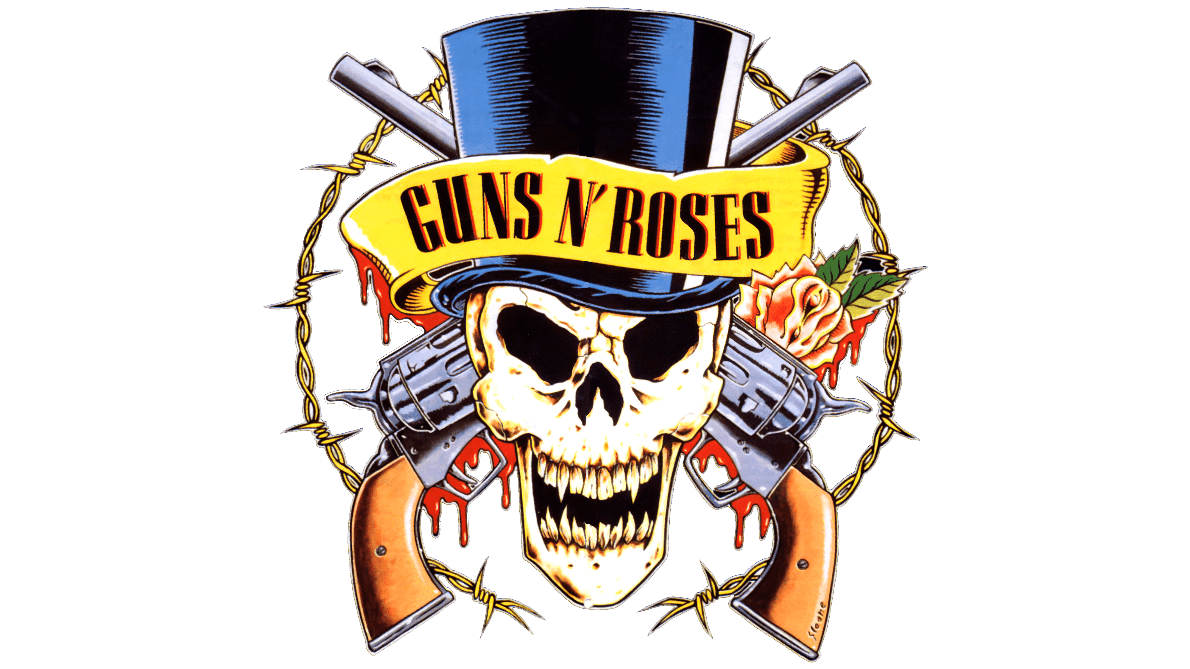
Two formidable revolvers, adorned with roses and a human skull, are featured on another emblem. This is the most ambitious and popular version, which is transferred onto clothing, making it a trendy sign. In the center is a grinning skull; behind it are two crossed barrels, classically turned towards each other. Behind the weapons are roses, from whose petals blood flows. The skull wears a bowler hat with a ribbon bearing the group’s name. All elements are surrounded by barbed metal wire.
Based on certain assumptions, this logo was sketched by Slash, a representative of the hard rock genre. However, according to Axl Rose, the band’s frontman and vocalist, the hit logo was created by tattoo artist Bill White.
The color palette across all versions of the emblem is highly saturated, approaching peak saturation, conveying maximum emotional intensity. It is dominated by red (closer to scarlet), black, dark green, brown, white, and several shades of ash-gray.