


![]() BTS Logo PNG
BTS Logo PNG
The original visualization features the BTS logo with trapezoidal elements that resemble open doors. They symbolize the team’s openness and accessibility to fans, reflecting the unity between the musicians and their supporters.
BTS is an acronym for the mega-popular Korean boy band, formerly known as “Bulletproof Boy Scouts” and, since 2017, as “Beyond the Scene.” BTS enjoys staggering popularity among the youth; in 2018, they were named “Person of the Year” by Time, surpassing the iconic American band Planet Earth and the divers who rescued children from a flooded cave in Taiwan.
The “Bulletproof Boy Scouts” were created on June 13, 2013, by Big Hit Entertainment as a counterpart to the female group “Girls’ Generation,” which was at the peak of popularity in Asia and had already conquered Europe and the USA.
Seven charming young men skilled in dancing and singing were selected for the male group through open auditions. Initially, BTS wanted to be called “Big Kidz” or “Young Nation,” but after the team’s creation, the producers unexpectedly proposed the name “Boy Scouts Bulletproof,” which shocked the members.
Initially, they were even against such a name, but when the guys explained the main concept of their boy band, the idea was accepted. The point is that the guys emphasized the military theme, so they came out in bulletproof vests for their first performance, which became their trademark and is reflected in the first logo.
BST lineup: RM (group leader), Chia, Shugi, J-Hope, Jimina, Wi, and Jong Kook.
In 2018, after the renaming, the group received the title “Artist of the Year” at the prestigious Mnet Asian Music Awards for the studio album Wings. In the American Billboard 200 albums chart, BTS achieved a unique result for artists from Asia, ranking 7th. Two singles, “MIC Drop” and “DNA,” became the first (and, to date, the only) in Korea to receive a gold certification from the RIAA.
Meaning and History
![]()
The BTS logo changed only once, but both versions are very symbolic and memorable. The brand’s main value and creativity are tied to its past, present, and future.
What is BTS?
It’s a South Korean vocal group targeting teenage girls. It consists of seven members led by Kim Namjoon. The full name of BTS is Bangtan Boys. In 2017, another version of the acronym’s decoding appeared: Beyond the Scene.
2013 – 2017
![]()
The group’s first logo featured a recognizable bulletproof vest with numerous pockets, surrounded by rays and two lightning bolts on either side. In the center, the name is accompanied by the acronym BTS. According to the creators’ concept, such reliable protection from pressure and prejudice is essential for young people in modern society. Over time, new goals were added to the concept: not stopping at what has been achieved but following the dream.
2017 – today
![]()
That year, representatives of the Big Hit Entertainment label decided to update the group’s name, values, and logo to reflect the new realities of the global world. The name “Behind the Scenes” suggests that, despite everything, young people hold on to what has been achieved, develop, and move forward. In light of the new concept, the protective gear was replaced with a stylized image of a slightly open door through which young people rush into the future. The BTS name moved to the bottom.
At the same time, the official BTS fan group ARMY’s logo was reworked. A new logo was created, very similar to the BTS emblem, also in the form of doors, only open from the other side.
As the label owner said, these two modern logos are the result of joint development by the group members, the design team, and the most active fans. The primary task set before them was to demonstrate that the brand and its representative team are focused on the future. At the same time, the logos of both performers and fans demonstrate their unity, so both versions are featured on all official BST products (albums, flyers, posters, and fan items).
Font and Colors
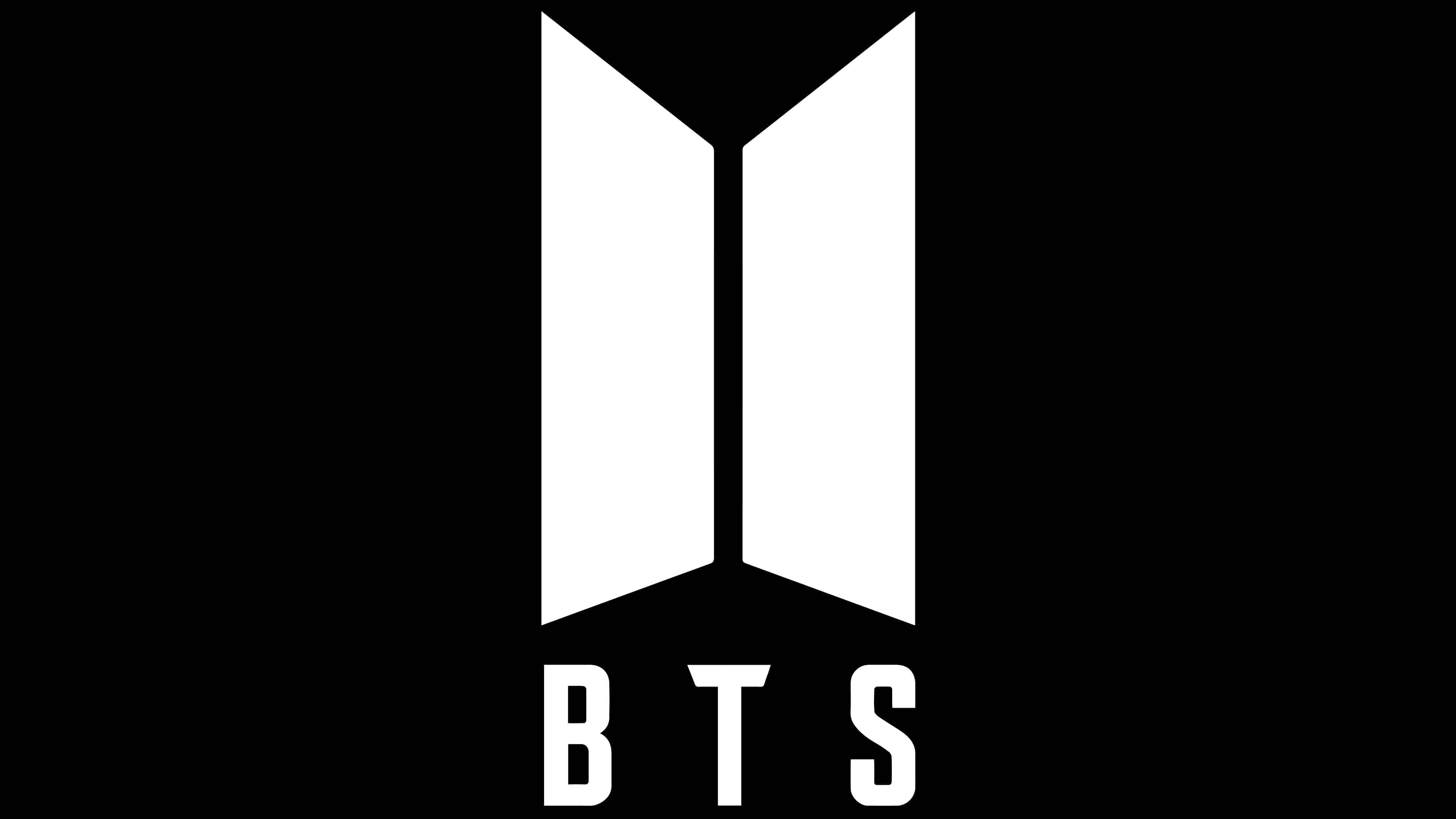
The group’s trademark consists of the word “BTS” (below) and two vertically positioned rectangles (above). The geometric shapes are trapezoidal and mirror images of each other. The left and right sides of the emblem are completely symmetrical because, according to the designers’ idea, they represent the doors to the future.
From 2013 to 2017, the group’s name was applied in stencil style with wide dashed lines. After updating the logo, the style of the inscription changed:
- The letters became solid.
- The letter “T” has triangular cuts on both sides of the horizontal stroke.
- The letter “S” has rectangular ends.
- Serifs and other decorative elements are absent.
The primary color of the emblem is dark gray, while the secondary color is white. The first is used for the trapezoids and the inscription “BTS,” and the second serves as a neutral background.