


![]() Queen Logo PNG
Queen Logo PNG
The Queen logo conveys the band’s spirit and atmosphere. It incorporates the members’ zodiac signs and elements of classical heraldry, giving it a coat-of-arms appearance. The symbol emphasizes the group’s grandeur, theatricality, and unique style, which have become a legend on the world stage.
Queen formed in 1970 after Brian May and Roger Taylor continued with their earlier band, Smile, and invited Freddie Mercury, who proposed a new name. John Deacon joined in 1971, completing the lineup.
The first album arrived in 1973 on EMI, but wider attention came with Sheer Heart Attack in 1974. In 1975, A Night at the Opera introduced “Bohemian Rhapsody”, a six-minute track that topped the UK charts for 9 weeks and gained further reach through one of the early promotional music videos.
By the late 1970s, Queen moved into large venues. News of the World in 1977 and Jazz in 1978 expanded their audience, while “We Will Rock You” and “We Are the Champions” became staples at sports events. In 1980, “Another One Bites the Dust” extended their presence into dance charts, and the band recorded the Flash Gordon soundtrack.
On July 13, 1985, Queen performed at Live Aid at Wembley alongside David Bowie and Elton John, drawing global attention. In November 1991, Freddie Mercury confirmed his illness and died the next day. In April 1992, a tribute concert at Wembley Stadium brought together major artists and was broadcast worldwide.
After 1991, May, Taylor, and Deacon released archive material, with Deacon later leaving music. Queen entered the Rock and Roll Hall of Fame in 2004. Collaborations followed with Paul Rodgers in 2005 and Adam Lambert from 2011. In 2018, the film Bohemian Rhapsody renewed interest in the song, returning it to the charts decades later.
Meaning and History
![]()
Freddie Mercury, who came up with the name Queen, also designed the logo, having graduated from art college in 1969 and having a strong understanding of painting. Now, the emblem he created is legendary, a symbol of the band, like Brian May’s hairstyle.
What is Queen?
It is a legendary rock band from London. It emerged in 1970 and has had a profound influence on the history of the music industry, inspiring several generations of future rock musicians. The band’s creative style combines funk, pop-rock, heavy metal, and even opera. Among their most famous hits are “We Are the Champions,” “We Will Rock You,” and “Bohemian Rhapsody.”
1968 – 1970
![]()
Before the band became known as Queen, the musicians performed under the name Smile. From the very beginning, they tried to stand out and avoid conforming to common rules. This approach was reflected in their visual image. The album artwork looked provocative and did not follow generally accepted standards.
The Smile album cover features large red lips. They are deliberately enlarged and appear caricatured, stretched into a wide smile. The teeth are heavily simplified and exaggerated. A white highlight in the shape of a small star is added to a front tooth, introducing irony and a sense of absurdity.
The band name is placed at the top and set in large yellow letters. The forms look uneven, as if applied with brush strokes. In the lower left corner is the inscription “ghost of a smile”. It is executed similarly but more carelessly. The text is curved and split into two lines.
In the opposite corner are the band members’ names: Brian May, Tim Staffell, and Roger Taylor. The names are set in a simple sans-serif typeface, in uppercase red letters with a thin light outline.
The Smile image was built on comic book aesthetics and intentionally exaggerated forms. It balanced between absurdity and emotional pressure.
1973 – 1975
![]()
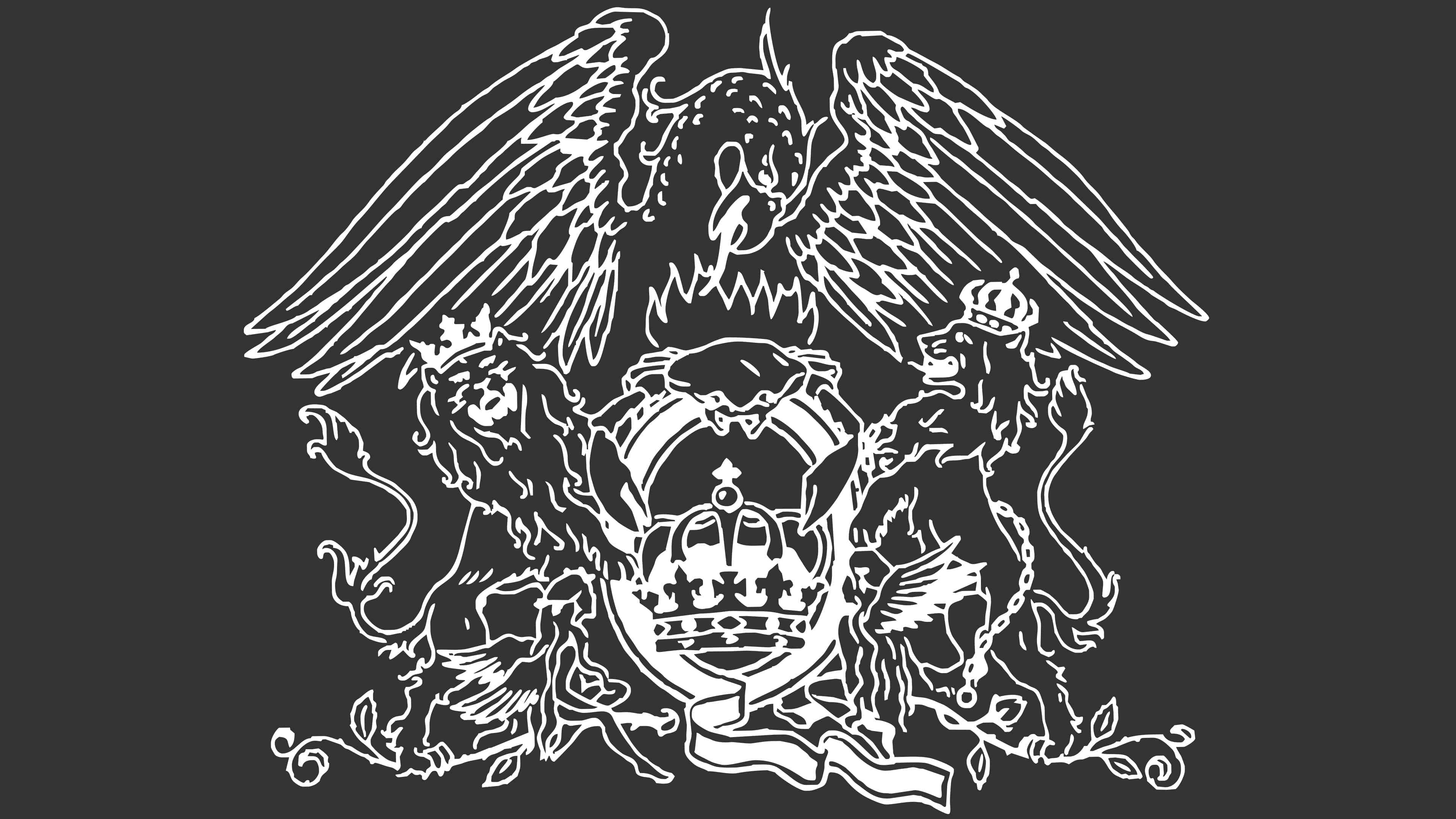
In July 1973, Queen released their debut album. Along with it came a logo created by Freddie Mercury. The vocalist developed the emblem himself, incorporating the zodiac signs of all four band members.
At the core of the logo is a large stylized letter Q, designed as an oval shield. Inside it is a crown.
On both sides of the shield are two lions. They are linked to the zodiac sign Leo, under which John Deacon and Roger Taylor were born. One lion is shown with a crown and spread wings, while the other raises its head and is crowned as well. At the base of the letter Q are two fairy figures. They refer to the sign Virgo, under which Mercury himself was born. The figures face the shield and appear to hold the letter Q.
Above the letter Q is a crab, associated with the sign Cancer of Brian May. It is placed in flames, from which a phoenix with spread wings rises. The bird tilts its head toward the center of the composition.
Curved ribbons, leaves, and plant elements complement the lower part of the emblem. These details close the composition and give it a finished heraldic appearance.
Freddie made the first drawing in 1972. The emblem was used on the albums Queen (1973) and Queen II (1974). The band name was placed on the front cover, while the crest appeared on the back. On the Sheer Heart Attack record, the logo appeared on the inner sleeve. It was also used on singles, posters, and on the bass drum during concerts.
The image refers to British heraldry and royal symbolism. This reinforced the name Queen’s sound and helped shape the band’s grand stage image.
1975 – today
![]()
In 1976, Queen introduced an updated crest, designed by Freddie Mercury, for the release of the album A Day at the Races. The logo became more detailed, new elements were added, and the band name was integrated into the composition for the first time.
At the center is the letter Q with a crown inside. A curved ribbon forms the letter. The interior of the crown is decorated with a cross and numerous ornamental details.
Above the letter is a stylized crab associated with Brian May’s Cancer sign. It is shown with raised claws and placed within tongues of flame. The flame rises and transforms into the image of a phoenix. The spread wings frame the upper part of the crest, and the tilted head directs the viewer’s gaze toward the center.
On the sides of the oval stand two lions associated with John Deacon and Roger Taylor. The animals are depicted standing on their hind legs, resting their front paws on the crest. The crowns on the lions’ heads reinforce the monarchic theme that runs throughout the mark.
Below the oval form is the word QUEEN. The letters have serifs and are close to Roman antiquas such as Trajan or Didot. The letter Q stands out for its elongated lower stroke, extending downward and to the right.
The updated crest preserved the earlier symbolism. The composition still includes the zodiac signs of all band members, surrounded by mythological and ornamental imagery.
Font and Colors
The complex, multi-component badge of the Queen is executed according to the classic canons of heraldry. The main elements indicate this:
- Lions standing on their hind legs
- Ribbon in the shape of the letter “Q” with a large crown in the center
- Mythical phoenix spreading its wings wide.
- The drawing is quite detailed; the artist depicted the main elements in black only.

An individual font was used for the name, invented by the band’s designer and photographer, Richard Gray. It’s characterized by long, thin strokes in a Roman style. All letters, except for “Q,” have serifs. Moreover, the serifs on “E” are positioned diagonally.
![]()