


![]() Disturbed Logo PNG
Disturbed Logo PNG
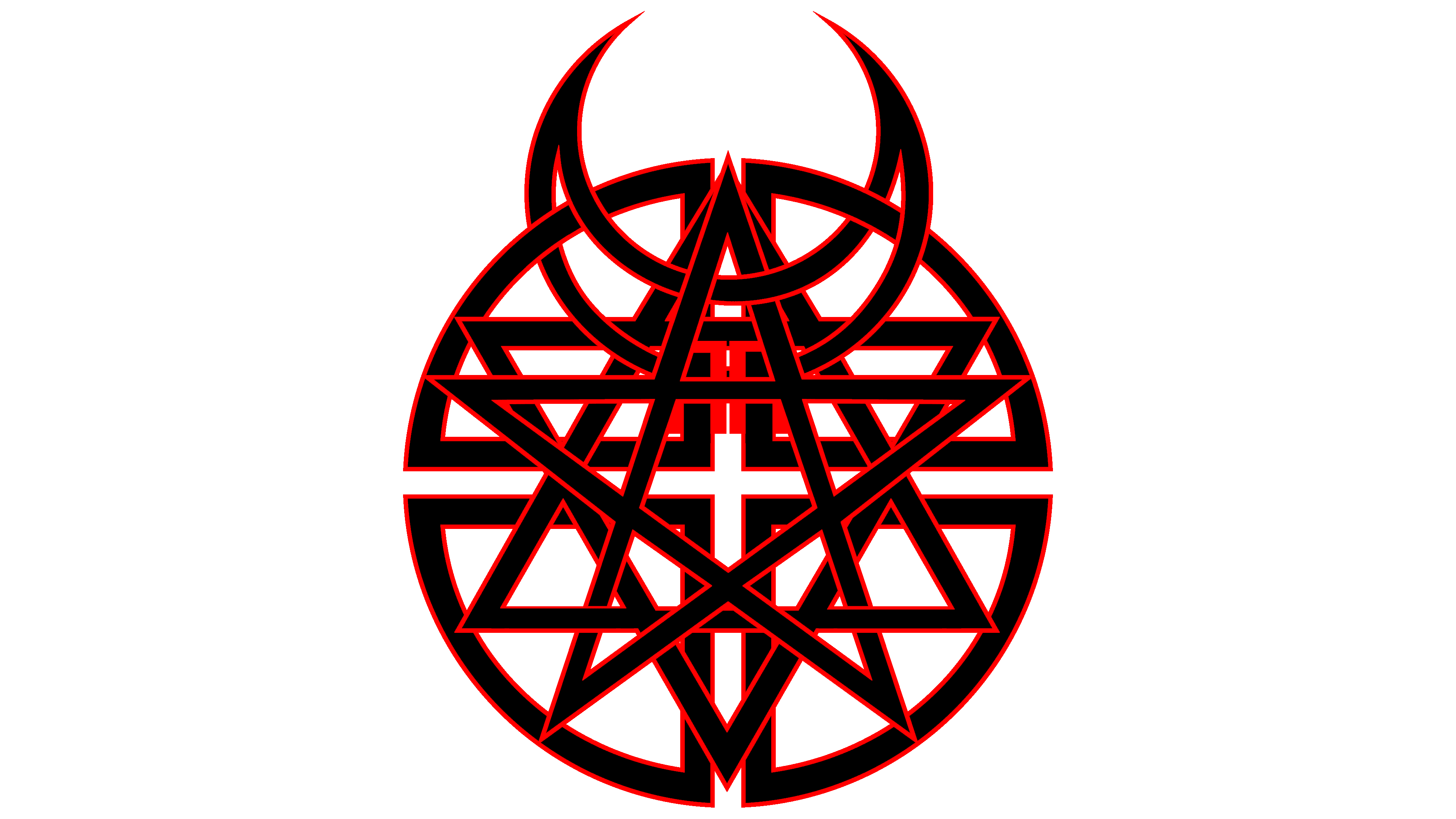
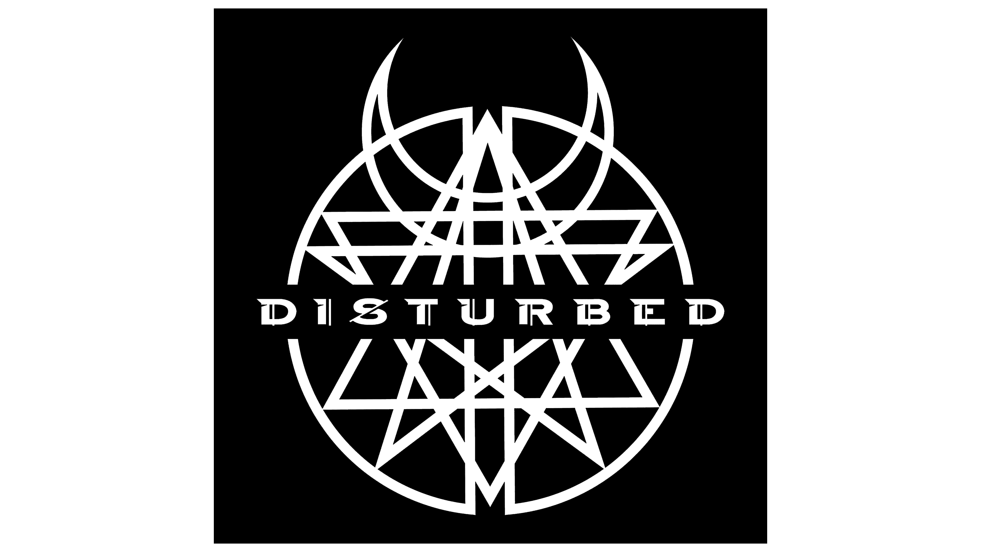
The heavy metal band Disturbed is represented by a logo that symbolizes unity in their activity and style, drawing on traits from four religions. The Spanish crescent, Wiccan star, Christian cross, and Star of David form the basis of the graphic emblem.
Disturbed emerged from a Chicago band called Brawl, formed by Dan Donegan, Mike Wengren, and Steve Kmak. After vocalist Erich Awalt left, the group placed an ad in the Illinois Entertainer. In 1996, David Draiman joined after multiple auditions, and the band adopted the name Disturbed.
The new lineup recorded two demos featuring tracks like “The Game”, “Down with the Sickness”, and “Stupify”. The illustration first featured the Masked Man, who became a symbol in subsequent issues.
In August 1999, the band signed with Giant Records and opened for Ministry in Chicago. Their debut album, The Sickness, arrived in 2000, reaching No. 20 on the Billboard 200 and selling over 4 million copies in the US. Songs like “Down with the Sickness” later appeared in Zack Snyder’s Dawn of the Dead.
From 2002 to 2010, the albums Believe, Ten Thousand Fists, Indestructible, and Asylum all debuted at No. 1 on the Billboard 200. In that period, Disturbed operated in the same field as Slipknot and Godsmack but maintained a consistent chart presence.
In 2004, Steve Kmak left the band and was replaced by John Moyer. In October 2011, Disturbed paused its activities and released the compilation album The Lost Children.
On June 23, 2015, the band returned and issued Immortalized in August, followed by a concert at House of Blues Chicago. Their cover of Simon & Garfunkel’s “The Sound of Silence” gained widespread online attention.
In October 2018, Disturbed released Evolution. Total sales exceeded 17 million records worldwide, with multiple RIAA certifications and two Grammy nominations.
Meaning and History
![]()
The group has had several logos, but the most legendary is depicted on the cover of the Believe album. It appeared in 2002. Before that, representatives of alternative metal had several other iconic options.
What is Disturbed?
It is a metal-rock band from the USA, formed in 1994 in Chicago, Illinois. Initially, it was called Brawl, and only two years later, it was renamed Disturbed.
2000 – 2002
![]()
At that time, the band used The Guy’s image as a logo. This is the musicians’ mascot, personifying the Archangel Gabriel, who is essentially a destroyer. The emblem first appeared on The Sickness album. It had no face, only empty eye sockets, raised eyebrows, and a snarling smile.
Five years later, it appeared on the album Ten Thousand Fists. There, the Guy was depicted as a young man in a torn hooded cloak. In subsequent works, he was depicted as fire, shackled in chains, and as the Dark Messiah.
2002 – 2005
![]()
During this period, another legendary version appeared. It consists of two parts: verbal and graphic. The musicians chose a Kabbalistic sign, placed within a circle, for the label. It is four religious symbols combined into one emblem: the Muslim crescent, the pagan pentagon, the Christian cross, and the Jewish Star of David. Its idea lies in the unity of religions. Above it is the name of the rock-metal group.
Then, another well-recognized version appeared. It is executed in a silver metallic color with a 3D effect, set against a dark red background. The group’s name is golden; the album’s name is black.
2008 – 2010
![]()
At this time, the musicians decided to change the brand name, leaving only the inscription. The letters are dark gray, capitalized, and complemented by serifs and highlights.
2010 – 2015
![]()
Designers placed the word “Disturbed” within a black rectangle, making the letters thinner. They became clear, legible, and large.
2015 – 2018
![]()
The current version looks like the crossed-out name of the music group. The color palette is light metallic on a white background. Above each sign, elongated shadows appear, as if they are illuminated from behind.
2018 – today
![]()
The current logo appeared on the cover of the Evolution album, released in 2018. And it’s again text without an icon, with its letters turned into graphic elements. This time, they look empty because they consist of a thin black frame on a white background. The symbols are wide, geometric, and even smooth. Sharp and rounded corners are distributed fifty-fifty. For example, the letter “D” has two acute angles and two obtuse angles. And so with all other signs. Each letter stands alone, at a moderate distance from the others, and they do not touch.
Font and Colors
If the first logos featured graphics, the latest ones do not. The role of the graphic image is passed to the text, where each letter is a separate drawn symbol. Starting in 2008, the word “Disturbed” has been reproduced in different ways: ornate, with serifs, bold, crossed out, and thin. Moreover, the design has moved from complex to simple: in the modern version, there are no ornate elements; it is extremely laconic.
The font in each case is unique, developed from a certain font but with radical changes. Thus, there are variants with spikes, serifs with the “chip” effect, elongated legs, and voids.
The color combination is more stable: it has always remained monochrome. On most albums, the emblem is executed in black and white. The exception was the logos from 2015-2018, which used beige and gray.
FAQ
What does the Disturbed logo mean?
The Disturbed logo signifies unity, expressed through iconic symbols of four religions. Thus, it combines the Islamic crescent, the Wiccan star, the Christian cross, and the Jewish Star of David.
Who is the vocalist of Disturbed?
The first vocalist of Disturbed was Erich Awalt, from 1994 to 1996. The current performer is David Michael Draiman, who is also a songwriter. He is also a rebel in spirit, which led to his immediate expulsion from the Wisconsin Institute during his first year.
Is Disturbed a religious group?
No, it is not a religious group but a music collective that performs rock and metal. It appeared in 1994 and uses a combination of several iconic symbols as a logo: Islamic, Wiccan, Christian, and Jewish.
Who is the mascot of Disturbed?
The mascot of Disturbed is The Guy, called the “spirit of vengeance.” He first appeared on the cover of The Sickness album, as a faceless figure with a malicious grin. Then the image was edited and converted to color.