The recognizability of the iconic Australian rock band was ensured by the AC/DC logo, which has maintained its foundation throughout all the years of existence. The emblem reflects the traits of their creativity – high voltage, electric discharges, and lightning sparks that ignite devotion in hearts.
AC/DC: Brand overview
| Founded: | 1973–present |
| Founder: | Malcolm and Angus Young |
| Headquarters: | Sydney, New South Wales, Australia |
| Website: | acdc.com |
Meaning and History
The debut emblem appeared in 1977, simultaneously with the release of the international version of the album “Let There Be Rock.” This event was made possible through the collaboration of Bob Defrin from Atlantic Records VP and the popular graphic designer Gerard Huerta. Their partnership is high voltage, electric discharge, lightning that still flashes and rumbles around the world, igniting a spark of devotion in the hearts of fans. Over the long years of the rock group’s existence, it has had several logo variations.
What is AC/DC?
AC/DC is a musical group from Australia that was formed in 1973 in Sydney. The ensemble was created by guitarist brothers Angus and Malcolm Young. The legendary group’s repertoire includes various genres of rock and heavy metal. Their debut album, High Voltage, was released in 1975. The group’s lineup has often changed, with the only original member remaining being Angus Young.
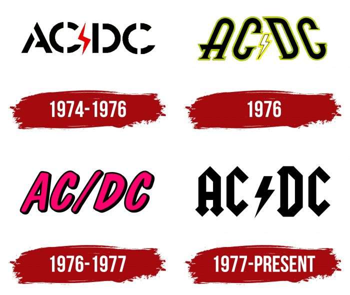
1974 – 1976
The first logo is a traditional warning sign made using a stencil. Such inscriptions are usually placed on transformer booths, shields, and electric cabinets to warn of the presence of high voltage, which is dangerous to life. This version was taken as a basis and refined. It was used on the debut album of the Australian group High Voltage, released in 1974. The letters are round, with intermittent spaces, characteristic of stencils.
1976
This version adorned the cover of the international album High Rock Hard Rock, released in 1976. In this emblem, the letters are elongated, with serifs and green edging, and turned towards each other.
1976 – 1977
The second international and third Australian compilations titled Dirty Deeds Done Dirt Cheap received the same design. The logo depicts the group’s name in red-raspberry with black shadows on the right. They give the letters volume.
1977 – today
In 1977, a gothic-style version appeared. It was first used on the cover of the Let There Be Rock album in international format. Two years later, the new logo adorned the album Highway to Hell, released in Australia.
AC/DC: Interesting Facts
AC/DC is a famous rock band from Australia that started making music in 1973. They’re known for lively shows and songs that lots of people love.
- How They Started: Two brothers, Malcolm and Angus Young, started the band. Their sister, Margaret, saw the name “AC/DC” on a sewing machine. It means “alternating current/direct current,” which reflects the band’s strong and lively music.
- Angus’s Outfit: Angus Young wears a schoolboy uniform when he performs. Margaret also suggested this, and it’s become a big part of how people recognize the band.
- Lots of Albums Sold: AC/DC has sold over 200 million albums worldwide. Their album “Back in Black” is super popular, with over 50 million copies sold.
- “Back in Black” Meaning: This album remembered Bon Scott, the band’s first lead singer after he passed away in 1980. The album cover is all black to honor him, and it was the first album with their new singer, Brian Johnson.
- Hall of Fame: In 2003, AC/DC was added to the Rock and Roll Hall of Fame because they’ve had a big impact on rock music and have stayed popular for a long time.
- Cool Music Video: Their music video for “It’s a Long Way to the Top (If You Wanna Rock’ n’ Roll)” is famous because it shows the band playing on a moving truck in Melbourne, Australia. It’s a memorable scene that’s unique to them.
- Keeping On: Although the band members have changed over the years, and Malcolm Young passed away in 2017, AC/DC still makes music and performs for fans.
- “Thunderstruck” and Science: Their song “Thunderstruck” has been used in science experiments, such as observing how people react to thunder and lightning while listening to it.
- Fans Everywhere: People worldwide, from different generations, love AC/DC. Their concerts are still super popular.
- In Movies and More: AC/DC’s music isn’t just on the radio; it’s also in movies, TV shows, video games, and even sports events. Their logo is famous, too.
AC/DC is remembered for their great music, fun concerts, and the love their fans have for them. They’re true rock legends.
Font and Colors
The Rockers’ trademark sign is associated with the group’s name, which is encrypted in an electrical abbreviation. AC – “alternating current,” DC – “direct current.” Instead of a slash, the musicians used a more fitting symbol – lightning, symbolizing high voltage.
The AC/DC font has constantly evolved and eventually turned into ornate symbols with pointed ends. The primary colors are black, white, and red. In one of the versions, yellow and green are also present.
AC/DC Logo Color Codes:
- Black: Hex color:#000000; RGB:0 0 0; CMYK:0 0 0 100; Pantone:PMS Process Black C


