


![]() Korn Logo PNG
Korn Logo PNG
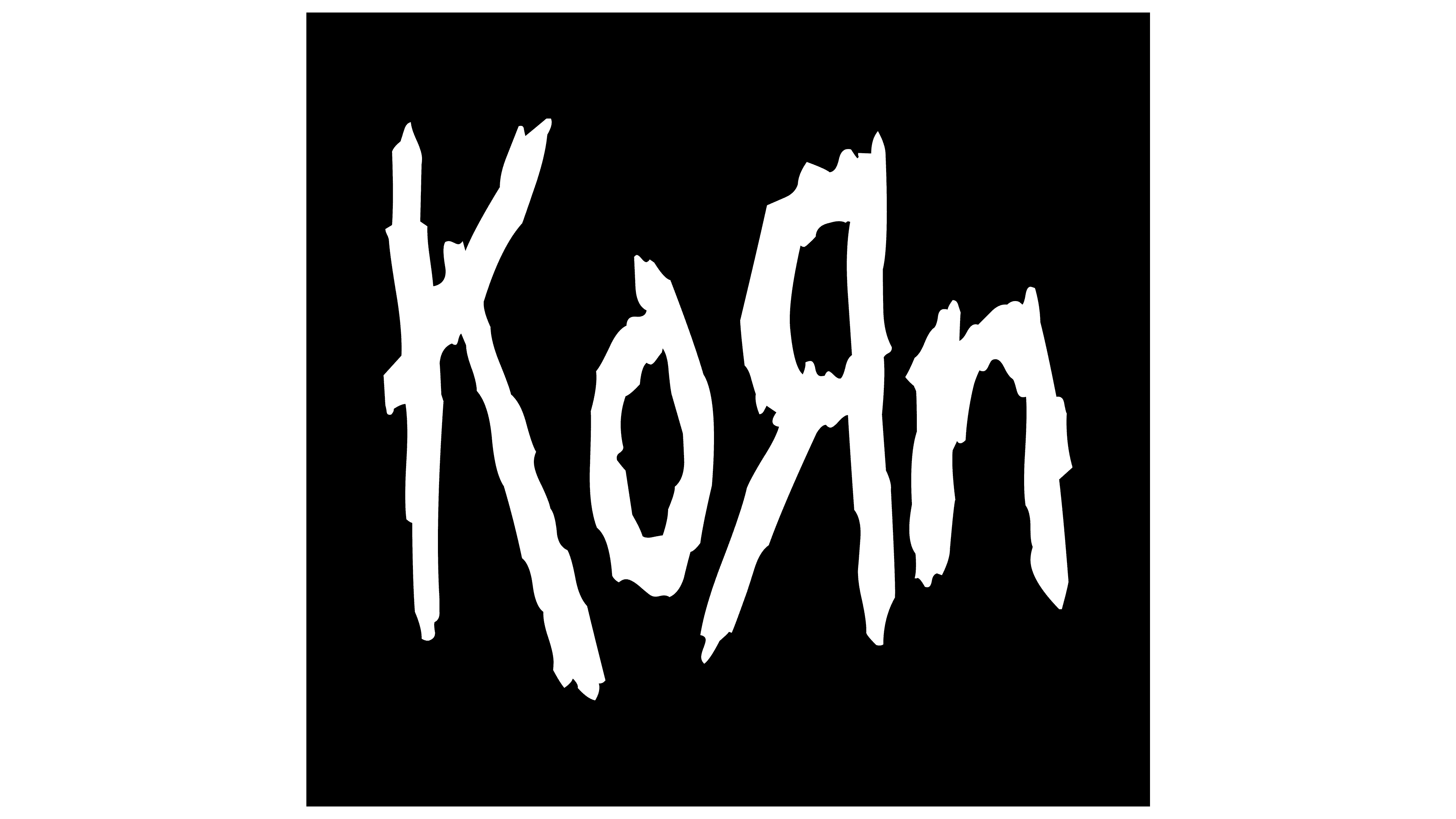
The Korn logo conveys the tension and raw emotion of the band’s sound. Its uneven lines evoke a scream, inner turmoil, and aggression, reflecting the atmosphere of their music, where pain, rebellion, and energy intertwine.
Korn formed in Bakersfield after the breakup of L.A.P.D., when James Shaffer, Reginald Arvizu, and David Silveria continued playing together. They briefly worked under the name Creep with Brian Welch and vocalist Corey Sink, but replaced him soon after.
In early 1993, they recruited Jonathan Davis from Sexart. He suggested the name Corn, later stylized as Koяn with the “R” reversed. The band began rehearsing and recording at Underground Chicken Sound, attracting attention for an unusual sound.
That same year, Korn released the demo Neidermayer’s Mind, distributed on about 1,000 cassettes. It led to a deal with Immortal Records. The debut album, produced by Ross Robinson, was released in October 1994 through Immortal, a division of Epic Records.
The second album, Life Is Peachy (1996), debuted at No. 3 on the Billboard 200. The breakthrough came in 1998 with Follow the Leader, which debuted at No. 1 and sold over 268,000 copies in its first week. Singles like “Got the Life” and “Freak on a Leash” gained heavy rotation on MTV.
Korn became associated with the rise of nu-metal alongside Limp Bizkit, in contrast to pop acts like the Backstreet Boys, NSYNC, and Britney Spears. In 1998, the band launched the Family Values Tour with Limp Bizkit, Ice Cube, and Incubus. The album Issues (1999) also reached No. 1.
In 2002, Untouchables reached No. 2 despite an early leak, and “Here to Stay” earned a Grammy. Brian Welch left in 2005 and returned in 2013. In 2011, The Path of Totality featured collaborations with Skrillex and 12th Planet.
By 2021, Korn had sold over 40 million records worldwide and had multiple Billboard top 10 releases. The album Requiem followed in February 2022 on Loma Vista Recordings.
Meaning and History
![]()
An unexpected musical combination can lead to astonishing results, including prestigious awards and super popularity. Initially, Korn’s logo was incomprehensible to many. But over time, it revealed itself to many fans of the unusual combination of bagpipes and rock.
What is Korn?
It is one of the most famous representatives of the nu-metal genre, combining elements of hip-hop, grunge, and hard rock. This American band debuted in 1993 with a demo recording called “Neidermayer’s Mind.” Subsequently, they gained fame for their aggressive lyrics, powerful riffs, heavy sound, and unconventional instruments, such as bagpipes.
1993 – today
![]()
The original logo of the musicians depicts the word “Korn,” or more precisely, its stylized variant, “KoЯn.” This wasn’t always the case: the band was initially called Creep until a fan suggested renaming it to Corn. Rhythm guitarist James Shaffer liked the idea but decided to replace “C” with “K” and reverse “R”.
The similar writing of the letter “R” is also found in the logo of Toys “R” Us, a company that trades in children’s goods. This is not surprising since some team members once worked there.
The inscription’s design was conceived by vocalist Jonathan Davis, who spent no more than a minute on the first sketch. Davis admitted on his Facebook page that he made the sketch with his left hand and used only a pencil. He managed to form the word “KoЯn” with trembling lines.
The simple yet stylish logo became iconic after it was colored. In the basic emblem version, the letters are highlighted in bold, deep black. But there is also a red version with a raspberry shade of scarlet.
1996
![]()
Font and Colors
The design of the “KoЯn” inscription is unique. Davis used a font that didn’t exist at the time. Later, specialists at the typographic institute Astigmatic One Eye invented the Kornucopia font, which includes similar symbols.
