DJ and producer Martijn Gerard Garritsen uses a minimalist logo with a modern design for his brand. The Martin Garrix logo appears appropriate, stylish, and creative – as does everything this talented individual does. It manifests the graphic expression of his inner world.
Martin Garrix: Brand overview
| Founded: | 2012–present |
| Founder: | Martijn Gerard Garritsen |
| Headquarters: | Amstelveen, Netherlands |
| Website: | martingarrix.com |
Meaning and History
The Martin Garrix logo demonstrates how closely identity is connected to the person it represents. In this case, there is a complete coincidence of name and logo. This is beneficial for creativity and even better for self-promotion! The symbolism is wonderful, fitting the musician’s concept.
As the most successful young DJ, Martin Garrix created a powerful visual label. It’s a stylish, memorable, and modern symbol executed in monochrome. It’s simple and elegant simultaneously. It features a strict design, impervious to time or trends, and is presented in several variations.
What is Martin Garrix?
Martin Garrix is the brand of the famous Dutch musician, producer, and DJ Martijn Gerard Garritsen. Under this stage name, he performs at numerous major festivals and clubs around the world. He began his career in 2012 and rose to fame in less than a year, releasing his hit “Animals.” Subsequently, he received several prestigious music awards, including the MTV Europe Music Award.
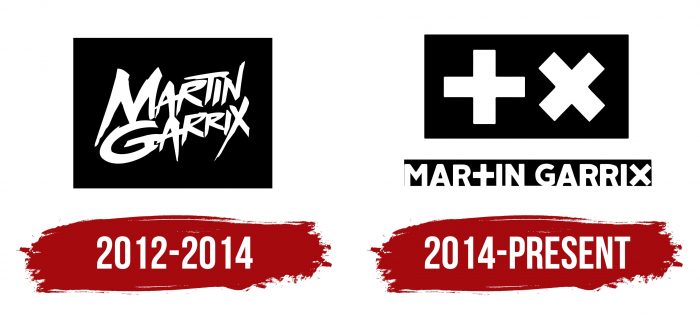
2012 – 2014
The debut emblem contains a white inscription on a black background. The font is individual and handwritten. The shape is a plaque with the first and last names, one above the other. Letters are styled as careless brush strokes with disproportionate placement. Symbols are elongated (legs for “M,” “N,” “A,” “X,” and horizontal stroke for “T”). This gives the logo a hidden dynamism and internal energy. Additionally, “M” and “G” are much larger than the other letters.
2014 – today
In 2014, the DJ’s branding took on a new sound. It became more in line with fashion and youth trends. The black and white palette was retained, but the graphic style became completely different. On the dark plate now are two equally sized symbols: plus (+) and cross (x). Separately at the bottom is the inscription “Martin Garrix,” which is slightly longer than the top. The font is Alright Sans Black, straight, bold, and sans-serif.
Martin Garrix: Interesting Facts
Martin Garrix, a famous DJ and music producer, has made a big splash in electronic dance music (EDM).
- Starting Young: Martin was born in the Netherlands on May 14, 1996, and loved music so much that he started playing guitar at eight.
- Inspired by a Performance: After watching Tiësto DJ at the 2004 Olympics, he knew he wanted to be a DJ too.
- Hit Song “Animals”: At only 17, he released “Animals,” a huge hit worldwide and a favorite at EDM festivals.
- Record-breaking DJ: In 2016, he became the youngest DJ ever to be ranked No. 1 by DJ Mag and stayed on top for three years.
- His Own Label: After leaving his old record label, he started STMPD RCRDS in 2016, naming it after his dad’s stamp company.
- Helping Others: Martin doesn’t just make music; he also helps needy kids through charity work with organizations like War Child.
- Working with Stars: He’s made music with famous artists like Usher, Dua Lipa, and Khalid, showing his versatility in many musical styles.
- Winning Awards: He’s won important music awards and was even named in Forbes’ “30 Under 30” list for his music.
- Amazing Shows: His concerts are known for being super cool, using the latest tech to make the experience unforgettable.
- Trying Different Music: Although Martin is famous for EDM, He also makes other types of music, showing that he likes to mix things up.
Martin Garrix has gone from a kid who loved music to a worldwide star, known for his hits for helping others and pushing the limits of what he can do with music.
Font and Colors
The modern version is built on an interesting similarity between “t,” “x,” and “+,” “x.” Designers replaced the corresponding letters in the words placed in a black rectangle with “plus” and “cross” signs. Thanks to this, the logo excellently conveys the spirit of club life and the style of electronic music. The logo is now widely used in mobile applications, websites, fashionable items, and other attributes.
There is another version of the logo. It consists of the DJ’s stage name and surname, the inscription “Martin Garrix” in a column, and divided by a white line of medium width. The letters “t” and “x” are also replaced with plus (+) and cross (x). The color palette is monochromatic – light inscription on a dark background. Sometimes, the rectangle has a white frame around the perimeter.
Martin Garrix color codes
| Black | Hex color: | #000000 |
|---|---|---|
| RGB: | 0 0 0 | |
| CMYK: | 0 0 0 100 | |
| Pantone: | PMS Process Black C |
