


![]() KISS Logo PNG
KISS Logo PNG
The KISS logo conveys the energy and intensity characteristic of the band’s sound. It embodies the same power and expressiveness found in their live performances, emphasizing the boldness and strength of their musical image.
In 1972, Gene Simmons and Paul Stanley left Wicked Lester after Epic Records refused to release their album. They sought a heavier, more theatrical format, recruiting Peter Criss through Rolling Stone and Ace Frehley through the Village Voice. The name Kiss appeared in early 1973, and Frehley designed the lightning-style logo.
On January 30, 1973, the band played its first show at Popcorn Club in Queens for a small audience. Early experiments with image led to a fixed set of characters: Demon, Starchild, Spaceman, and Cat, each with distinct makeup and identity.
In August 1973, manager Bill Aucoin secured staging elements and a deal with Casablanca Records. The debut album arrived in February 1974, but early releases sold poorly, and the 1975 tour was funded on borrowed money.
A breakthrough came in September 1975 with the live album Alive!, recorded across shows in New Jersey, Detroit, and Cleveland. It delivered the band’s first gold record, while “Rock and Roll All Nite” entered the US Top 40 and helped stabilize Casablanca.
In 1976, Destroyer, produced with Bob Ezrin, expanded the sound with orchestration. “Beth” reached No. 7 on Billboard Hot 100. By 1977, Kiss had sold out the Budokan in Japan and surpassed The Beatles’ attendance record.
In 1978, all four members released solo albums. In 1983, during the Lick It Up era, the band removed their makeup and appeared on MTV without masks. The original lineup reunited in 1996, and the tour generated $143 million.
In 2014, the founders were inducted into the Rock and Roll Hall of Fame. The End of the Road tour began in 2019 and concluded on December 2, 2023, at Madison Square Garden.
Meaning and History
![]()
The KISS logo is unique and precise. It’s a high-voltage shock that courses through body, mind, and nerves. It’s raw because of the songs’ realism. It sparkles with vibrant colors. It’s piercing, reminiscent of an electric shock. In other words, this logo is timeless because it transcends reason: it’s a bundle of energy. It’s an element.
What is Kiss?
It is an American cult rock band known for its bold shows. Its members apply frightening makeup, dress in provocative glam-rock stage costumes, and use pyrotechnics during performances. The group began its rise to fame in 1973 when Ace Frehley joined Paul Stanley, Gene Simmons, and Peter Criss. The band released many successful albums, including “Love Gun,” “Rock and Roll Over,” and “Destroyer.”
1973 – 2023
![]()
The KISS emblem is one of the most scandalous and recognizable in the world. It appeared in the autumn of 1973 and was first depicted on a concert poster in New York. Guitarist Ace Frehley, who sketched the emblem on several announcements with a marker, is considered the creator of the idea. Then, the drawing was refined by vocalist Paul Stanley, who had an art education.
Using a ruler and a permanent marker, Paul tried to align the lines. He did it by eye, so the “S” letters came out uneven. They still differ slightly because the rock band wasn’t striving for perfection.
Font and Colors
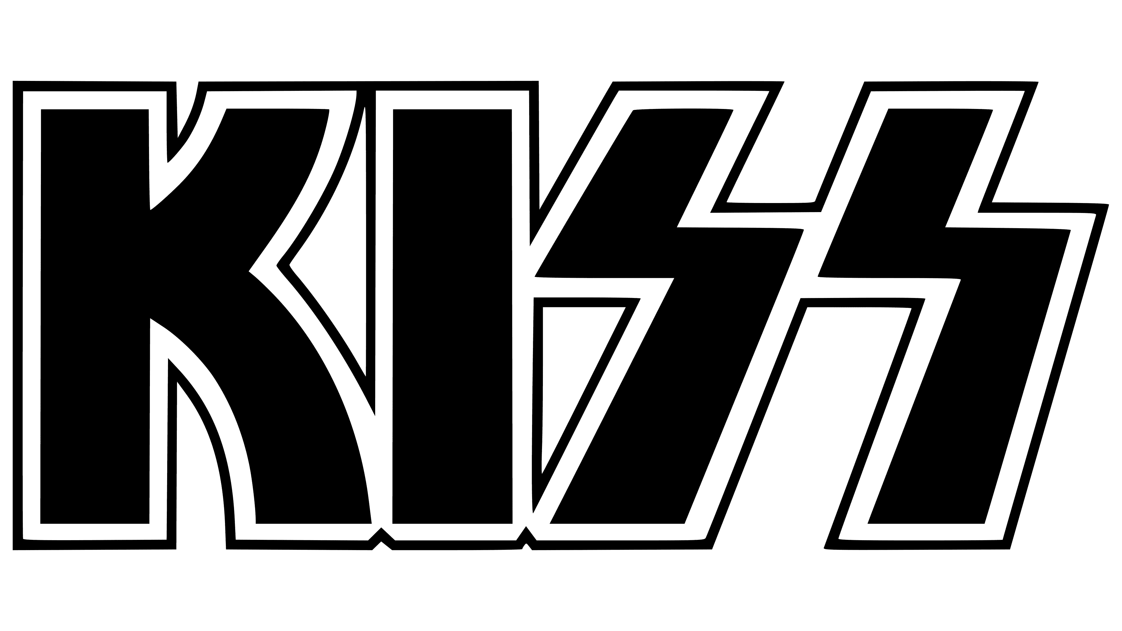
The current emblem is very similar to Stanley’s original version. It features the group’s name: uppercase “K” and “I” without serifs and two “S” in the shape of lightning bolts. Some saw this as a direct reference to the Nazi symbol of the Schutzstaffel organization. It went so far that German authorities vetoed the controversial logo and confiscated all KISS albums.
In the late 1980s, the team members had to redesign the drawing. Thus, a version with an angular “SS,” similar to an unfolded “ZZ,” appeared. It was used in all countries where fascist symbols were banned. Later, Ace Frehley confessed that he meant no harm; he just liked the lightning bolt. And the seeming resemblance to the Schutzstaffel symbol was just a coincidence.
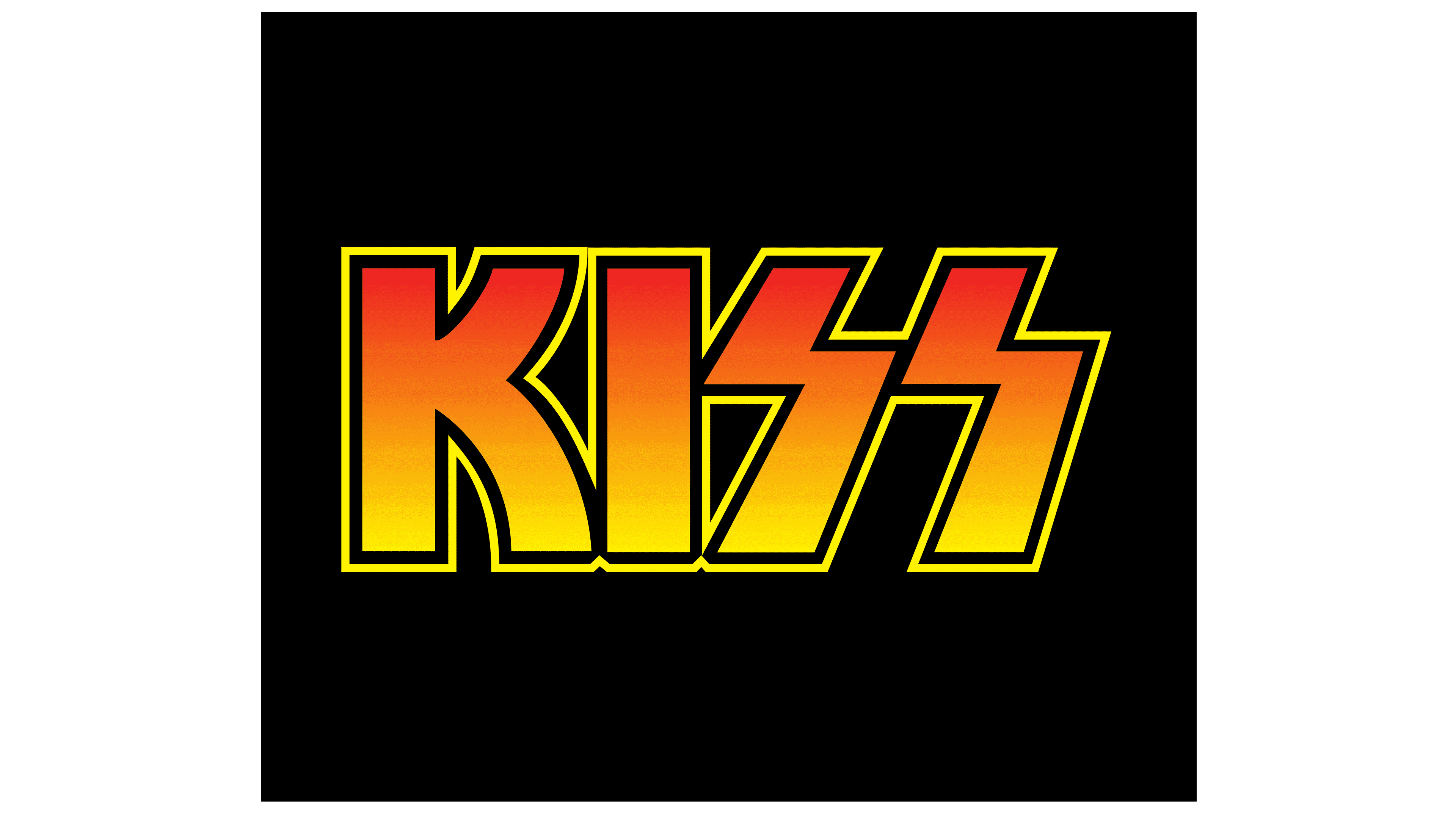
The color palette deserves special attention. Originally, the inscription was red and yellow with a smooth gradient. The letters are outlined by three lines: one yellow and two black. But there are also simple black-and-white versions of the logo.