


![]() Megadeth Logo PNG
Megadeth Logo PNG
Good musicians must be recognizable, and great music must be super impressive. The Megadeth logo, which remains universal on the cover of each new album, adheres to this principle. The emblem defines the band’s attitude towards creativity, in particular, and towards the world as a whole. Living on the edge of sensations is its credo.
Megadeth began after a split with Metallica. On April 11, 1983, Dave Mustaine was removed from the band and sent back to Los Angeles from New York. During the trip, he saw the term “megadeath” in a leaflet about nuclear weapons and adapted it as the name of a new project.
Back in Los Angeles, Mustaine teamed up with David Ellefson and set a goal of building a faster, heavier band. After multiple lineup changes, guitarist Chris Poland and drummer Gar Samuelson formed the core of the band. On February 17, 1984, the band played its first show at Ruthie’s Inn in Berkeley.
In 1985, Megadeth released Killing Is My Business… and Business Is Good! on Combat Records. The album included “Mechanix”, a track that Metallica later reworked as “The Four Horsemen”. After Combat sold the contract to Capitol Records, Peace Sells… but Who’s Buying? followed in 1986 and entered wider rotation through MTV.
By 1989, a stable lineup featuring Marty Friedman and Nick Menza culminated in Rust in Peace (1990), widely cited as a key thrash metal record. Countdown to Extinction (1992) reached number two on Billboard 200 and went platinum, while Youthanasia (1994) entered the top four. Six consecutive albums achieved platinum status in the U.S.
The band’s sound shifted on Risk (1999), a shift that drew criticism. Friedman left in 2000. In 2002, Mustaine suffered a nerve injury and dissolved the group. Megadeth returned in 2004 with The System Has Failed, issued through EMI.
In 2010, Ellefson rejoined, and Megadeth performed with Slayer and Anthrax as part of the “Big Four”. In 2017, the band won a Grammy for “Dystopia”. After Mustaine’s recovery from throat cancer in 2019, the group released Megadeth in January 2026, reaching number one on Billboard 200.
Meaning and History
![]()
The soundtrack’s covers feature a logo with the stylized word “Megadeth.” The band’s name is derived from the similar-sounding noun “megadeath,” meaning a million deaths. This term is often used in the context of nuclear war.
When the band’s debut album, “Peace Sells… but Who’s Buying?”, was released, it featured an elegant gothic emblem. The red letters with white edging were written in a square geometric font. The letters “M,” “g,” and “H” had long curved flourishes.
What is Megadeth?
It is a music band from the USA, founded by David Scott Mustaine and David Ellefson. Its genres include thrash metal, heavy metal, and speed metal. The most celebrated album is the Grammy-nominated Countdown to Extinction.
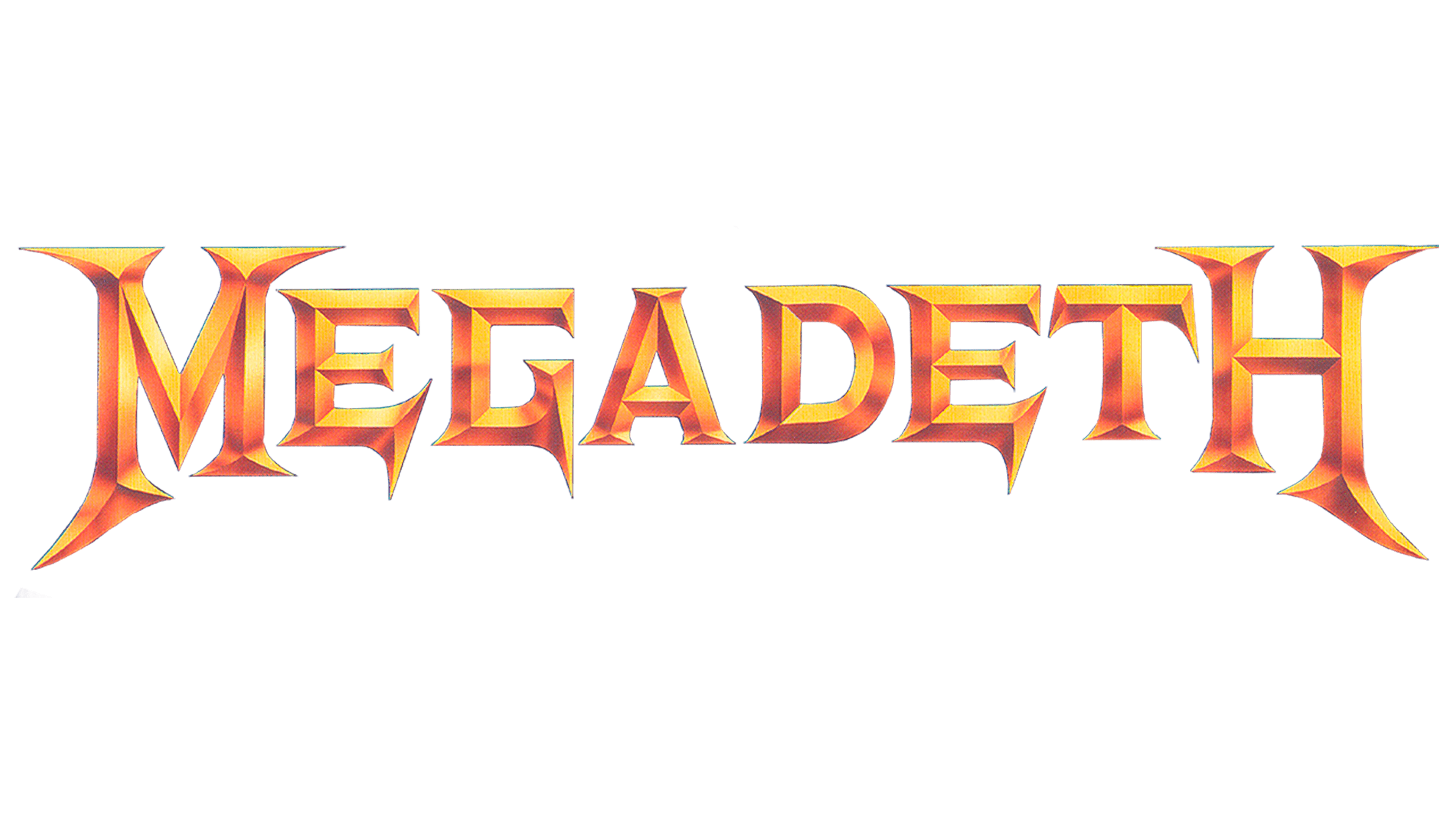
The cover of “Peace Sells… but Who’s Buying?” first featured a new logo: the word “Megadeth” with spiked serifs. A golden gradient created a 3D effect.
In 1992, the band’s fifth studio album was released. Designers changed the color of the “Megadeth” inscription to black and silver. This emblem was considered the primary one, although other versions were often used. For example, a round graphic sign with red-printed symbols was specifically designed for Cryptic Writings (1997).
Font and Colors
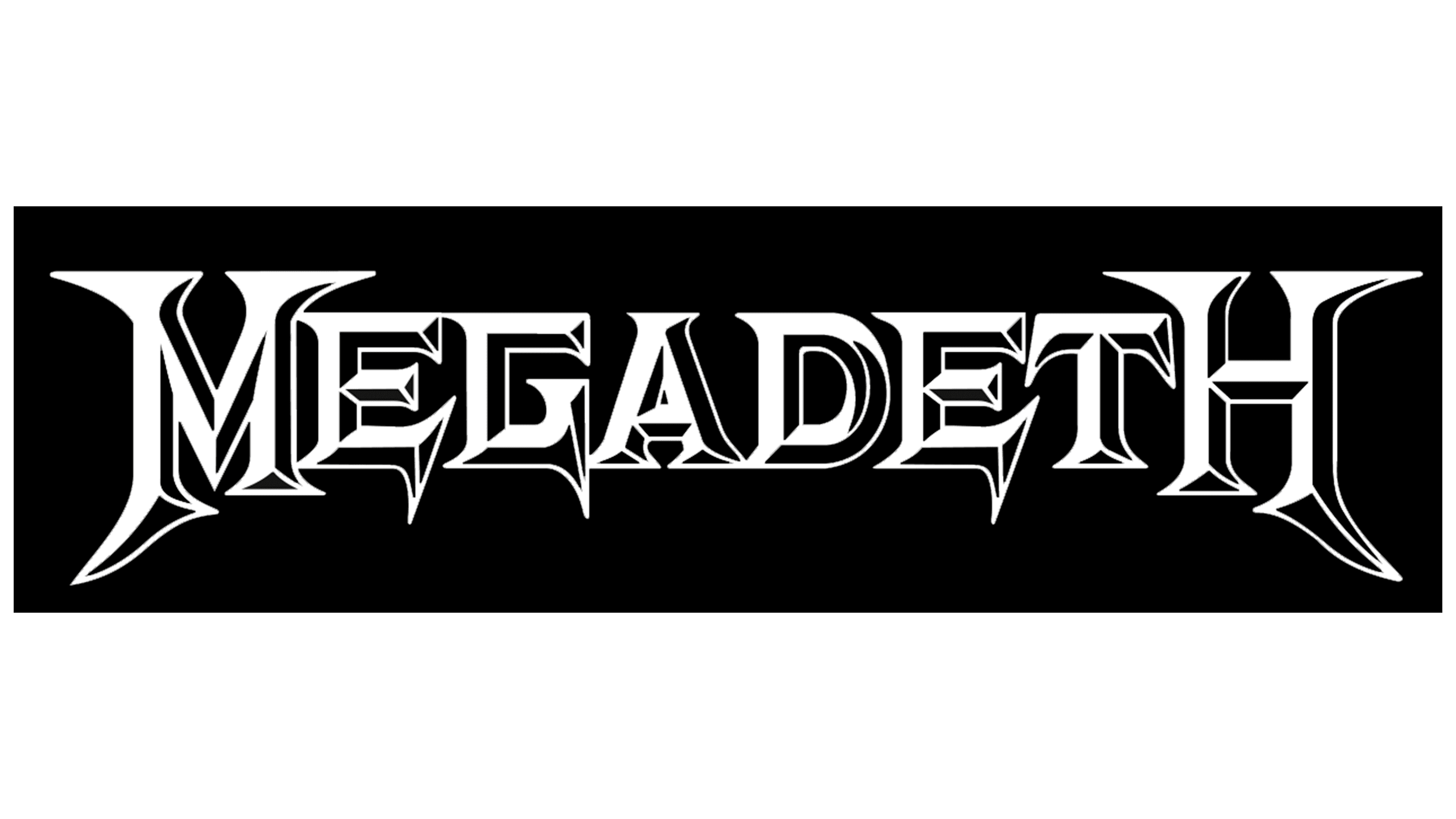
The band’s name is written in an unusual serif font. The jagged edges match the aggressive mood of thrash metal. Based on the original typography, Shane McFee created the gothic font Megadeth. The bold capital letters are very close together; there’s almost no space between them. At the same time, “M” and “H” are higher than the other symbols.
As for the color palette, it constantly changes. Currently, two variants are considered primary. The first is a monochrome combination of black and white. The second is a silver volumetric inscription on a dark background. There are also red versions with various shades.
Megadeth also has its recognizable symbol: a skull with metallic “glasses” and “headphones.” This mascot, named Vic Rattlehead, is present on many of the band’s studio albums. The unique character changes in each drawing, but the original form makes it recognizable.
FAQ
Who created the Megadeth logo?
The inspiration for the Megadeth logo, in the form of a skeleton head, comes from David Scott Mustaine himself, who formed the group after leaving Metallica.
Why is Megadeth called Megadeth?
David Mustaine came up with this name after leaving Metallica. He was sitting on a bus and composing lines for a new song when he stumbled upon the word Megadeath. Since Pink Floyd already had that title, the musician decided to remove the letter “A” from “T.”
Does Megadeth have a mascot?
Yes, this rock band has a mascot. His name is Vic Rattlehead. He looks like a skeletal head with closed ears, mouth, and eyes.
What font is used for the Megadeth logo?
For the MEGADETH inscription, an individual set of glyphs is used. Shane McFee developed a similar ancient font. It’s called Megadeth.