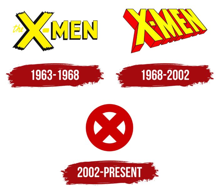
The idea of prohibition, protest, fear, and violent emotions is embedded in the X-Men logo. There is too much difference between representatives of both worlds. Therefore, between them, there is a door that excludes information leakage. The emblem is relentless: people are not allowed to know about mutants.
X-Men: Brand overview
| Founded: | September 1963 |
| Founder: | Stan Lee, Jack Kirby |
| Headquarters: | United States |
Meaning and History
Stan Lee would name the comic book series The Mutants, but Marvel executives were against it. In their opinion, readers might not have known what the word meant. As a result, the co-writer was forced to develop something else. He suggested an alternative, X-Men. That was the exact name in the comics for the group of people with superpowers that Professor X founded. In the first issue, the coalition leader explained that he gave the mutants this name because of their extra skills.
The “X-Men” lettering was present in almost all the franchise’s logos except the last one. The rebranding was intended to reboot both the storyline and the design system.
1963 – 1968
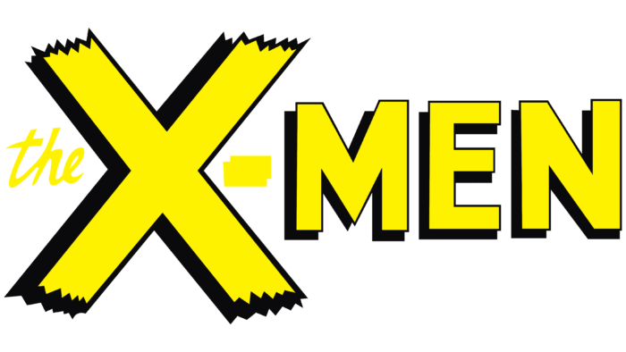
When the first comic book series began to be released, the title was depicted in bright yellow on its covers. All parts of the text took up one line. At the front was the handwritten “the,” in small type with a slight slant to the right. It occupied the left corner of the huge letter “X,” which looked like two torn pieces of scotch tape pasted in the shape of a cross. Next was a hyphen in the shape of a horizontal rectangle. And behind it was the word “MEN,” written in bold grotesque. All the elements except the article had black outlines and cast shadows.
1968 – 2002
In the late 1960s, an attempt was made to update the comic due to low sales. Graphic artist James F. Steranko drew a new logo for the superhero story. As far as we know, he was never paid for the redesign. The article “the” disappeared from the lettering, and it became three-dimensional. Because of the drastic change in proportions, the letters seemed to be in an invisible plane, which inclined. At the same time, their size decreased from “X” to “N,” as if the word was gradually moving away. The side edges were colored red and outlined with thin dark outlines. Shadows in the form of blurred gray bands enhanced the 3D effect.
2002 – today
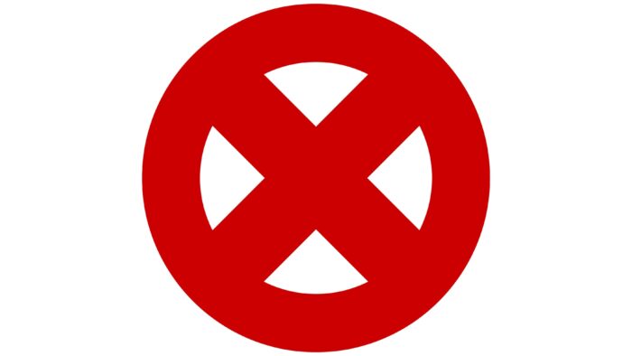
At the dawn of the 2000s, the Grant Morrison era began in X-Men history. The Scottish writer had arranged a reboot of the comic book. Around the same time, the logo was updated. The lettering disappeared, and the centerpiece was the bold “x” in a ring. The visual symbol was red and resembled a forbidding road sign in structure. It later transferred to some of the other media products of the franchise.
X-Men: Interesting Facts
The X-Men franchise, a cornerstone of Marvel Comics, has grown from its comic book roots to include TV shows, movies, video games, and many merchandise.
- Origin: Stan Lee and Jack Kirby created the X-Men, who first appeared in 1963. The original team was Cyclops, Beast, Angel, Iceman, Jean Grey (Marvel Girl), and their leader, Professor Charles Xavier.
- Themes: The X-Men stories are praised for their messages about acceptance, diversity, and fighting prejudice, often seen as reflecting real-world issues like racism and homophobia.
- Mutants as Metaphors: The idea that mutants are born with their powers symbolizes identity and belonging. Their powers usually appear during adolescence, echoing the real-life journey of self-discovery and acceptance in the teenage years.
- Famous Foes: The series has introduced iconic villains like Magneto, Apocalypse, and the Sentinels. Magneto, a Holocaust survivor, is a complex character who sometimes allies with the X-Men.
- Since debuting in 1974, Wolverine has become one of the most beloved characters, famous for his healing ability and metal claws.
- Phoenix Saga: “The Dark Phoenix Saga” is a pivotal storyline about Jean Grey becoming the Dark Phoenix and facing tragic consequences. This story has been adapted multiple times across the franchise.
- TV Show Success: “X-Men: The Animated Series” (1992-1997) helped make the X-Men popular beyond the comics, introducing many to the X-Men’s world for the first time.
- Movies: Starting with “X-Men” in 2000, the film series helped spark the superhero movie boom of the 21st century. The series includes movies, like the acclaimed “Logan” in 2017.
- Diverse Characters: The X-Men roster includes characters of various backgrounds and nationalities, such as Storm, one of the first major black female superheroes, and Nightcrawler, a devout Catholic.
- Cultural Impact: The X-Men have significantly influenced popular culture, sparking conversations about social issues and themes of prejudice and equality.
The X-Men stand out for their engaging stories, complex characters, and exploration of social issues, cementing their place in comic book history and the wider landscape of pop culture.
Font and Colors
The X-Men visual identity system is not streamlined because different logos are used on the posters and posters of different movies. As for the comic book emblem, it has contained the letter “x” in a ring in recent years. It is a simple symbol built on a minimalist design.
The modern graphic sign contains no lettering. The last time the franchise name was featured in a 1968 logo, it was Steranko’s work, not associated with any fonts.
X-Men color codes
| Racing Red | Hex color: | #cc0001 |
|---|---|---|
| RGB: | 204 0 1 | |
| CMYK: | 0 100 100 20 | |
| Pantone: | PMS Bright Red C |


