Règles Élémentaires updated its identity for its tenth anniversary. The French association began as an initiative focused on access to hygiene products and grew into an organization working with periods, health, poverty, and equal access. Antoine Peltier created the new image. The logo takes the leading role. It helps the organization speak about the topic calmly, openly, and with a lively human tone.
The association has worked since 2015 and promotes menstrual equity in France. Its focus includes access to period products, education, health, and the fight against taboos. On its website, Règles Élémentaires uses the phrase “Changer les règles pour changer le monde.” Through it, periods are connected with dignity, basic care, and access to information.
The previous logo looked utilitarian. The mark with a face and hair suggested a women’s theme, while the large inscription next to it read like the label for a public campaign. For the early stage, the format worked. Later, the association grew and began communicating with partners, schools, volunteers, government bodies, and audiences on social media. The old mark outgrew its former role.
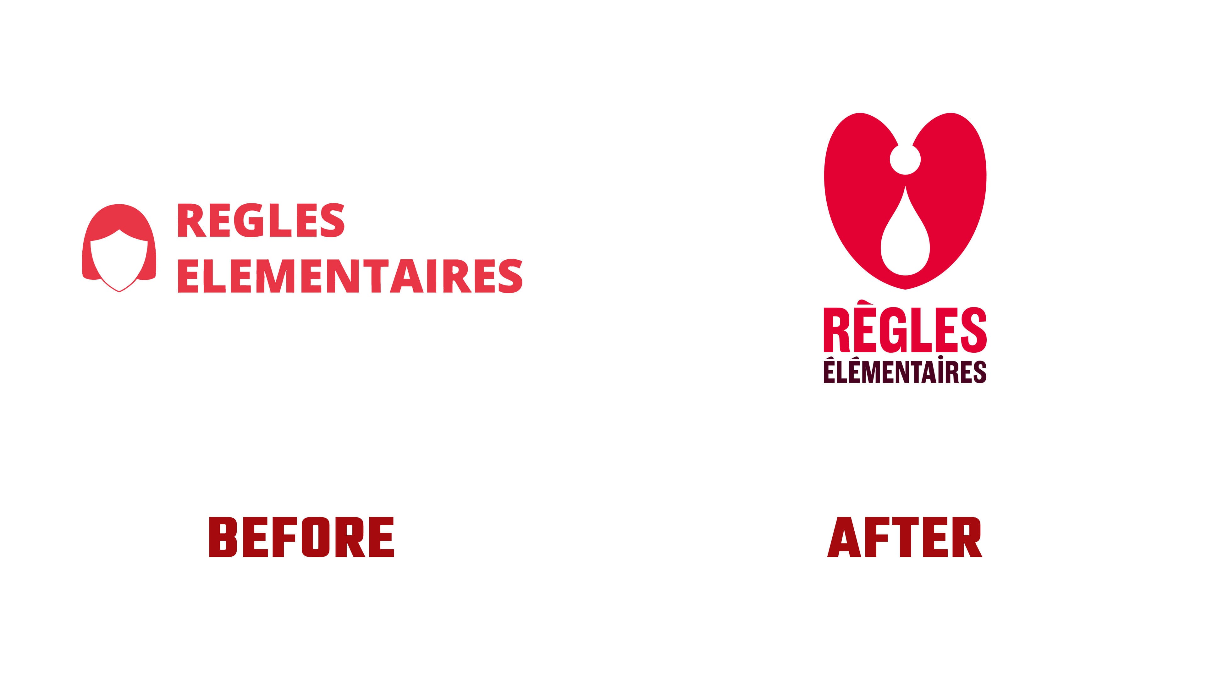
In Antoine Peltier’s version, the logo is built around a heart with a drop inside. A softer mark replaced the literal body illustration. The heart is connected with care, support, and participation. The drop delicately introduces the themes of blood, the cycle, and health. The emblem presents the subject of periods calmly and openly.
The logo became vertical. The symbol sits above the name, so the mark appears more like a complete emblem than a service label. The name Règles Élémentaires is set in the dense, high-contrast typeface Lorimer No 2 Condensed. Its form refers to the typography of protest materials from the 1950s in the United States. Through the typeface, the brand gains a civic tone and the energy of a public statement.
Red remained the main color of Règles Élémentaires. In the new identity, it feels warm and bodily, with a soft reference to blood. It is paired with a dark shade called dried blood. At the same time, secondary colors without gendered associations were added for various applications. In the logo, red connects the mark to the theme of periods. It shortens the distance between the association and its audience.

For body text, the system uses Parkinsans, created by Red Stone for an association against Parkinson’s disease. Paired with Lorimer No 2 Condensed, it gives the system two tones. Headlines sound denser and more public, while explanatory materials feel softer and closer to living speech. In the logo, Lorimer No 2 Condensed carries the main weight because it gives strength to the name next to the heart and drop.
The tenth anniversary update preserves the mission of Règles Élémentaires and makes it visible through a mature emblem. The logo shifts the topic of periods from awkwardness to one of care, rights, and openness. For partners, it shows the scale of the work. For the audience, it offers a sign of support. For the brand, it marks a new stage after ten years of work on a topic long surrounded by silence and taboo.