


Malwarebytes separated its “M” emblem from its name in a new logo Redscout unveiled in June 2026. Previously, the symbol served as the first letter of the name, followed by “alwarebytes.” The full name now appears alongside the emblem, with a space between them. The New York agency developed the update to introduce a broader consumer audience to a brand long familiar to technical professionals.
Founded in 2008, Malwarebytes became known for its malware detection and removal software. Over time, it expanded its services to include device security, privacy, and personal data protection. It kept free tools for combating malware and scams in its lineup. Outside the tech community, however, consumers struggled to see how Malwarebytes compared with major antivirus brands. Redscout’s task was to communicate the expanded offering and help the company earn everyday users’ trust.
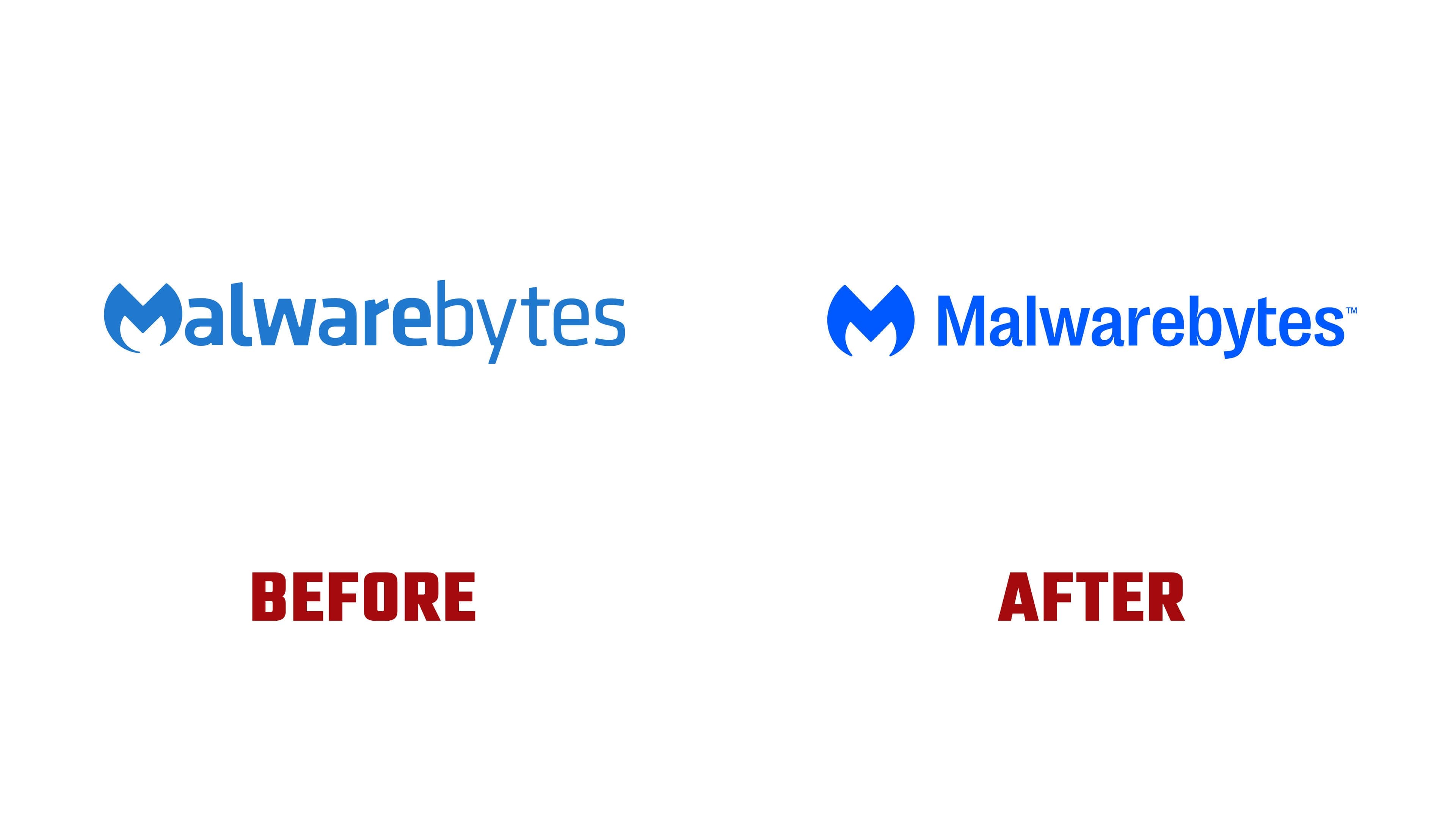
The update also changed the lettering. In the previous version, a bold “alware” sat beside a thin “bytes,” visually splitting the name. The new wordmark uses a consistent weight throughout. It is set in Right Grotesk, a sans-serif typeface with narrow proportions. Small angular notches known as ink traps appear where certain strokes meet. Combined with the letters’ rounded sections, they give the wordmark a technological feel. The compact spacing helps the long name fit into a small area.
The blue “M” retains its superhero-emblem resemblance. Two sharp points rise from the top, separated by a V-shaped notch. The sides are rounded, while the lower ends taper to points around an open white-space area. Redscout refined the shape to make its left and right halves symmetrical. The adjustment makes the emblem easier to center and align with the name. The blue is now brighter.

The superhero theme originated with an earlier Malwarebytes redesign. Designer Rob Bajohr sought to create a team emblem suitable for a business setting. Employees saw their fight against online threats as a heroic mission, which led him to explore superhero imagery. The icon that preceded his design had been commissioned through 99designs for $100. It was difficult to reproduce, and some employees and customers struggled to recognize an “M” in it. The replacement needed to work across applications ranging from software interfaces and merchandise to signage at the company’s headquarters.
Malwarebytes founder Marcin Kleczynski unveiled that redesign on February 17, 2016, alongside an updated website. The launch coincided with the release of Malwarebytes Breach Remediation for businesses and the company’s move from San Jose to Santa Clara. Redscout revisited the brand’s earlier identity, including the superhero “M” and former mascot Zero, and reconsidered who should play the hero. In the new story, the user becomes the hero by taking control of their digital life. Malwarebytes serves as the protector, helping people use the internet freely. The emphasis shifts from fear of threats to the possibilities available to users.
Across the rest of the identity, photographic camera angles and comic book imagery reinforce the superhero theme. Pao Bassol created the illustrations, and Bryan Gancedo-Gonzalez developed the animation. Bright colors supplement the core blue. The updated identity is rolling out across Malwarebytes products, advertising campaigns, and its website.