Badger Brewery, a family-operated brewery in Dorset with a history dating back to 1777, has revealed a revamped image. The brewery has an extensive reach, owning 56 managed pubs and holding tenancies for 111 others, ranging from Devon to Sussex and extending to London. Despite its long-standing presence, Badger Brewery faced a particular challenge: its core brand identity was often eclipsed by the fame of its brews, such as ‘Golden Champion’ and ‘Fursty Ferret.’
To tackle this issue, design agency Robot Food took charge, aiming to bring the Badger Brewery name to the forefront while still cherishing the unique flavors of each brew. The essence of the rebrand lies in the idea of ‘crafting character,’ a concept devised to forge a stronger link between the array of beers and the storied history of Badger Brewery.
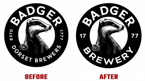
Central to the rebrand is the Badger Brewery logo, which retains the iconic badger image. The logo’s text components, however, have been meticulously refined. It now features a clean, sans-serif typeface for the word “BADGER” while ingeniously embedding the year of the brewery’s establishment, “17/77,” into the visual design.
A standout element in rebranding is the series of whimsical, realistic illustrations crafted by artist Bob Venables. These serve as individual avatars for each beer variant and align perfectly with the brewery’s revised brand ethos of ‘crafting character.’ These illustrations sport a variety of eccentric attires but are unified by a common deadpan facial expression, thereby maintaining a consistent, playful vibe across the product lineup.
The redesigned labels pull no punches in addressing the brand recognition issue. The new horizontally oriented logo provides brand recognition. Moreover, the standardized layout, featuring bold and eye-popping colors, successfully amalgamates the beer names and their unique illustrations into a unified brand expression. Even the neck labels have been revamped, now featuring only the badger image and color-coordinated to match the primary label, which aids in immediate brand recall.
Badger Brewery’s rebranding away from the typical craft beer design is a breath of fresh air. It succeeds in modernizing the brewery and positions it as a potentially dominant player in an overcrowded beer market. Through its newly minted brand identity, Badger Brewery strikes a harmonious balance, allowing each unique brew to shine while reinforcing a unified brand identity that is instantly recognizable and deeply resonant.


