In 1978, the Container Store was established and had grown to become the only leading specialty retail store offering storage and organization products in the US. Over the years of its existence, the brand has gained immense popularity in its own country while having 94 stores in different states. Despite such a small number of outlets, each of which occupies about 25,000 square feet, the brand is the leader in its field in terms of sales of its products. Its assortment includes more than 11 thousand items that demonstrate the advantages of organized and environmentally friendly life. This affected the style and way of doing business by the brand itself. Its neat organization was demonstrated on 02/22/22 when Container Store unveiled its new identity by launching a major company to rebrand and increase its presence in the domestic market. The Renewal Day was not chosen without reason, as it is the most recent organized day with this combination of numbers in this century.
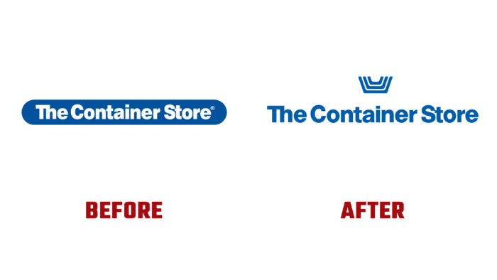
The company unveiled and launched a completely reimagined Helvetica-inspired logo, a new slogan, and a daily welcome offer. The visualization demonstrated how a modern national brand is being formed. Having set itself the task of changing lives with the help of the power of organization and order, Container Store turned to all the meaningful and original call – Welcome to The Organization. The entire identity has become a reflection of the onset of the brand’s more modern and expressive era. The designed badge features three nested shopping baskets, which symbolize smiles in a subtle and inspiring way while representing the company’s main features – the largest range for organizational solutions, premium cabinets, and containers in stock and to order, providing unrivaled targeted services. At the same time, the visual solution has a fundamental impact on how customers form their relationship with the company, which many call a “happy place.”
The created sign speaks of the emotional benefits of the products offered, demonstrating how an organization can bring a sense of freedom, peace, and joy. Having built a variety of visual metaphors, the designers conceptualized them at a set point that consistently organizes the visual experience of the entire identity, from containers to the subtly crafted “smile.” To enhance the sign, digital processing was carried out, which made it possible to use it as an element of the logo composition or as an individual brand sign. The new design of the logo has opened up more possibilities for its use, both in various applications and in any execution – typographic or digital.


