Quark is a privately held company founded in 1981 in Denver, Colorado. She celebrates her 40th anniversary in business this year. In connection with this event, and with the arrival of a new CEO, the company changed its logo. As a pioneer in digital publishing, content automation, and graphic design, the brand now dominates the digital design, prepress, and publishing market. Its offices can be found in many countries in Asia and Europe. The brand’s main goal is to effectively assist customers in managing the content lifecycle with feedback, which includes professional content design, automation, and analytics. It offers a range of products that integrate traditional printing with corporate content management, personalization, and collaborative workflow tools.
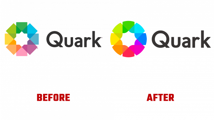
The new logo builds on the previous one. It retains visual consistency to such an extent that a cursory scan may overlook the dramatic changes. First of all, an adjustment to the color palette was made. All colors have acquired brightness and saturation, which is provided by new digital technologies. This applies to the color mark and the dark gray tint of the text name. This creates a completely different perception of the logo, ensuring it is legible at any scale.
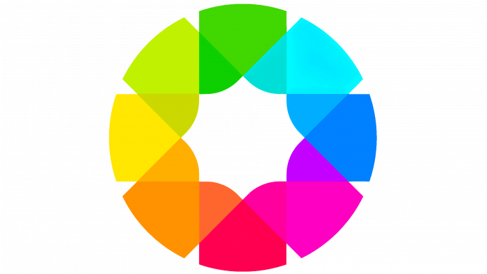
Visual changes were made to the graphics of the sign. The “flower” created from colored leaves has acquired a rounded contour thanks to the curves of the upper part of each leaf. The same bends were worked out in the lower part, which forms the inner element, which previously very much resembled the shape of the “Rub el Hizb” – a Muslim symbol formed by two superimposed squares rotated 45˚ relative to each other. Now, this sign has lost this perception due to the abandonment of the square shape. Now the central negative space forms an octagram-shaped figure – a cross-arrow. Turning out to be inscribed in a circle, such a combination of elements symbolizes order, creation, and balance.
The text is in a Geraldton Bold by Pepper Type sans serif font, making it easy to remember and read.
The whole composition has acquired a modern appearance, becoming more effective while maintaining its uniqueness and recognition. All this became possible thanks to the professionalism of the company’s designers, who demonstrated the highest level of craftsmanship.


