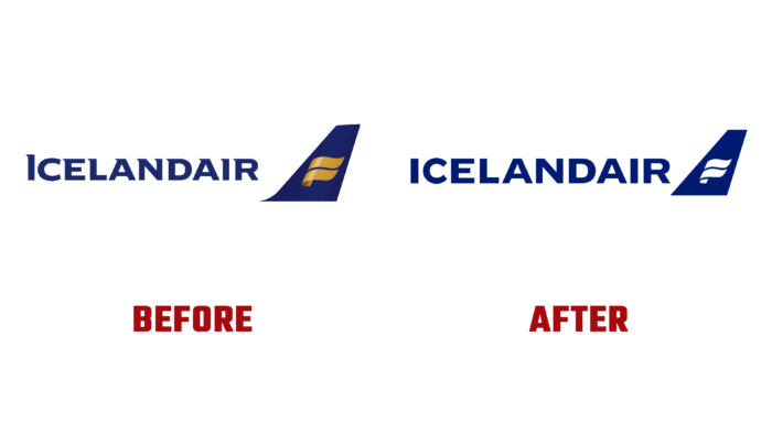
This year the flagship of Icelandic air transportation, Icelandair, pleased its customers with a new, original aircraft design. As a result of the rebranding, the company, founded in 1937 in Akureyri, has a new attractive identity that adorns the aircraft with new colors. For the first time since 2006, the aircraft’s livery design has been changed as part of a complete rebranding program. This has become necessary to ensure a more complete and fresh brand presence in the air travel market. The color scheme was taken from real Icelandic nature. A special place was occupied by the most attractive and beloved by every Icelander tones and shades characteristic of the local phenomenon – the northern lights. It took almost a year to develop a new design that was created using unique, refreshing ways to bring the spirit of ICELAND to the world.
The first from the fleet eligible to show off the new livery as early as January was the TF-ICE, a Boeing 737 MAX 8 named Jökulsárlón after the country’s most famous glacial lagoon. A complete re-registration of all sides is scheduled for the period covered by the maintenance schedule for each side. At the same time, the main special-purpose aircraft will retain their traditional coloring.
The new visualization consists of five different colors applied to the surface of the tail – boreal blue, magenta, sky blue, yellow, and green. This choice of colors is due to the main shades that characterize various unique phenomena of Icelandic nature. When creating the livery, technology was used to form an image that impacts the viewer, similar to a billboard. Considering the company’s main feature – a large amount of time spent in the sky, the design’s inspiration was drawn from what the crews and customers see in front of them and the windows overboard during the flight. The base colors of the identities are navy blue and white. The palette consists of very rich and characteristic shades of Iceland – northern blue, purple, clearly defined and saturated blue, golden yellow, and green. This combination made it possible to fully convey the bright Icelandic spirit to the whole world and show how diverse ICELAND’s world is. With the help of this color scheme, the brand tried to convey to everyone that this spirit is available to those who are willing and ready to share it with indigenous representatives sincerely.
In a common unified style, the design of the restaurant hall of the central airport in Reykjavík was recently redesigned. Here, sustainability was emphasized, which was formed using recycled materials and vintage furniture after it was recycled.


