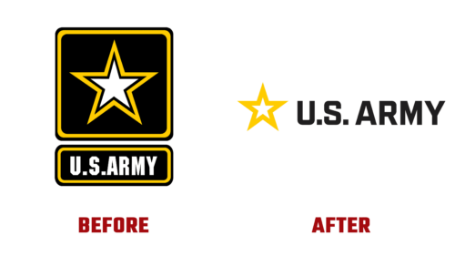
In early March of this year, the U.S. Army changed its identity for the first time in many years. The emblem from 2001 no longer reflects the current situation. Now, the main focus of the designers is on the youth, showing that service in the Army is an excellent opportunity not only for career growth but also for a better life. As emphasized by Christine Elizabeth Wormuth (U.S. Army administration representative), the modernized logo demonstrates limitless possibilities for young men and women.
To fit the “Be All You Can Be” concept (Army slogan), designers took several steps:
- Removed the background square and rectangle, showing the absence of boundaries for a fulfilling life, striving forward, and professional development;
- Chose a new custom font – simpler, clearer, more open, with less sharp cuts at the corners and smooth roundings;
- Abandoned the idea of double edging, presenting a star within a star – the idea that everyone can shine in the brilliant Army;
- Replaced thin lines with bold ones, promoting the concept of reliability, strength, steadfastness, and resilience in any life situation;
- Adjusted the color palette, using a saturated yellow instead of pale yellow – warm and sunny, evoking positive emotions;
- Regrouped elements, placing the star and text in one line, to emphasize equal opportunities for all.
The result is an accurate reflection of modern realities. Chief of Army Enterprise Marketing Alex Fink noted that the brand now fully informs the environment about the possibilities of Army service. It is focused on tasks, community, emotions, the interconnection between the population and the Army, showing unity of goals.


