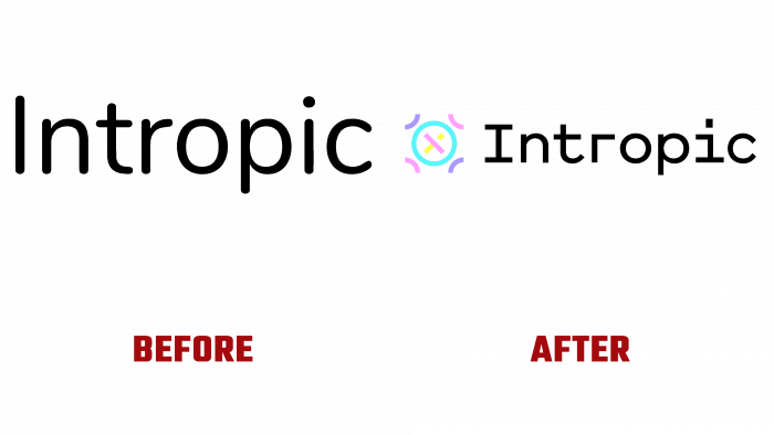
Developed by British Ravinder Bhadhal and Sam Shannon in 2018, the Intropic electronic app has changed its style. Created for processing and analyzing the collected data, as a convenient tool for increasing the efficiency of any business, the platform opens up endless opportunities for its users. Together with Intropic, you do not need to have many years of experience in leading large enterprises to achieve real heights in your type of business. Thanks to the platform, it became possible to significantly reduce the time and labor costs for processing a large amount of information. With its help, it is easy and simple to structure existing data, including cloud data, make adjustments and additions, find effective links in their parameters.
To create a new design, the developers used the services of That Thing (London, UK) designers, who creatively approached the task. A radical change in the logo was carried out using the achievements of modern technologies. Its new look began to meet all the requirements for high-quality reflection of visual information, both digital and printed. When creating the logo, an important feature of the application was effectively reflected – the ability to find a logical relationship, points of contact in a huge variety of actions, and disparate details to form a logically grounded semantic chain. This was achieved by an original sign in the form of an icon made of several small elements. It forms a symbolic reflection of the moment when the various pieces of the puzzle fell into place. At the same time, the next step will be to include this system as another puzzle for the next, much larger and more significant puzzle.
Graphics and design solutions ensured that the platform provided all the necessary tools to form a single semantic picture from a seemingly chaotic set of information. It is the unique transition from chaos to order symbolized by cymatic patterns, dynamic displays of symbols of natural phenomena. At the same time, to simplify perception, special visual cues were developed and implemented. Symbols used in the formation of visual identity have been applied to denote emerging ideas or the results of strategic thinking and data processing. The entire graphic language was built on a variety of constantly changing geometric shapes and figures.
The text of the title is made in a font with a rather pleasant design, the shape of which is very consistent with the spirit and idea of the platform itself. Particularly effective is the execution of the letter “I” aligned with the icon. An original visual perception is created in a dystopian style of the formation of the entire composition. At the same time, complete unity of the entire composition, its ease of reading, and ease of memorization, has been achieved.


