The Baojun logo captures attention with its originality. The emblem elements emphasize stability and balance, combining traditions and innovations. The symbol appears suspended in the air, creating a sense of lightness and motion.
Baojun: Brand overview
The Baojun brand, known for its affordability, was born in 2010 through a partnership between General Motors and China’s SAIC Motor Company, forming the SAIC-GM-Wuling joint venture. The brand began its journey with the launch of the Baojun 630 sedan in 2011, focusing on creating basic and fuel-efficient vehicles primarily designed for small towns in China.
The brand’s portfolio soon expanded to include hatchbacks, vans, and MPVs, catering to the growing demand for affordable cars in the Chinese market. A major highlight of 2018 was Baojun’s introduction of its first electric vehicles, the E100 and E200, backed by General Motors.
The combination of General Motors’ manufacturing prowess and SAIC’s local expertise in the Chinese market has contributed to Baojun’s rapid growth over the past decade. As of 2020, more than 5 million Baojun vehicles have found their owners, making the brand one of the best-selling in China.
By serving small and emerging vehicle segments outside major cities, Baojun has allowed General Motors and SAIC to gain a strong foothold in these markets. As the Chinese market continues to expand, Baojun’s lineup of fuel-efficient vehicles is seen as a stepping stone for Chinese consumers looking to purchase their first car.
Meaning and History
What is Baojun?
It is a Chinese automobile brand established as a joint venture between General Motors, SAIC Motor, and Wuling Motors. The brand specializes in producing affordable and stylish cars for the mass market. The company offers a range of models, including sedans, SUVs, and MPVs, catering to consumers’ needs. Known for its competitive pricing and modern design, the company provides high-quality vehicles with advanced features in China and other markets.
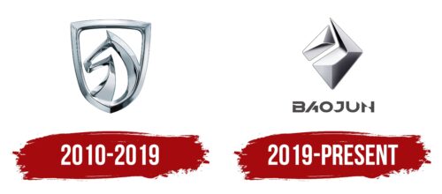
2010 – 2019
Baojun, which operated from 2010 to 2019, chose a logo deeply rooted in Chinese culture and traditions. The brand name “Baojun,” which translates to “precious horse,” is reflected in the emblem’s image of a horse. This association with the animal is deliberate, as animals symbolize desired qualities or aspects of life in Chinese mentality. The horse represents grace and speed, perfectly mirroring the brand’s ambition to create fast and elegant cars.
The Baojun emblem features a horse and is designed as a shield, further emphasizing the safety and reliability of the brand’s vehicles. The shield shape is traditionally associated with protection and confidence, making it an ideal choice for a car brand looking to highlight its strengths in vehicle safety.
Baojun cars are known for their reliability, safety, and appealing design, combining aesthetic beauty with advanced technical features. They target consumers who value beauty and functionality in vehicles, setting them apart from competitors.
2019 – today
The Barreiros logo, displayed on the vehicles from this Spanish company, combines elegance and uniqueness. The logo features smooth cursive handwriting with angular letters, adding a modern touch. Each letter is connected, forming a continuous, fluid line.
The first letter, “B,” stands out in uppercase with a long horizontal stripe underscoring the name “Barreiros.” This design highlights the brand name and adds a sense of authority. The stripe draws attention, making the name memorable.
Below the inscription is a symbol resembling the number 8, divided vertically by a line. This figure adds intrigue and sets the logo apart from more conventional designs.
The emblem is rendered in sleek black, giving it a sophisticated and timeless look. The black color conveys professionalism and reliability, which is essential for an automotive brand.
The cursive inscription gives the logo a personalized and chic appearance, like a signature. This design choice imparts individuality and exclusivity. The large “B” commands attention, emphasizing the brand’s identity with clarity and strength.
The 8-shaped figure adds depth and meaning, enhancing the logo’s appeal. Combining the angular cursive inscription, the prominent “B,” and the mysterious 8-shaped figure creates a visually striking and rich logo.


